
Dynatrace Blog
Drive your business forward in the digital age.

Dynatrace plans FedRAMP Class D (High): Why it matters for agency strategic planning
Dynatrace Release Radar 06.26

Get real service insights in minutes with the QuickStart app, Dynatrace Free Trial, and dtwiz CLI

Your Kubernetes cluster has a graph. Here’s how to interrogate it.

Seeing the core clearly: Dynatrace mainframe monitoring meets IBM z17
Dynatrace named a Leader in the 2026 Gartner® Magic Quadrant™ for Observability Platforms for the 16th consecutive time

Dynatrace Security Enrichment: Every threat intelligence source in one unified experience
Dynatrace plans FedRAMP Class D (High): Why it matters for agency strategic planning

Dynatrace Release Radar 06.26

Quit trying to keep up with every new AI tool and keep building
Smarter, safer Agentic AI: Dynatrace observability meets NVIDIA AI-Q

Your business applications are at risk: Introducing in-context security findings for Kubernetes
Multicloud HIPAA compliance for healthcare: Dynatrace now supports AWS, Azure, and GCP
Beyond LLM-as-a-judge: Establishing LLM evaluations as a foundation for trustworthy agentic AI systems
Log management for AI workloads: How to bring your logs and telemetry plan into the AI-first century

Building in the open: How Dynatrace invests in open source to move the industry forward

Getting started with cloud modernization
How AI workloads are changing what logs must deliver, forcing a new strategy
Dynatrace Release Radar 05.26
Moving from insight to action: How Dynatrace and AWS are reshaping cloud operations

What’s new in Dynatrace SaaS version 1.341

Orchestrate multicloud AI agents for autonomous incident resolution
Dynatrace observability is now a Kiro power

From reactive to proactive: How NAIC embedded AI‑powered observability directly into the IDE
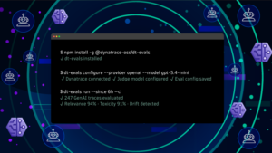
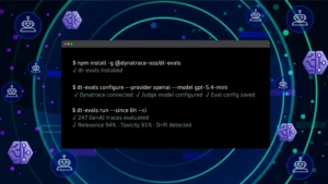
Evaluate LLM and agent quality in Dynatrace AI Observability with dt-evals