

This series covers recent Dynatrace releases and updates, focusing on what’s new, what’s changed, and how these recent enhancements can benefit you and your organization. Each post covers newly available capabilities and points you toward where to explore them.
The April 2026 Dynatrace SaaS releases bring six updates aimed at a familiar problem: too much manual work between a signal and an answer. The updates focus on native cloud visibility, deeper Kubernetes insights, consistent severity handling, faster investigations, and smoother analytics work.
Explore all updates hands-on in the Release Radar launchpad.
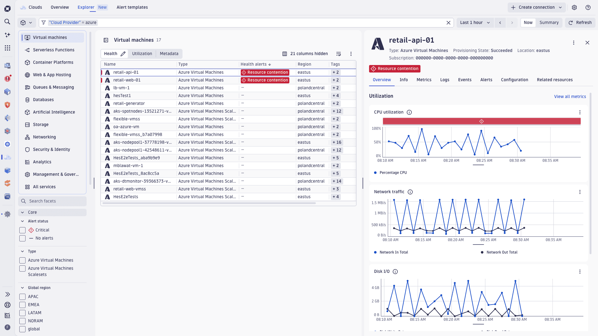
A native Azure experience in Clouds
What does Dynatrace add for Azure practitioners?
Dynatrace now extends the enhanced Clouds experience to Microsoft Azure, putting Azure subscriptions on the same footing as AWS. Metrics, logs, metadata, and topology now sit in one managed view, so Azure teams can move from inventory to investigation without stitching the picture together by hand.
What you get out of the box
- Opinionated insights and ready-made dashboards built from enriched Azure telemetry, so investigations start with answers instead of a blank canvas.
- Pre-configured health alerts for Azure, created and managed directly in Clouds, with drill-down, search, and filtering directly in the Clouds app.
- Broad metric coverage for any Azure Monitor native platform metric across Azure services.
- A rich Azure topology inventory that periodically scans Azure environments and enriches resources with native metadata such as tags and subscription IDs, all queryable with Dynatrace Query Language (DQL).
- Simple onboarding and lifecycle management that turns Azure subscriptions into native Dynatrace connections and manages them centrally.
Dynatrace also adds drilldowns from cloud entities into the relevant Dynatrace experiences, so teams can keep moving instead of bouncing between cloud and platform views.
Kubernetes visibility for autoscaling and custom resources
What’s new in Kubernetes observability?
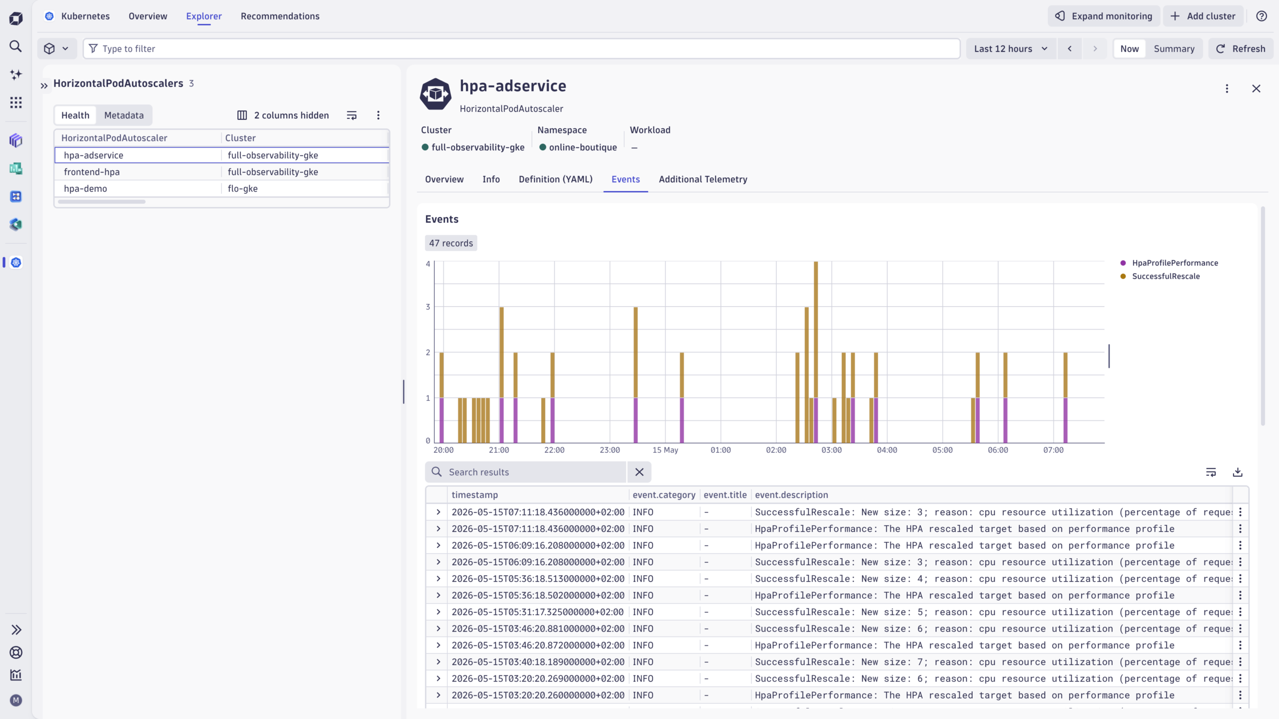
Dynatrace extends Kubernetes visibility to two additional object types that SREs and platform teams rely on daily: Horizontal Pod Autoscalers (HPA) and Custom Resources (CRs).
Horizontal Pod Autoscaler as a first-class object
HPA is now a first-class object in enhanced Kubernetes visibility. You can see when scaling kicked in, what triggered it, and how desired and actual replica counts lined up next to the workloads involved.
Custom Resource insights
You can monitor up to five Custom Resources per cluster, surfaced the same way as built-in Kubernetes objects. This brings CRD-heavy ecosystems such as Argo, Istio, Cert-Manager, Kyverno, and operator-managed databases into the same investigation scope as the rest of your cluster.
For clusters connected through cloud integrations, the Kubernetes cluster details page now exposes the underlying cloud configuration (EKS, AKS, or GKE) in YAML or JSON, making cloud-side and cluster-side state accessible in one place.
A unified severity model for alerts and problems
What is event.severity in Dynatrace?
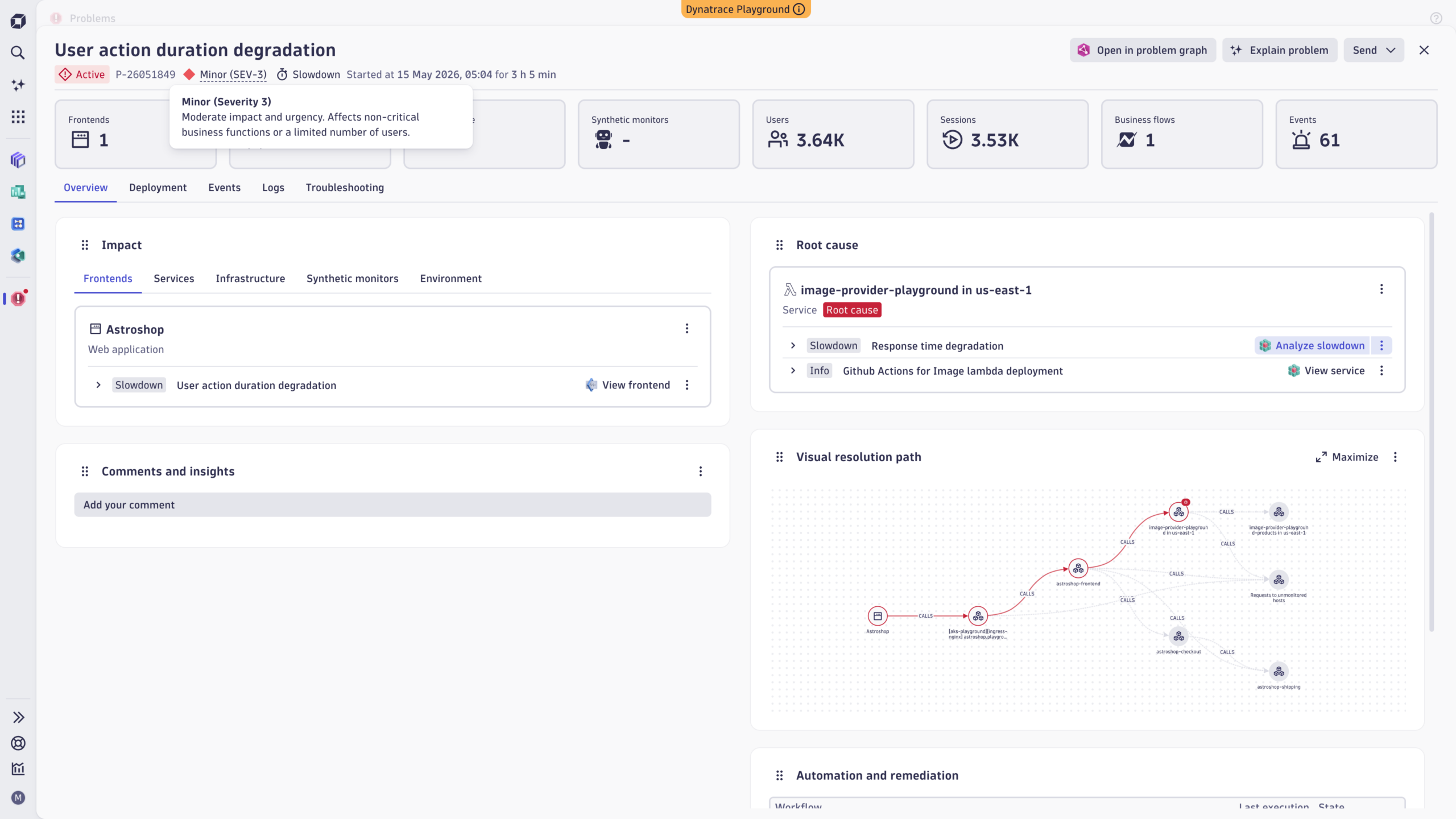
Dynatrace introduces a standardized event.severity field for alerts and problems, aligned with the ITIL Incident Management framework. Severity is stored in Grail as an integer from 1 (Critical) to 5 (Informational) and is shown as a human-readable label across the platform.
Severity levels at a glance
| Value | Label | Description |
| 1 | Critical | Major business disruption; service outage |
| 2 | Major | Significant impact; workaround may exist |
| 3 | Minor | Limited or non-critical impact |
| 4 | Warning | Low impact; no business disruption |
| 5 | Informational | No business impact |
Severity automatically propagates from correlated alerts to the parent problem, with the highest severity always taking precedence. This gives teams one severity model to filter on, route with, and escalate from.
You can now:
- Filter the problem feed by severity
- Display a severity column with visual icons in problem lists
- Use severity as a condition in Workflows for alert routing and notifications
Faster Investigations with Smartscape navigation
What changed in Smartscape?
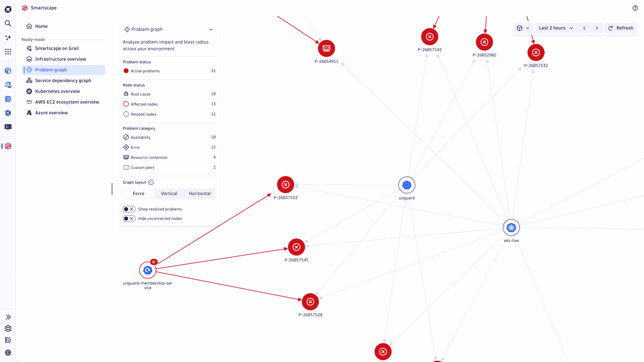
Smartscape now offers all six ready-made views, such as vertical topology, horizontal topology, and visual resolution path, just a click away in a persistent side panel. You no longer need to return to the landing page in the middle of an investigation.
The new Recent views section shows your latest investigations, making it easy to reopen them, compare them, and keep working as you test a root-cause hypothesis.
The result is less backtracking in the middle of an incident.
Dashboards and notebooks: productivity improvements
What’s new for dashboard authors and analysts?
The latest release adds several practical upgrades for team members who build dashboards and work in notebooks every day.
- Treemap visualization for identifying dominant categories in hierarchical data, such as requests per service by Kubernetes namespace.
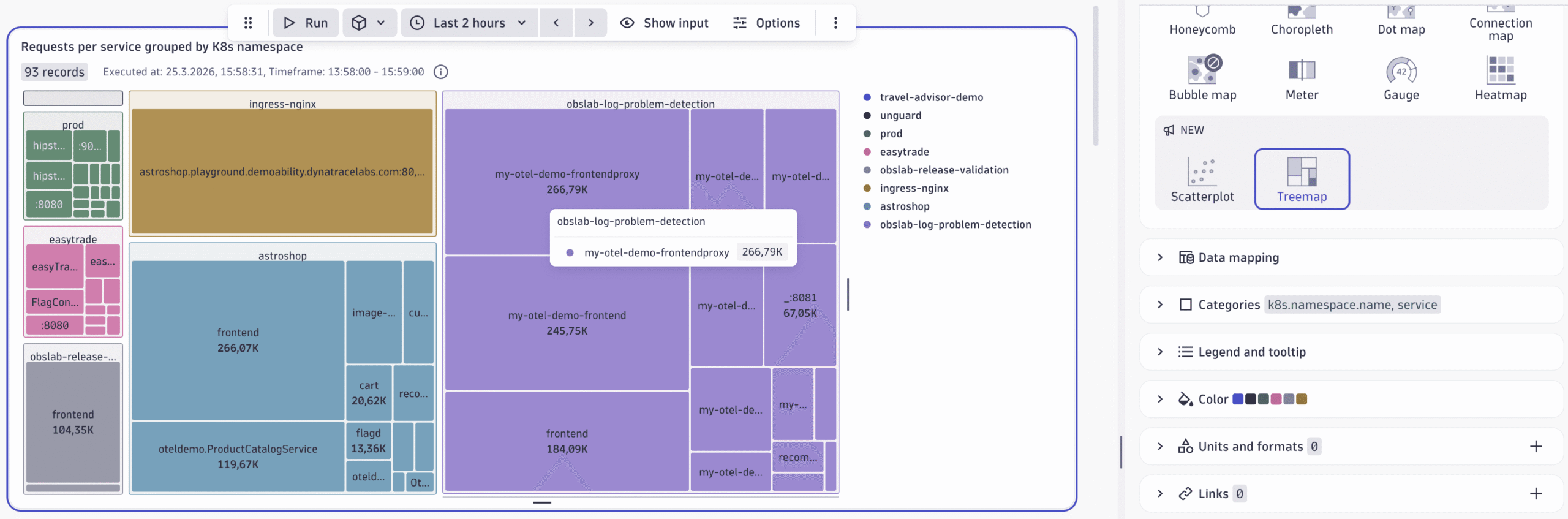
Treemap visualization example - Dashboard variables for dynamic coloring and thresholds, so visual conditions stay in sync with environment or team selectors.
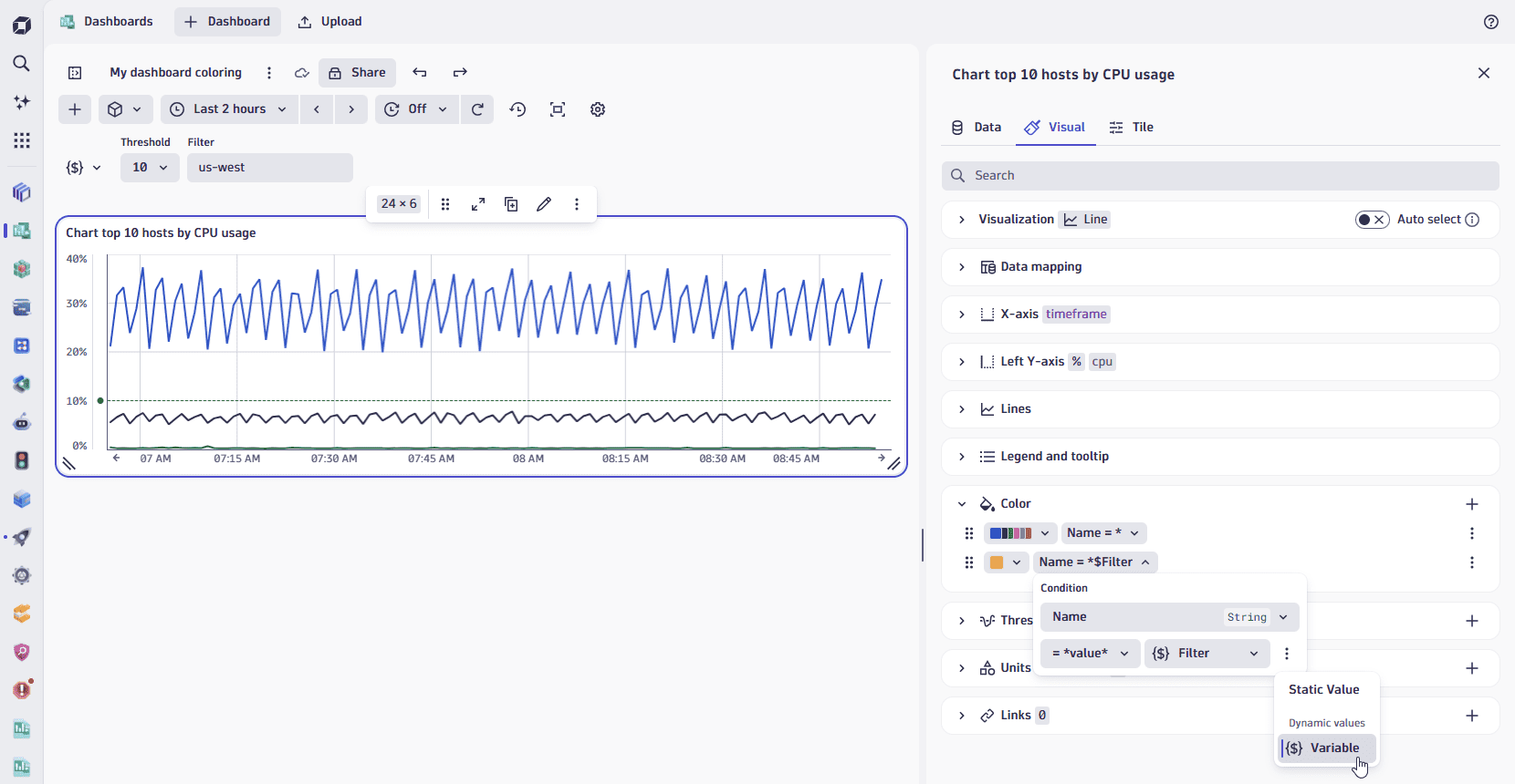
Use dashboard variables for dynamic coloring and threshold conditions - Centralized tile indicator controls, allowing you to show or hide warnings, descriptions, and custom timeframes at the dashboard level.
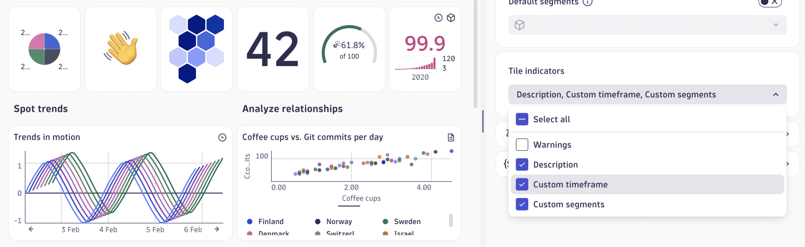
Select or clear tile indicators on a dashboard - Direct image upload in Markdown using a built-in image library shared across Dashboards, Notebooks, and the Launcher.

Upload image directly in Markdown
- Row marker coloring for tables, making it easier to visually group related rows without sacrificing readability.
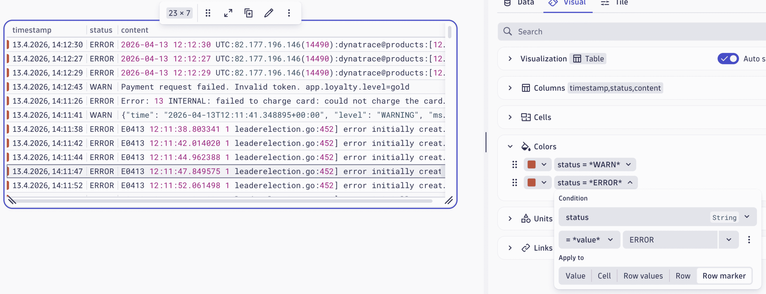
Highlight table rows with color markers in Dashboards and Notebooks
User experience improvements
Why does the platform feel faster?
This release smooths out the path from the first symptom to root cause analysis. Tracing and services workflows now handle high-span traces more reliably, show timing more clearly, and surface useful sample traces earlier.
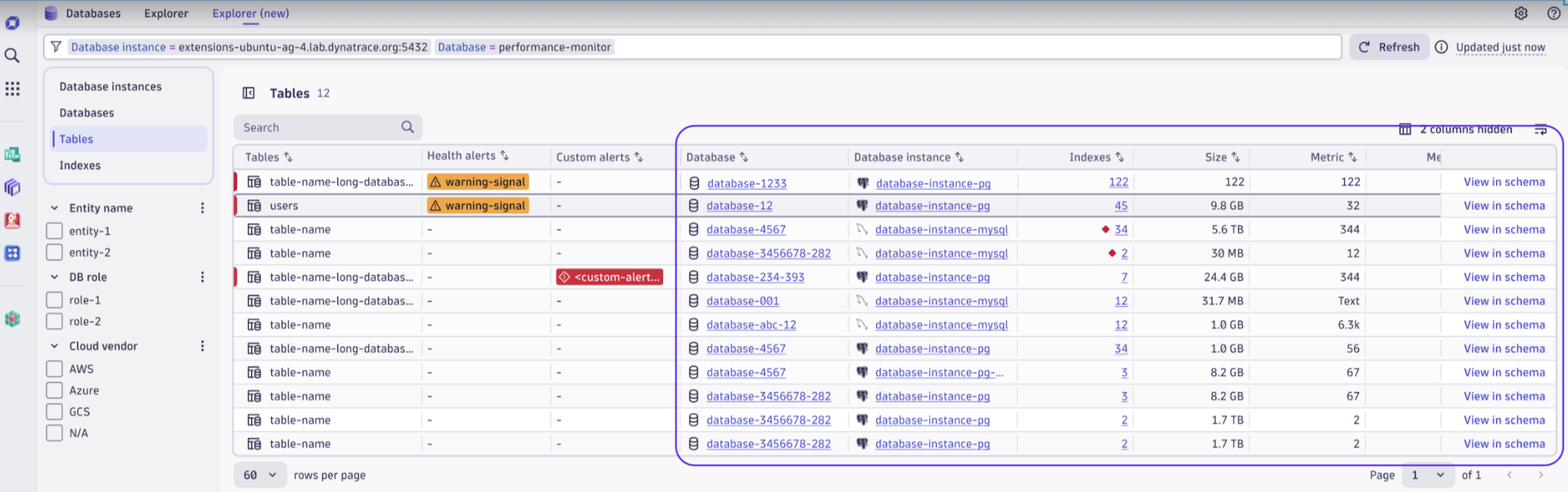
Table-first workflows also benefit from richer entity-detail tables, better filtering, and clearer structure, helping teams answer more questions without switching views. Navigation patterns, overlays, and error messaging are now more consistent across the platform, reducing mental overhead when time is tight.
Why these updates matter
Taken together, these updates eliminate inefficiencies in the work that teams do every day. Cloud operations teams, Kubernetes SREs, on-call engineers, and analytics authors get richer context, faster paths to answers, and simpler ways to share what they find. This is where Dynatrace earns its keep under pressure.
Explore the updates live in the Release Radar launchpad.

Looking for answers?
Start a new discussion or ask for help in our Q&A forum.
Go to forum