
We’ve just expanded our visualization catalog with six powerful new additions: four new world map visualizations, the much-requested gauge chart, and an even more advanced heatmap. Available in both Dashboards and Notebooks, these new visualizations unlock a new level of visual storytelling and data analysis across any vertical or use case. Just like all our visualizations, these new additions combine smart defaults, exceptional flexibility, and a consistent, familiar configuration experience, thus delivering immediate value while still giving you the power to tailor every detail to your needs.
Harness geographical insights from your data
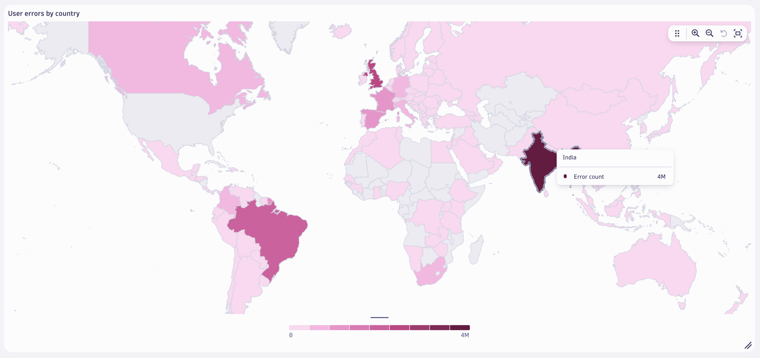
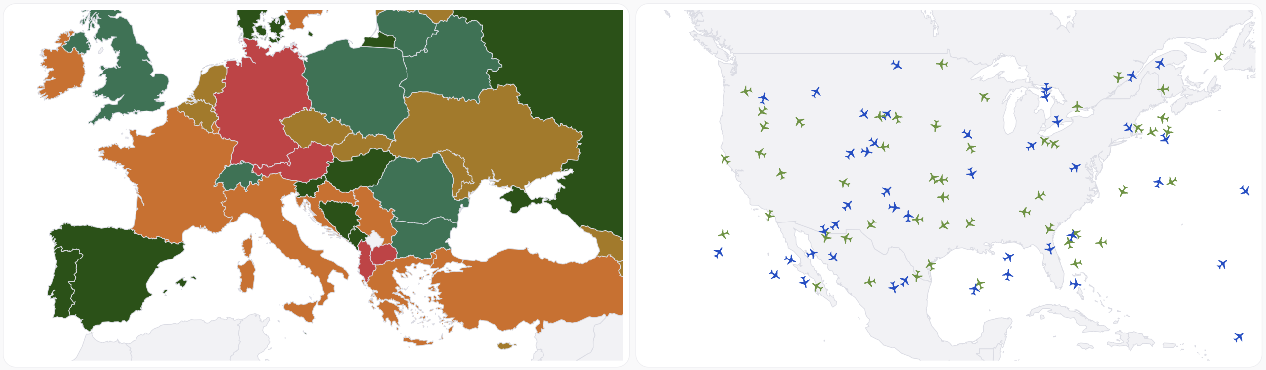
With the new world map data visualizations, you can easily bring datasets into a geographical context by leveraging geospatial attributes. From Apdex scores by country, sales by branch location, and user errors by region, to global traceroutes, delivery vehicle tracking, and LLM usage by location, we’ve got you covered. All world map visualizations are world-view aware, adapting to different geopolitical perspectives and regional boundaries, with no additional configuration required.
To support a wide range of geospatial use cases, we introduced four distinct map types, each focusing on specific “stories” that can be told:
- Dot distribution: Marks precise locations (for example, real users, store locations, delivery vehicles, cruise ships).
- Bubble: Visualizes volume or intensity at specific points (for example, traffic, error counts).
- Connection: Shows relationships or flows between locations (for example, service-to-service traffic, traceroutes).
- Choropleth: Highlights aggregated metrics by country or region (for example, showing total revenue by country to quickly spot which regions are driving the most sales).
How to use world-map data visualizations effectively
World maps are among the most powerful and unique visualizations for exploring data from a geographic perspective. They make spatial patterns and regional insights immediately clear. What might be difficult to spot in a table often becomes instantly visible in a sequentially colored choropleth map, helping you uncover trends tied to real-world locations.
For the best possible results:
- Choose the right map type for your data.
- Use a choropleth map for aggregated data by country or region.
- Use dot distribution or bubble maps for precise location-based data points.
- Use connection maps to visualize routes, flows, or relationships between locations.
- Tailor color schemes and granularity to your audience. For example, executive dashboards may benefit from simplified, high-level views, while operational dashboards might require more detailed, granular data.
- Leverage dashboard variables (for example, region, service group, or environment) to dynamically filter and update the map in real time, enabling more interactive and context-aware exploration.
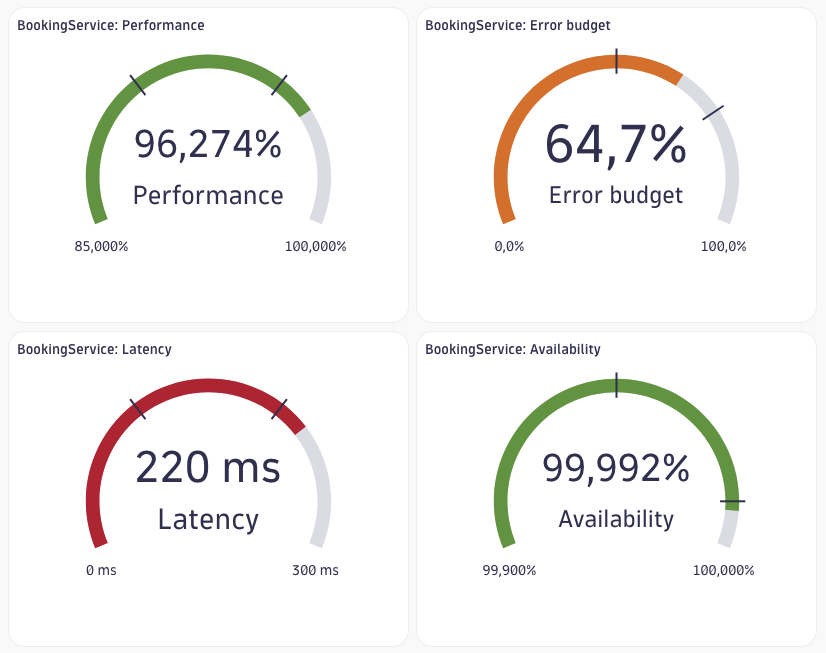
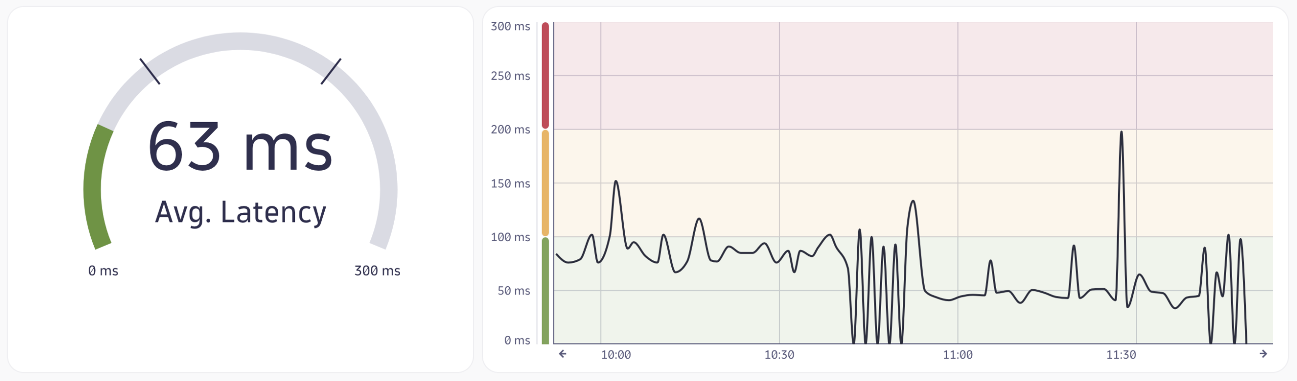
Track key thresholds with gauge visualizations
Gauge charts are a powerful way to visualize real-time metrics against thresholds, providing immediate visual feedback on whether you’re operating within acceptable limits. Gauge charts are perfect for tracking key performance indicators (KPIs) like response times, error rates, or throughput. They’re also well-suited for visualizing SLOs, making it easy to see how close you are to breaching targets, and for monitoring LLM performance, visualizing token usage, model load, or latency per prompt in AI Observability use cases. In business analytics, gauge charts can be used to represent conversion rates, revenue goals, or customer satisfaction scores.
How to use gauge charts effectively
Select a gauge chart when you need to display a single metric and compare its current value against one or more thresholds.
When configuring a gauge chart, don’t forget to:
- Define meaningful minimum and maximum values to ensure the gauge data visualization accurately reflects the expected range of the metric.
- Apply custom color coding to define threshold ranges, for example, use green for “healthy,” yellow for “warning,” and red for “critical” states. This enhances visual clarity and helps users quickly interpret a metric’s status.
- Pair gauge charts with time series visualizations to provide both real-time status and historical context, helping users understand not just the current state, but how it’s evolved over time.
Unlock hidden patterns with enhanced heatmaps
Traditionally, heatmaps were limited to showing how a metric changes over time. With our new enhanced heatmap, that constraint is gone. You can now combine any axis type, time series, numerical, or categorical, unlocking a much broader range of use cases and analytical depth.
This flexibility allows you to visualize complex relationships across dimensions, such as service vs. error code, user segment vs. response time, or model version vs. token usage. Whether you’re analyzing RUM data, Application Security alerts, or LLM performance, the enhanced heatmap data visualization helps uncover patterns and hotspots that were previously hidden.

How to use heatmap visualizations effectively
Use a heatmap to explore relationships across multiple dimensions, especially when those dimensions include a mix of value types.
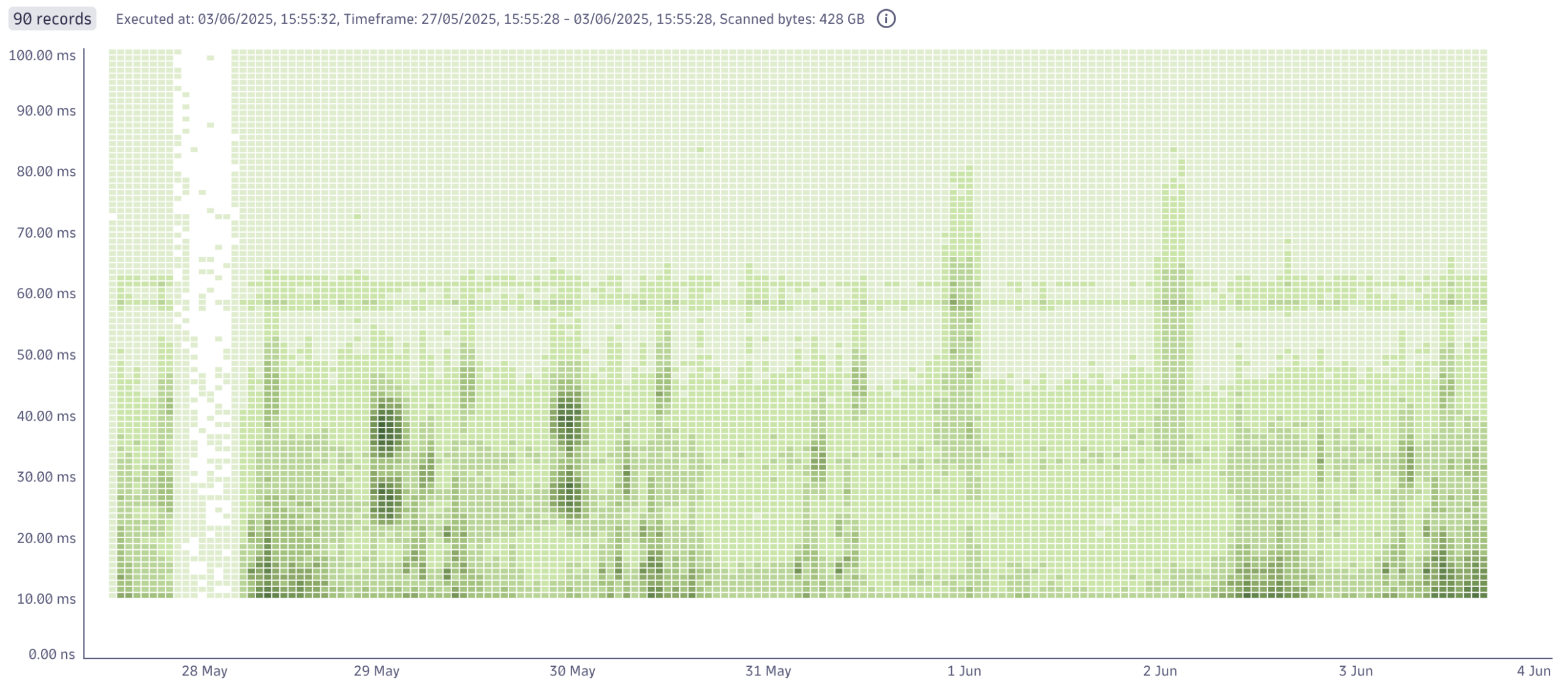
Heatmaps are ideal for uncovering patterns, correlations, and anomalies in complex datasets. They’re particularly useful for comparing metrics, enabling analysis that goes far beyond traditional time-based heatmaps. In the example below, the heatmap visualizes how request durations are distributed over time: darker areas reveal when and where high volumes of similar-duration requests occur, helping you spot performance trends and anomalies instantly.
- Choose meaningful dimensions: Combine time, numerical, and categorical axes in ways that reveal useful patterns, for example, service vs. error code, region vs. response time, or model version vs. token usage.
- Use consistent binning and grouping: Aggregate your data in a way that supports meaningful comparisons. For example, group timestamps into hourly or daily intervals, or bucket numerical values into ranges.
- Apply intuitive color palettes: Use color gradients that clearly communicate intensity or severity, such as diverging color palettes to highlight differences around a midpoint or sequential color palettes to represent gradual changes in intensity, ensuring the colors align with the data’s structure and purpose.
- Avoid overcrowding by using dashboard variables and filters: Heatmaps can become hard to interpret when too many values are shown at once. Use dashboard variables (for example, service, region, environment) and filters to dynamically narrow the scope, focusing on what’s relevant without overwhelming the user.
Try the new data visualizations
Explore the new visualizations directly in Dashboards or Notebooks.
- See applied LLM Observability use cases for these data visualizations in our latest blog post covering all new features in the Dashboards app.
- Use the Dynatrace Playground to test out visualizations without touching your production environment.
- If you’re interested in previous additions to our data visualization catalog, such as honeycomb or histogram, have a look at our previous blog post.


Looking for answers?
Start a new discussion or ask for help in our Q&A forum.
Go to forum