As enterprises aim to improve system availability, it’s crucial to understand service-level objectives. See how Dynatrace customers used SLOs to support business demands.
Every organization’s goal is to keep its systems available and resilient to support business demands. A service-level objective (SLO) is the new contract between business, DevOps, and site reliability engineers (SREs). However, many teams struggle with knowing which ones to use and how to incorporate them into the processes.
Below, Dynatrace customers shared their SLO management journey and discussed the resulting dashboards they rely on daily to manage their mission-critical business processes and applications.
What are SLOs?
A service-level objective is part of a framework for tracking service levels that also includes service-level agreements (SLAs), service-level indicators (SLIs), and error budgets.
SLAs are contracts signed between a vendor and customer that guarantee a certain measurable level of service. SLIs, meanwhile, measure the level of service the customer receives from the service provider. SLOs define the actual target and the timeframe to observe a certain SLI. Lastly, error budgets, as the difference between a current state and the target, represent the maximum amount of time a system can fail per the contractual agreement without repercussions.
A world of misunderstandings
Organizations have multiple stakeholders and almost always have different teams that set up monitoring, operate systems, and develop new functionality. A common theme among the enterprises that shared their experiences was a collective misunderstanding of SLO timeframes, how to measure them, and ownership when they are violated. They held many meetings to answer the following questions:
- We need to reach 99% reliability, but for what time period?
- My web requests are all HTTP 2XX success, so why are my users getting errors?
- The dashboards are green, so why are users complaining?
- The monitoring team set up the dashboard, so who owns violations?
Example 1: Four golden signals
Our first customer is from a multinational software corporation that develops enterprise software to manage business operations and customer relations. To ensure their global service levels, they fully embraced the best practices outlined in Google’s SRE handbook, called the “Four Golden Signals,” to standardize what they show on their SRE dashboards. The “Four Golden Signals” include the following:
- Latency. This refers to the time it takes to serve a request.
- Traffic. This represents the total number of requests across the network.
- Errors. This is the number of requests that fail.
- Saturation. This refers to the load on your network and servers.
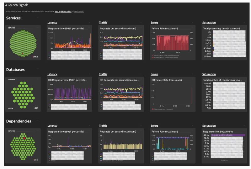
These four dimensions apply to any layer in the technical stack, such as front-end, databases, and external services. Additionally, they modeled it into multiple dashboards, as shown in Figure 1.

This dashboard has one column for each of the four signals. The top row reports the overall application health. The rows thereafter report the health of front-end, databases, and external services. The metrics behind the four signals vary by row. For example, saturation could be CPU time per request, queue size, used database connections, and API throttle limit utilization.
Additionally, the customer built other dashboards with the same four signals. For example, one dashboard is broken down by cloud hosting provider. In this case, the customer offers a managed service that runs on Amazon Web Services, Microsoft Azure, and Google. So, they have the same application and need to see service levels broken down by each provider and region.
Example 2: A look into the user journey
Another example is from one of the largest communication technology and services companies in Greece. This enterprise felt it best to get a solid business-oriented view first to prioritize the IT team’s efforts. There was a disconnect between the IT monitor showing all green on dashboards and the users who were complaining. Therefore, this enterprise worked with their business teams to outline key user journeys and the critical application functions that support them.
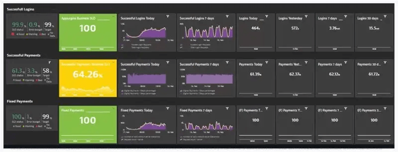
As shown in Figure 2 for their mobile application, the customer broke down each major step in the user journey to make purchases — login, on-demand payments, and scheduled payments.

In this view, the first column shows an aggregate metric and error budget for the service-level objective for success transactions. The second column is the same SLO, but it is shown as a time-series chart. The third and fourth columns are transaction volume trends for different time aggregations, such as today and the last seven days. The remaining columns are summary transaction statistics for various timeframes.
By modeling each of the key user journey perspectives, the team has the information it needs to improve early problem detection and customer user experience.
Lessons learned
Each of these customers is continuously learning when it comes to SLO management. Below is a summary of their key takeaways:
- Understand SLAs and internal business goals.
- Identify external stakeholders that will be affected by any SLA violation.
- Identify internal stakeholders and get alignment between teams.
- Choose the right SLIs.
- Identify key service-level objectives that support SLAs.
- Identify key services affecting the service-level objective.
Find out how Dynatrace can help you establish and improve your service-level management. Existing customers can reach out to the DynatraceOne team or their account manager. Newcomers can sign up for a fully functional Dynatrace trial account for free.


Looking for answers?
Start a new discussion or ask for help in our Q&A forum.
Go to forum