Network Monitoring
Ensure your applications are running on a robust, resilient, and healthy network infrastructure.

Monitor network communications across all deployments
Whether multi-cloud, hybrid, or on-premises, use the power of unified observability to ensure seamless visibility across applications, infrastructure, and network layers.
Observe applications down to the network
Get comprehensive, end-to-end visibility into your network infrastructure, ensuring seamless communication among all components with:
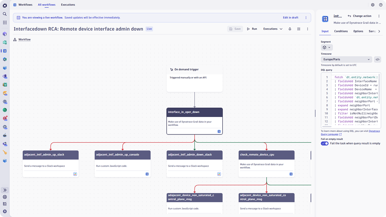
- AI-driven application performance degradation root cause analysis down to the network.
- Correlation of network data with application and infrastructure insights for faster root cause analysis.
- Unified monitoring of all components of modern networks: SD-WAN, Firewalls, routers, switches, load balancers, etc.
- Full visibility on the network path across on-premises devices, the internet, and clouds.
Leverage automation to streamline network observability
Ensure comprehensive coverage for even the largest and most complex environments by eliminating manual setup to allow rapid deployment and scalability.
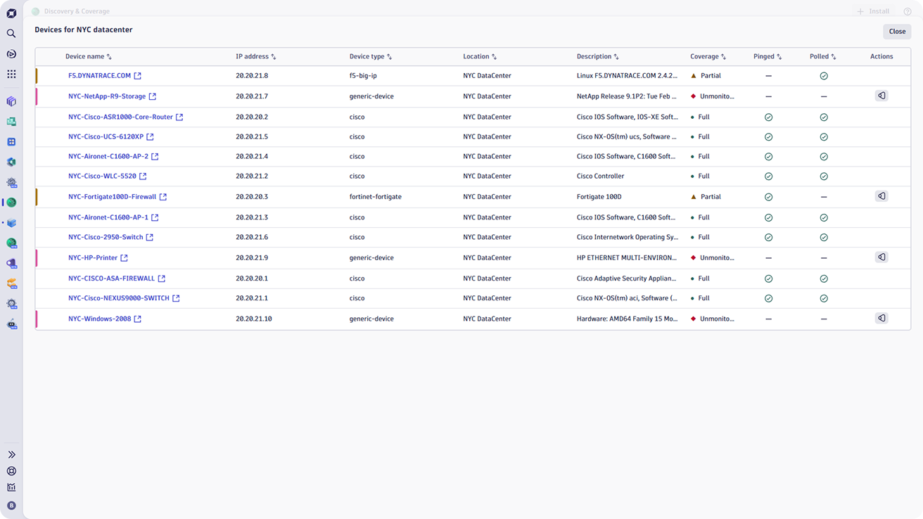
- Automatically discover and monitor thousands of network devices of all types to ensure no part of the network is left unobserved.
- Reduce setup time by rapidly scanning thousands of IP addresses to identify and categorize devices.
- Automate the configuration of network monitoring with tools like SNMP Auto Discovery, Ping, and Polling, enabling rapid detection and setup for thousands of devices without manual intervention.
- Automate network problem remediation by leveraging the Workflow app to gather all information pertinent to the situation at hand.
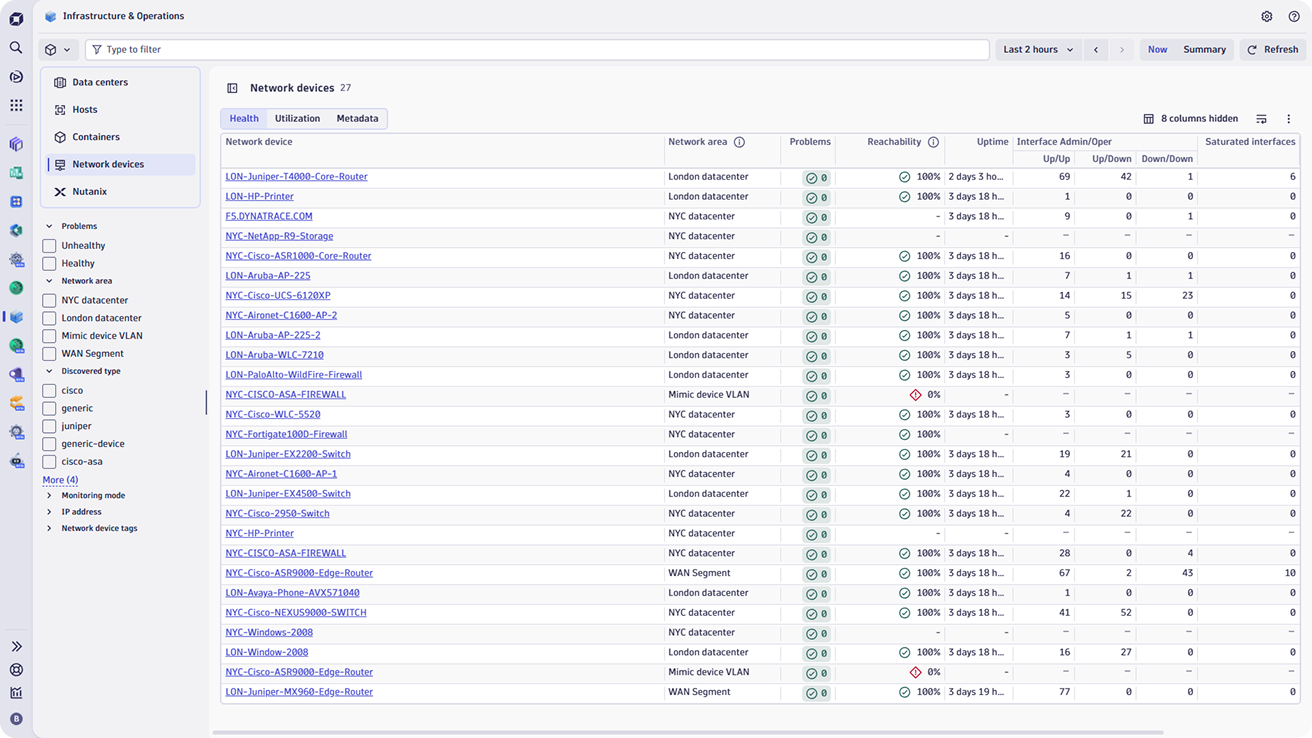
Proactively manage network health and performance
Ensure your network operates at peak performance by continuously monitoring the health and efficiency of all components.
- Proactively address issues before they impact users or business operations with real-time insights.
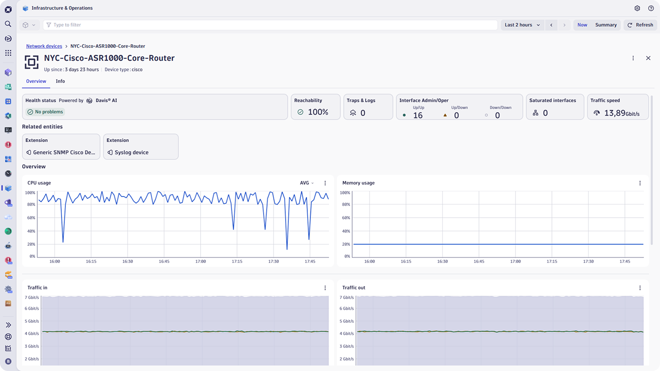
- Ensure optimal operation by continuously tracking the status and performance of routers, switches, load balancers, and other devices.
- Pinpoint root causes across your network and predict performance degradation with AI-driven insights.
- With capacity planning and optimization, track bandwidth usage, interface errors, and throughput trends over time.
- Enable data-driven decisions for scaling and optimizing network resources, preventing bottlenecks before they impact users or applications.
Enhance conformity and security with device autodiscovery
- Automatically identify all devices on the network, ensuring a complete and up-to-date inventory for compliance audits and management.
- Quickly identify unknown or rogue devices, helping to prevent unauthorized access and potential security breaches.
- Enables consistent observability level and configurations across all devices, reducing the risk of unmonitored networks.