
If you’re responsible for a mobile app, you probably have questions like “Is the performance particularly bad on a certain device, operating system, or geolocation?,” “Do certain problems only occur in a certain app version?,” or, more generically, “Is there anything impacting the performance or error rate of my app?”
With the latest release of Dynatrace, we’re rolling out multi-dimensional analysis (MDA) for mobile apps and custom applications. It’s the first step in a series of planned features within the larger domain of user-action analysis.
What is multi-dimensional analysis?
Multi-dimensional analysis allows you to leverage all the details that Dynatrace captures about your app and enables you to exploratively analyze your app’s performance and health. You can identify the reasons for errors, for example, whether they’re geographical or related to a specific OS version. The flexible means by which you can apply filters also makes it the perfect tool for focusing on a small segment of your data and analyzing outliers (for example, analyzing all user actions that were slower than five seconds).
We’re introducing the multi-dimensional analysis workflow in different areas of Dynatrace (see below).
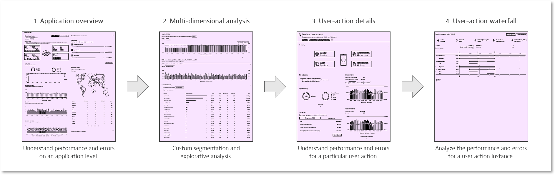
The chart above shows what the full workflow will look like once it’s complete. The user-action details page is currently under development; for now, MDA leads directly to the user-action waterfall. See the What’s next section below for our upcoming features.
A word on performance
In order to give your queries maximum flexibility, multi-dimensional analysis runs directly on code-level data storage, our most verbose storage. By analyzing representative sets of data, you get blazingly quick results of the highest quality. All fields that can be used for filtering are also indexed. This guarantees constant analysis time and also ensures that a large enough sample that matches the filters is processed for analysis. With this approach, we believe we’ve made multi-dimensional analysis the perfect tool for analyzing your mobile-app monitoring data and gaining new insights.
What are the changes?
Notice that the top user actions section of the application overview page has been changed. The new section shows the top three 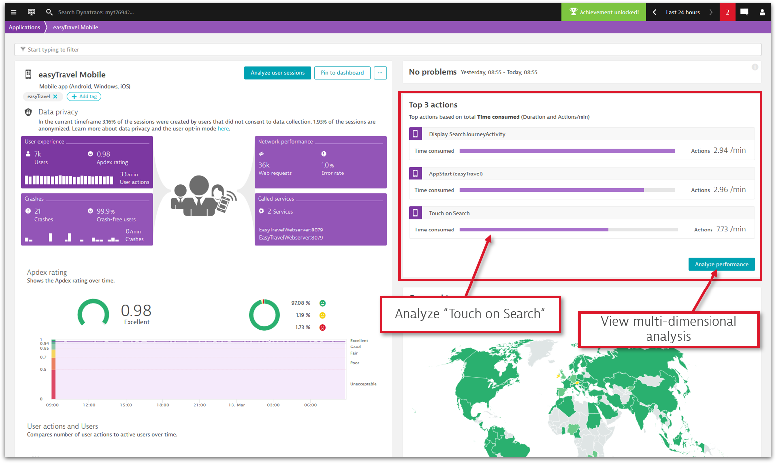
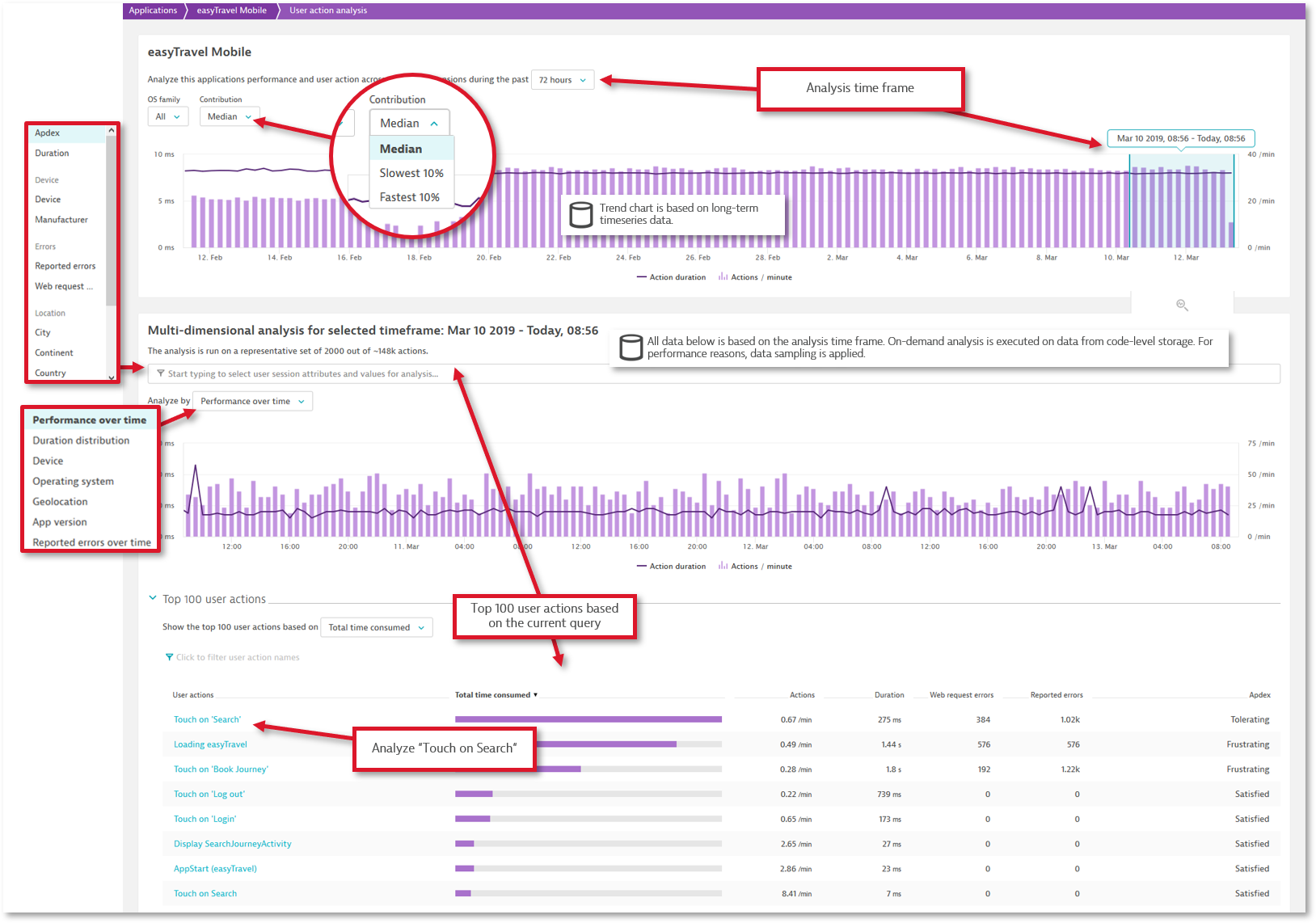
On the multi-dimensional analysis page, you’ll find two main sections. The top section allows you to do some basic filtering and shows all user actions over the time frame selected for the portal. You can further define an analysis time frame that is to be used for the actual multi-dimensional analysis. The analysis time frame is also visualized in the user-actions over time chart below.
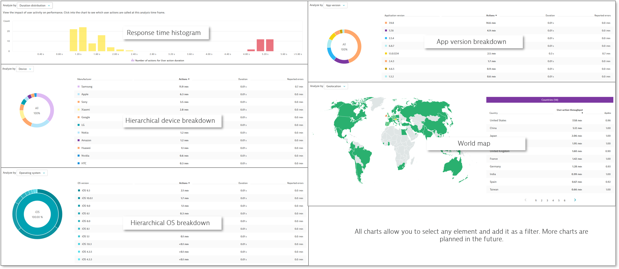
The lower section contains the actual search field where you can use all the different filters to slice and dice user actions. The results are rendered in a chart, which shows user actions over time by default, but you can change the analysis to view other metrics such as an action duration distribution histogram or OS breakdown. The charts also offer a nice way to refine the search—just click any element to add it as a filter in the search field.
At the bottom of the page, you can see a list of all the user actions that match the current filters. Clicking a user action takes you to the waterfall analysis view with all the specified filters. In the future, we will introduce a user-action details page between the MDA and the waterfall. See What’s next for more information.
What’s next?
Some features and improvements that we plan to introduce in the future include:
Additional charts and filters
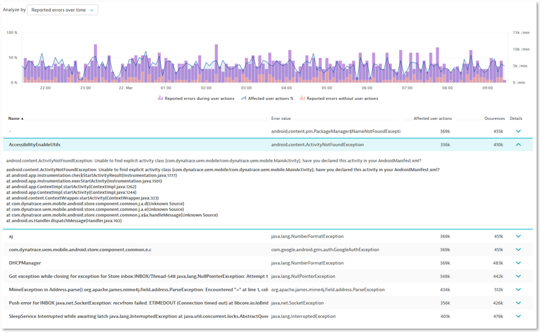
There will be additional charts like reported errors over time and web requests over time, as well as the capability to filter for certain errors or user actions.
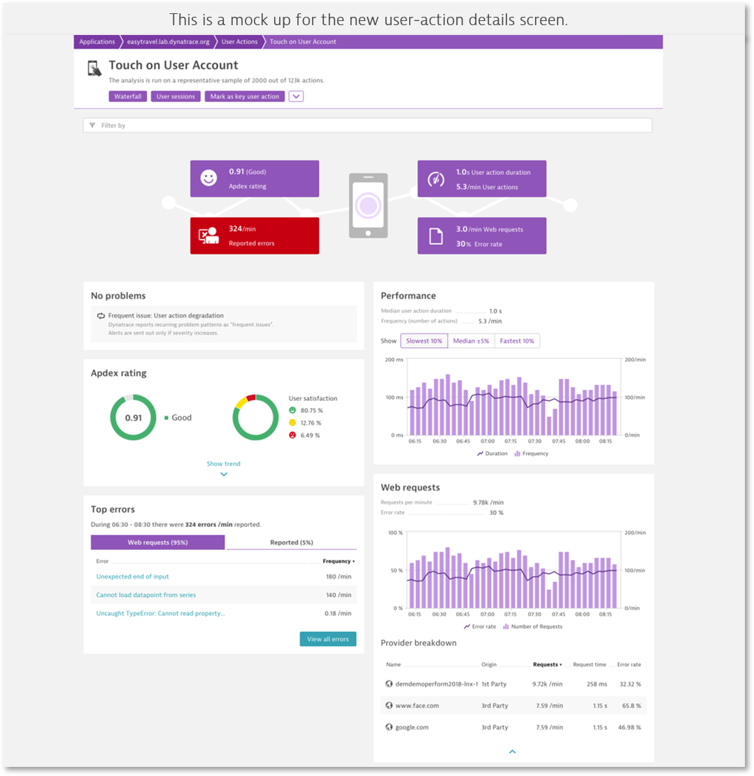
Action details
The next big step will be the user-action details page where you can mark an action as a key user action. This will give you timeseries data for charting, separate Apdex configurations, and also separate baselining settings for any given user action.
Action properties
We plan to introduce action properties based on the reportValue() API call and will allow the use of properties as filters for multi-dimensional analysis.
Subscribe to custom metrics
This feature will allow you to subscribe to new metrics that are based on the current filters on the multi-dimensional analysis page (for example, user actions in the US that have a frustrated Apdex value). By subscribing to a custom metric, you will be able to build a custom chart that shows the number of frustrated actions in the US. You can also export the timeseries via REST and more.
Additional multi-dimensional analysis workflows
We plan to apply the same multi-dimensional analysis workflow for other areas like web requests, crashes, and reported errors. This will unleash the full power of Dynatrace for mobile-app monitoring.
We hope that you like the new features and we look forward to reading your comments and success stories at Dynatrace Community!


Looking for answers?
Start a new discussion or ask for help in our Q&A forum.
Go to forum