
Dynatrace Blog
Drive your business forward in the digital age.

Dynatrace plans FedRAMP Class D (High): Why it matters for agency strategic planning
Dynatrace Release Radar 06.26

Seeing the core clearly: Dynatrace mainframe monitoring meets IBM z17
Dynatrace named a Leader in the 2026 Gartner® Magic Quadrant™ for Observability Platforms for the 16th consecutive time

Dynatrace Security Enrichment: Every threat intelligence source in one unified experience
Dynatrace plans FedRAMP Class D (High): Why it matters for agency strategic planning

Dynatrace Release Radar 06.26

Quit trying to keep up with every new AI tool and keep building
Smarter, safer Agentic AI: Dynatrace observability meets NVIDIA AI-Q

Your business applications are at risk: Introducing in-context security findings for Kubernetes
Multicloud HIPAA compliance for healthcare: Dynatrace now supports AWS, Azure, and GCP
Beyond LLM-as-a-judge: Establishing LLM evaluations as a foundation for trustworthy agentic AI systems

Log management for AI workloads: How to bring your logs and telemetry plan into the AI-first century

Building in the open: How Dynatrace invests in open source to move the industry forward

Getting started with cloud modernization

How AI workloads are changing what logs must deliver, forcing a new strategy
Dynatrace Release Radar 05.26
Moving from insight to action: How Dynatrace and AWS are reshaping cloud operations

What’s new in Dynatrace SaaS version 1.341

Orchestrate multicloud AI agents for autonomous incident resolution
Dynatrace observability is now a Kiro power

From reactive to proactive: How NAIC embedded AI‑powered observability directly into the IDE
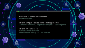
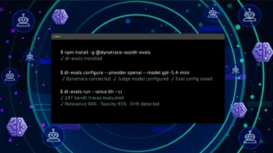
Evaluate LLM and agent quality in Dynatrace AI Observability with dt-evals

Beyond correlation to autonomous action: Why “good enough” observability fails in the age of agentic AI

Dynatrace Managed release notes version 1.340