
Dynatrace Blog
Drive your business forward in the digital age.


Dynatrace Intelligence at the core of autonomous operations
Autonomous operations hits an inflection point: New agentic AI report reveals what’s fueling scale (and blocking it)
Nutanix .NEXT 2026: Turning cloud complexity into clarity with AI-powered observability

Bring real-time production insights into Claude Code with the Dynatrace MCP Server

Improved browser monitor experience: Synthetic on the latest Dynatrace platform

How lookup tables turn observability data into business insight
Five real-world lessons for building developer workflows in the agentic era

What’s new in Dynatrace SaaS version 1.335
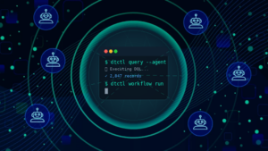
dtctl: The Dynatrace observability CLI that’s built for AI agents and humans

Dynatrace Managed release notes version 1.334

10 things I learned writing 49,000 words about vibe coding

Observe API responses to runtime behavior: Connect Postman’s Agent Mode with Dynatrace

Strengthen your security posture with the Common Configuration Scoring System for misconfigured production environments

Unlocking CI/CD success with observability

OneAgent release notes version 1.333
What’s new in Dynatrace SaaS version 1.334

Unlock business-centric compliance intelligence with Dynatrace Compliance Assistant

The runtime reckoning: How the agentic evolution is reshaping security

Dynatrace Release Radar 01.26

Fueling visual insights with MCP applications for complex data analysis

Stop treating all IT problems the same: Prioritize what matters most with business process entities now in Dynatrace Smartscape

Why exceptions matter: Elevating your distributed tracing investigations

Ingest, enrich, and deduplicate Qualys vulnerability findings with Dynatrace
What’s new in Dynatrace SaaS version 1.333

Deep troubleshooting and crash intelligence in the new Dynatrace RUM experience