
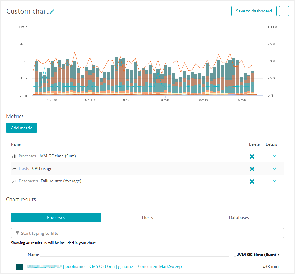
The latest Dynatrace release includes some powerful new dashboard charting features for our power users, along with many improvements in stability and performance. In addition to these performance tweaks under the hood, we’ve streamlined the workflow for creating charts and raised the limit on metrics per chart from 2 to 5. Per metric, you can now chart data of the top 15 entities and browse metric values of up to 100 entities in the table beneath the chart. See example below.
Metric splitting and result-filtering based on dimensions
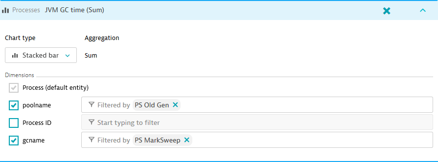
The most powerful new dashboarding feature that Dynatrace now offers is the ability to specifically define metric splitting for generic dimensions and to filter on those dimensions on the fly. With this approach, you can easily drill for the data you’re interested in—thereby making your charts more relevant.
What you get with this update
- Streamlined charting workflow
- More metrics per chart
- Configurable metric splitting
- Dimension-based filtering
What’s next
Be sure to check out our Community forum post that explains additional planned enhancements for custom dashboards. And be sure to look for a recording of our recent webinar on actionalble dDashboarding with Dynatrace on the Dynatrace YouTube channel.
Here are upcoming highlights that we plan to add to our charts in the near future:
- Improved metric picker
- Support visualization of discontinuous metrics
- Tooltip enhancements for analyzing peaks
- Improved coloring


Looking for answers?
Start a new discussion or ask for help in our Q&A forum.
Go to forum