
Dynatrace dashboards provide visibility into petabytes of observability data, but to make the best use of it, you need to know how to focus on what matters most. In part 3 of our power dashboarding series, we’ll show you how to apply various filtering options to zero in on the most relevant information.
Dynatrace dashboards offer several ways to filter data, each suited for different use cases. By the end of this tutorial, you’ll know how to:
- Apply instant ad-hoc filters directly on tiles
- Filter across multiple tiles using variables
- Leverage Segments for platform-wide filtering aligned with business context
We’ll walk through these different techniques using one of our ready-made dashboards to monitor Kubernetes resource usage. This dashboard has been developed for troubleshooting and performance analysis; you can find it on the Dynatrace Playground.
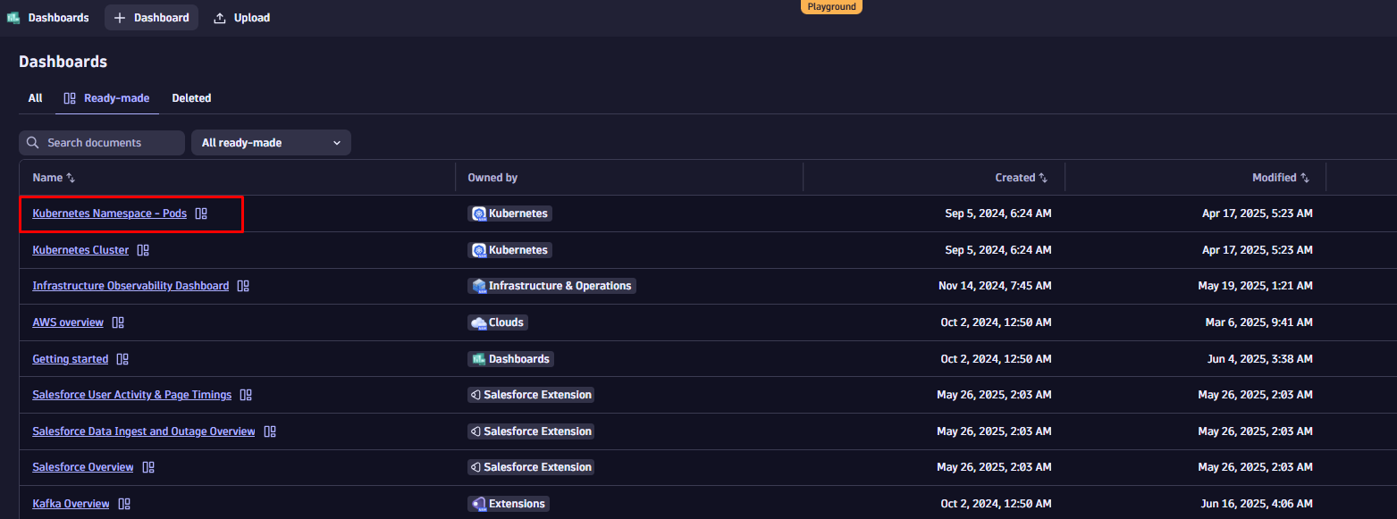
To follow along, start by duplicating the dashboard. Open the dashboard list, search for “Kubernetes Namespace – Pods”, and select “Duplicate” from the context menu next to the dashboard name.
Fast and focused: filter your data instantly in the tile configuration
First, let’s explore how to define individual filters for each tile.
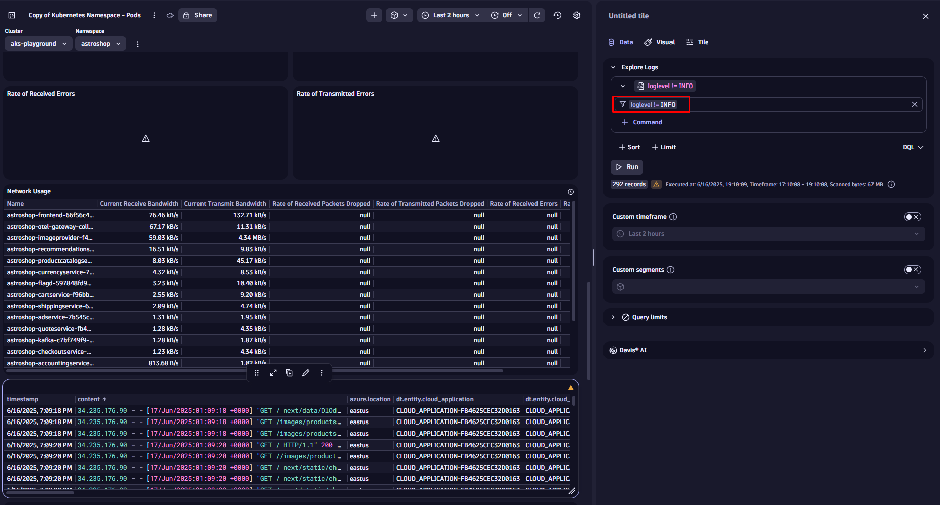
Imagine we want to enhance our Kubernetes dashboard by adding log data to provide deeper context, such as errors, warnings, or other significant events, alongside our performance metrics. This enhancement helps to correlate issues faster and improve troubleshooting efficiency.
We use the filter field in the tile configuration narrowing down the visible data, focusing only on error messages, by adding
loglevel = ERROR
Once you hit Run the new filter is applied. If you want to exclude unnecessary log levels instead, you could do so by changing the filter condition to:
loglevel != INFO
We could also filter our logs by specific services, message content, or log sources. Applying filters works the same on all other data tiles, like metrics or business events.
Query and filter your data with natural language or DQL
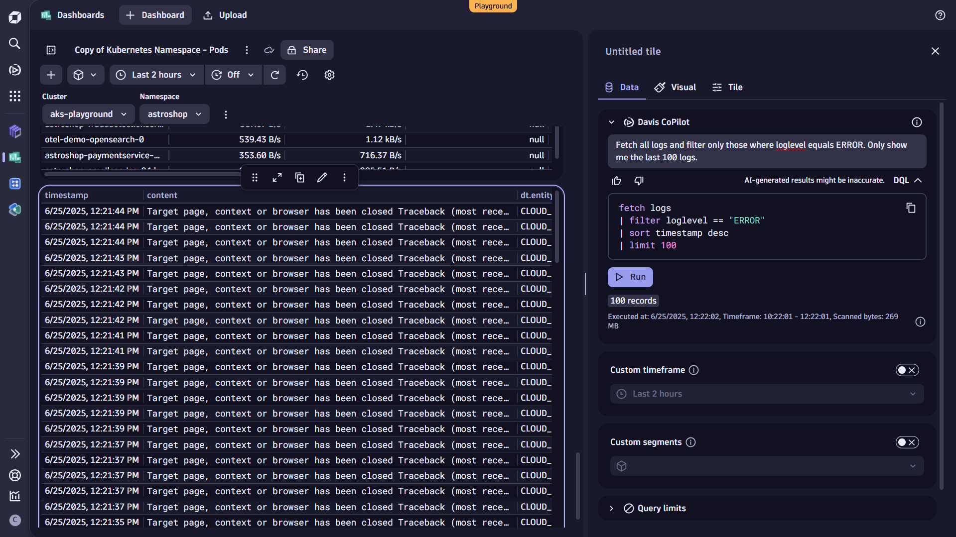
Alternatively, you can filter your data by adding the filter condition to the query itself. You can also use Davis CoPilot™ for that. Just add a CoPilot tile to Query with AI and include the desired filtering as part of your prompt:
Fetch all logs and filter only those where loglevel equals ERROR. Only show me the last 100 logs.
Davis CoPilot automatically translates your input into Dynatrace Query Language (DQL). To view the generated query and see how the filter command is applied, select DQL directly below the prompt field.
Do you want to go deeper? DQL offers very powerful filtering capabilities and flexible alternatives like the recently launched Search command, which is ideal if you’re unsure where or how specific information is stored in your data. For more, check out the topic How to use DQL queries in our documentation.
Dynamic filtering across multiple tiles using variables
So far, we’ve focused on adding static filters to specific tiles. Using variables, you can easily make your dashboards interactive, applying filters across multiple tiles in real time.
For example, if you’re comparing resource usage across several Kubernetes namespaces, doing it manually means editing each tile to change the namespace, every single time. That’s time-consuming and prone to mistakes. Variables solve this by letting you filter tiles from a single input.
Defining variables is simple and straightforward: the easiest way is to start with static variables, where you manually add a list of entries as free text. You can also use a CSV file as input for the list.
But you can also use dynamic variables, where the entries are based on data stored in Grail or fetched externally. The benefit of this approach is, that in case a value changes, the variable is always automatically updated.
Our example dashboard already provides some variables, like Cluster and Namespace. By clicking on the overflow menu on the top right, you can add view and edit existing variables or add new ones.
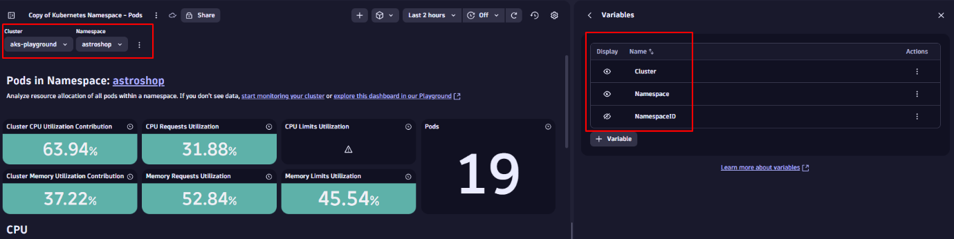
You can also use hidden variables, which are not visible as a drop-down but used behind the scenes to power specific tiles and keep the dashboard clean and focused.
Add variables to tiles
First, let’s enhance the filter statement of our log tile by adding a variable. This is similar to using a static value, but now we reference an existing variable using the $ symbol followed by its name. Let’s update the filter and add the cluster name and namespace.

Once saved, you can use the dropdowns at the top of your dashboard to filter the data in the log tile we have updated before. Variables are supported by all tiles. To learn more, visit the topic Add a variable to a dashboard in our documentation.
Use Segments to create filters aligned with the business context
Segments are used to logically structure data in Dynatrace. They are dynamic and multi-dimensional, offering a simple to way to slice data and persist the filtering across apps. They introduce a way to add (business) context of a specific users, based on real-world dimensions, such as org units, hyperscaler regions or infrastructure components.
In our example, we’ll use a Segment that is already defined on our tenant. You can select Segments by selecting the square icon at the top right corner of the dashboard.
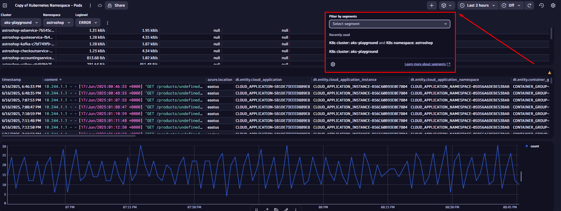
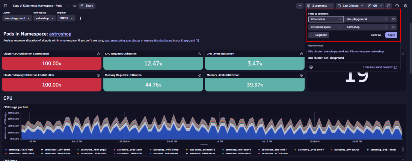
Let’s apply the “K8s cluster” and “K8s namespace” Segments. When you select the K8s cluster Segment (e.g., aks-playground), it uses a variable to dynamically list all available monitored Kubernetes clusters. It also includes predefined conditions to automatically pull in all related data for the selected cluster.
Keep in mind: every time you apply a Segment, it acts as a pre-filter across your data. While you won’t see it as a visible query condition, it’s applied as the first filter on your dashboard.
Segments are multidimensional, meaning you can layer them for more precise filtering. Stacking the K8s namespace Segment (for example, astroshop) further narrows the scope. Your dashboard tiles instantly reflect only the data relevant to that namespace, without requiring any manual updates on the tiles.
Since data is prefiltered based on the selected Segments, this approach improves performance and reduces the volume of data processed, which is especially useful at scale.
If you want to learn how to build your own Segments, please have a look at our Kubernetes segments tutorial.
See Dynatrace dashboards and variables in action
We have now learned different ways to slice and dice data within Dynatrace Dashboards. If you want to see a different example, check out this observability lab video by Andreas Grabner, where he walks you through practical use cases:


Looking for answers?
Start a new discussion or ask for help in our Q&A forum.
Go to forum