Business event analysis and examples
Once stored in Grail, you can query your business event data interactively and analyze it using DQL. DQL is the starting point for analysis, whether you use Notebooks, Dashboards, or the DQL Query API (latest Dynatrace). You can use query results interactively or pin them to a dashboard as charts, tiles, or tables.
Query and analyze your data
-
Select Notebooks
 or Dashboards
  .
. -
Build and run your query.
You can use your queries to create metrics and charts for dashboards. You can also run queries via API to use the data externally.
Metric examples in Notebooks
Using DQL, you can create metrics on an ongoing basis from any numeric data collected as business events. There are multiple options for charting results in Notebooks , with suggestions that are optimized to your metric data.
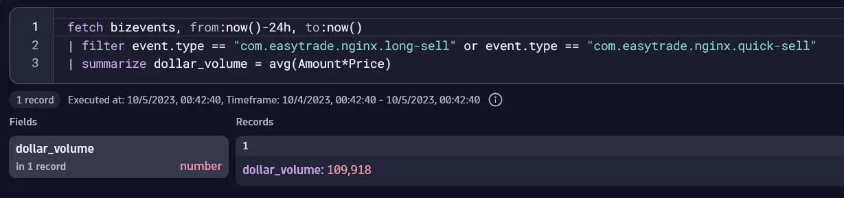
Average trading dollar volume: Single value
This example calculates the average total trading dollar volume generated by EasyTrade in the last 24 hours.
- Assets bought through EasyTrade are captured by the
com.easytrade.quick-buyandcom.easytrade.long-buyevent types. The total trading dollar volume is calculated as the number of assets bought multiplied by the asset price.
The metric below yields a single numerical value, displayed as a Record list in Notebooks.
fetch bizevents, from:now()-24h, to:now()| filter event.type == "com.easytrade.quick-buy" or event.type == "com.easytrade.long-buy"| summarize dollar_volume = avg(amount*price)
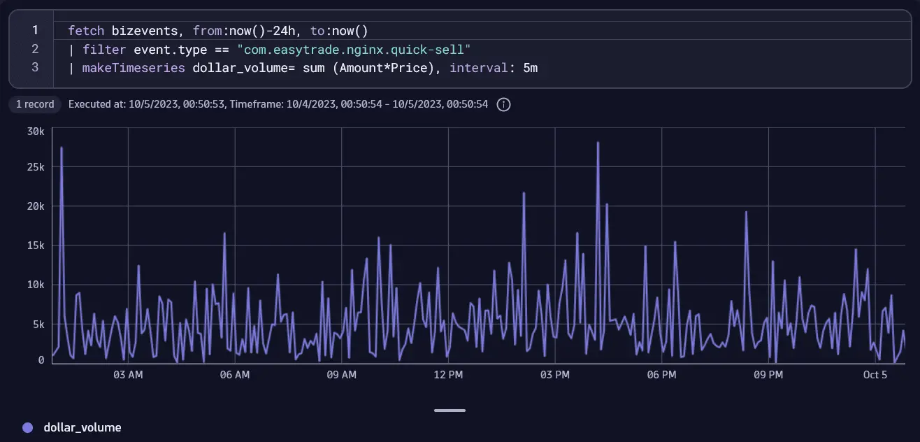
Total trading dollar volume in time intervals: Line chart
You can create interval-based metrics. This example queries the total trading dollar volume in the last 24 hours in intervals of five minutes. This example uses the DQL makeTimeseries command to build a time series from a measure (the sum of dollar volume), which you can then use to leverage the power of charting in Notebooks or Dashboards.
- Assets sold through EasyTrade are captured by the
com.easytrade.nginx.quick-sellevent type. Trading dollar volume is calculated as the number of assets sold multiplied by their price.
This query returns a value representing the dollar volume in intervals of five minutes.
fetch bizevents, from:now()-24h, to:now()| filter event.type == "com.easytrade.nginx.quick-sell"| makeTimeseries dollar_volume= sum (Amount*Price), interval: 5m
The image below shows a Line chart for query results in Notebooks.
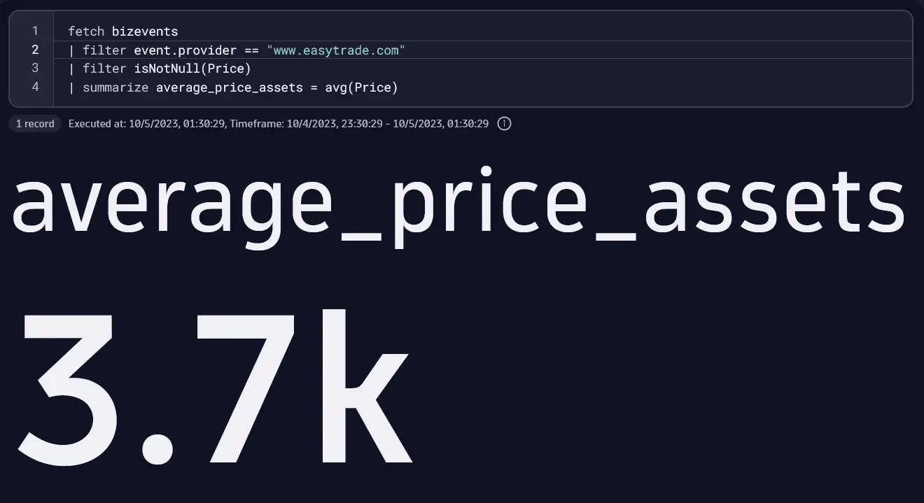
Average asset price
This example fetches the average asset price for both buy and sell orders through EasyTrade.
- Assets can be bought and sold through EasyTrade, captured, for example, by the
com.easytrade.quick-buyandcom.easytrade.nginx.quick-sellevent types. - Without filtering by
event.type, this query returns the average asset price for both buy and sell orders.
fetch bizevents| filter event.provider == "www.easytrade.com"| filter isNotNull(Price)| summarize average_price_assets = avg(Price)
This query is best displayed as a Single value (shown below) or a Record list.
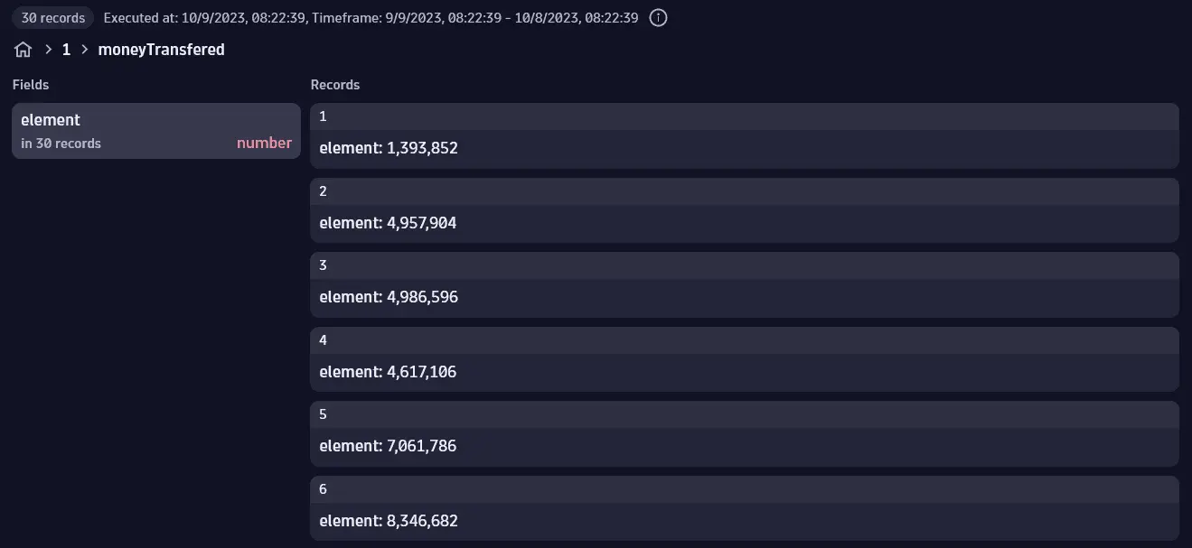
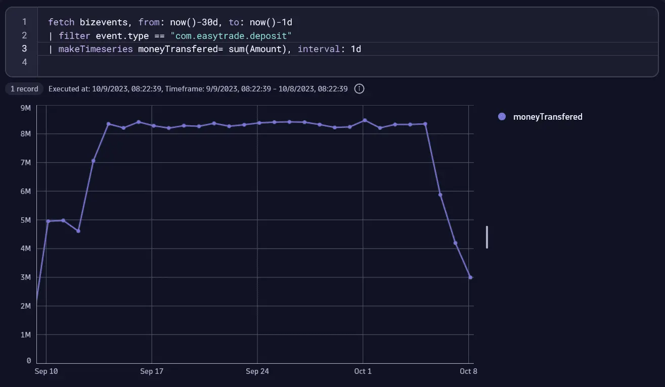
Daily deposit value in the last 30 days
Find out how much money was transferred to EasyTrade accounts per day, within the last 30 days.
- Money transferred to EasyTrade is captured by the
com.easytrade.depositevent type. - The query logic involves:
Summarizing the amount of each event to provide the total amount of money transferred to EasyTrade.
Splitting this amount into days.
fetch bizevents, from: now()-30d, to: now()-1d| filter event.type == "com.easytrade.deposit"| makeTimeseries moneyTransfered= sum(Amount), interval: 1d
The images below show the results as an expanded Record list and a Line chart.
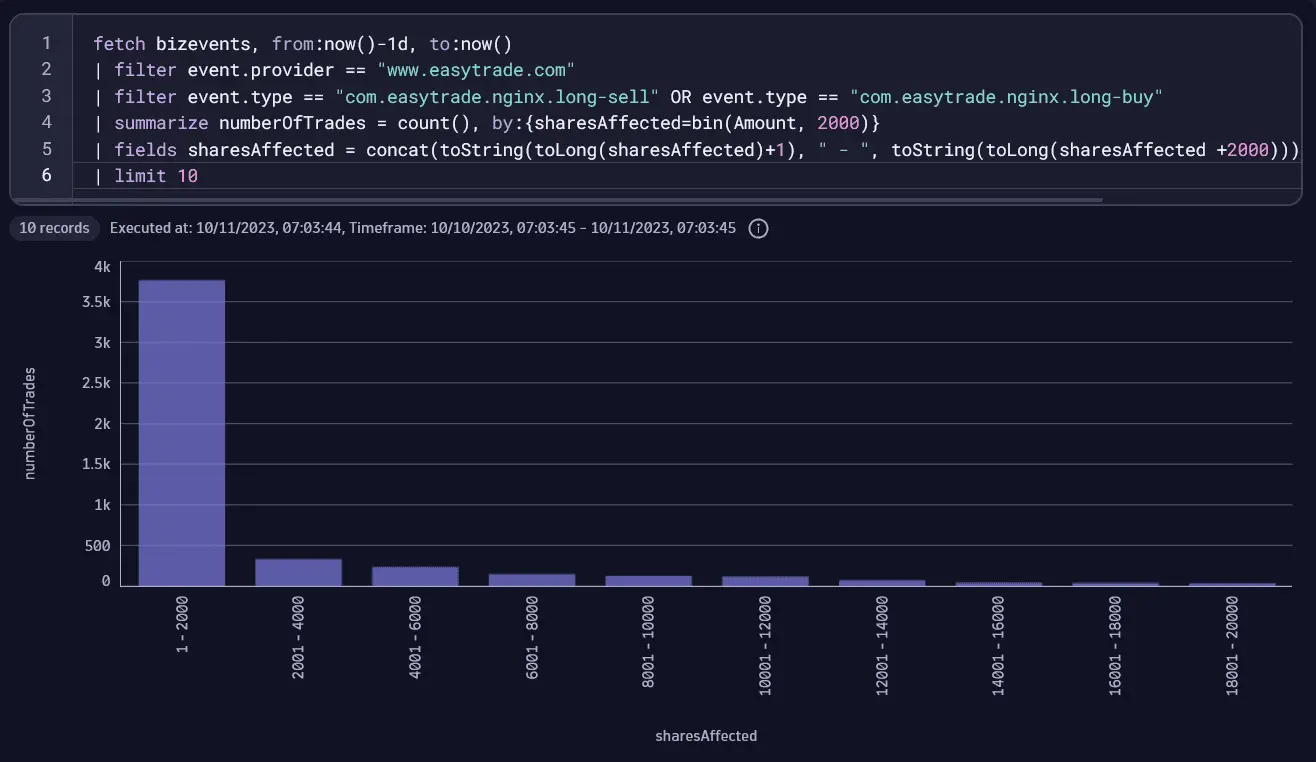
Distribution of trades by buckets of 2000 shares
This query shows how many shares were traded in EasyTrade over the last 24 hours.
This query shows the distribution of trades (or trade counts) by buckets of 2000 affected shares, so we can see how many trades affect 0–2000 shares, 2001–4000 shares, and so on.
- The Categorical chart is the best choice for displaying this data in columns showing the number of trades for each bucket.
fetch bizevents, from:now()-1d, to:now()| filter event.provider == "www.easytrade.com"| filter event.type == "com.easytrade.nginx.long-sell" OR event.type == "com.easytrade.nginx.long-buy"| summarize numberOfTrades = count(), by:{sharesAffected=bin(Amount, 2000)}| fields sharesAffected = concat(toString(toLong(sharesAffected)+1), " - ", toString(toLong(sharesAffected +2000))), numberOfTrades| limit 10
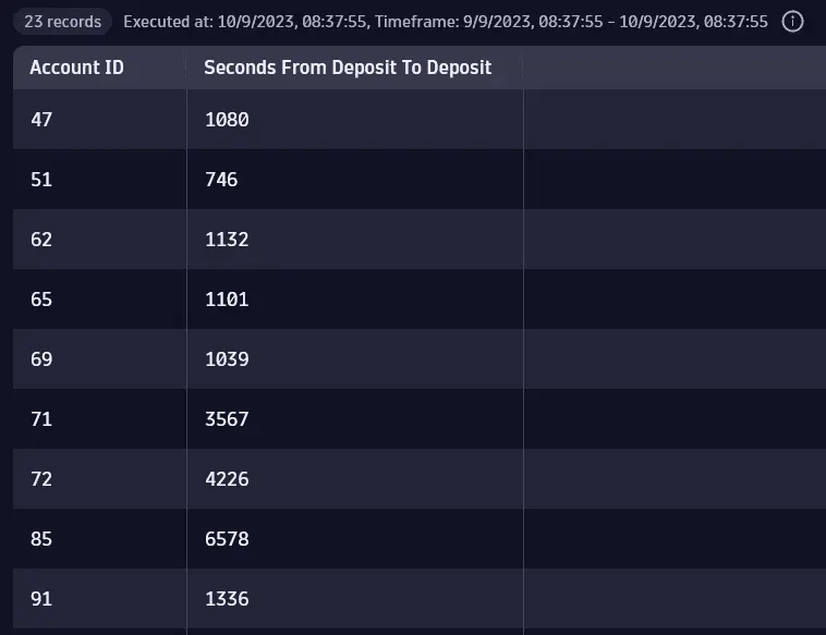
Time elapsed between events
You need to know how long it takes for a customer to trade, that is, for how much time a customer's money is in the platform before being transferred outside. To achieve this, you need to find out the time elapsed between related events, namely, the first deposit of money in EasyTrade and the first withdrawal of assets.
fetch bizevents, from:now()-30d, to:now()| filter event.provider == "www.easytrade.com"| sort timestamp, direction:"descending"| filter event.type == "com.easytrade.deposit" OR event.type == "com.easytrade.withdraw"| fieldsAdd deposit_ts = if(event.type == "com.easytrade.deposit", timestamp)| fieldsAdd withdraw_ts = if(event.type == "com.easytrade.withdraw", timestamp)| summarize {first_deposit_ts = takeFirst(deposit_ts), first_withdraw_ts = takeFirst(withdraw_ts)}, by:{`Account ID`}| fieldsAdd timeDepositToDeposit= (first_withdraw_ts - first_deposit_ts) /(1000000000.0)| filter timeDepositToDeposit > duration(0,unit:"ns")| fields `Account ID`, `Seconds From Deposit To Deposit`= timeDepositToDeposit
The image below shows query results displayed as a Table in Notebooks.
Query steps explained
-
Line 1
fetch bizevents, from:now()-30d, to:now()Fetches the business events table. In addition, the optional
from:parameter specifies the query start timestamp. -
Line 2
| filter event.provider == "www.easytrade.com"The
filtercommand provides the business event records based on the defined event provider. -
Line 3
| sort timestamp, direction:"descending"To get the most recent events first, you can sort the results by the most recent timestamp.
-
Line 4
| filter event.type == "com.easytrade.deposit" OR event.type == "com.easytrade.withdraw"A new filter combines two different types of events: the deposit of money in EasyTrade and the withdrawal of money from the trading platform.
-
Line 5
| fieldsAdd deposit_ts = if(event.type == "com.easytrade.deposit", timestamp)The
fieldsAddcommand creates a new field: a timestamp. This is the deposit timestamp. -
Line 6
| fieldsAdd withdraw_ts = if(event.type == "com.easytrade.withdraw", timestamp)The
fieldsAddcommand creates a new field: a timestamp. This is the withdrawal timestamp. -
Line 7
| summarize {first_deposit_ts = takeFirst(deposit_ts), first_withdraw_ts = takeFirst(withdraw_ts)}, by:{`Account ID`}The
summarizecommand groups by account:The first timestamp for a deposit event.
The first timestamp for a withdrawal event.
-
Line 8
| fieldsAdd timeDepositToDeposit= (first_withdraw_ts - first_deposit_ts) /(1000000000.0)Creates a new field to calculate the difference between two timestamps in order to calculate the time elapsed between the first deposit and first withdrawal actions per account (in seconds).
-
Line 9
| filter timeDepositToDeposit > duration(0,unit:"ns")This filter command removes all 0 and negative values, so any withdrawal of money that took place before the deposit of money is removed from the results.
-
Line 10
| fields `Account ID`, `Seconds From Deposit To Deposit`= timeDepositToDepositThe
fieldscommand restricts the output to the account ID and the time elapsed between the first deposit and the first withdrawal.
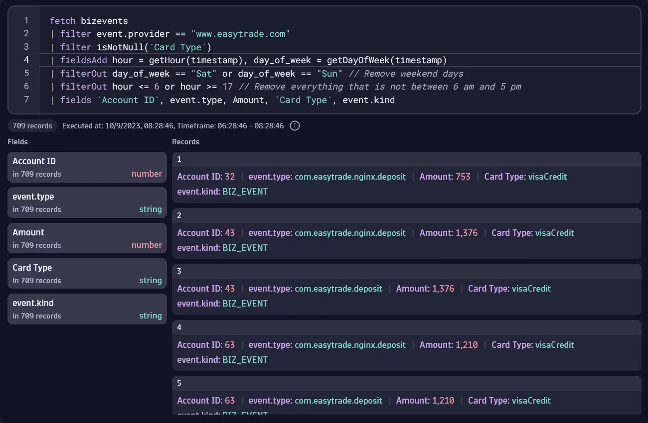
Business events during office hours
To get business events (credit card transactions in this example) occurring only during business hours, choose the business hours to monitor and then remove the non-working days (for example, Saturdays and Sundays) and non-working hours (for example, 5 PM to 6 AM). crediut card transactions
Be conscious of the time zone: if you're based in the UK and analyze events during office hours in a Singapore-based company, timestamps need to be adjusted.
fetch bizevents| filter event.provider == "www.easytrade.com"| filter isNotNull(`Card Type`)| fieldsAdd hour = getHour(timestamp), day_of_week = getDayOfWeek(timestamp)| filterOut day_of_week == "Sat" or day_of_week == "Sun" // Remove weekend days| filterOut hour <= 6 or hour >= 17 // Remove hours not between 6 AM and 5 PM| fields `Account ID`, event.type, Amount, `Card Type`, event.kind
The image below shows query results displayed as a Record list.
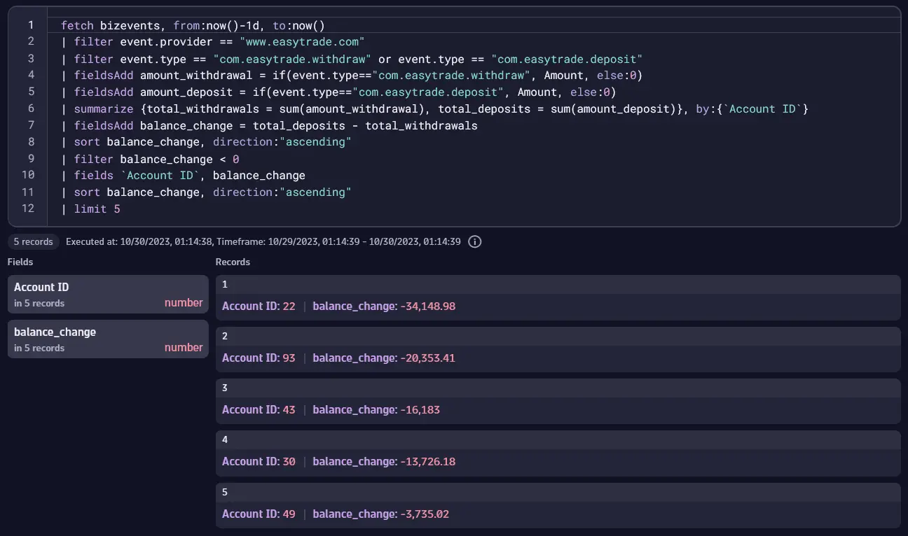
The top five accounts with the greatest decrease in account value
To find the top five accounts with the greatest decrease in the account value in the last 24 hours, this query compares total deposits to total withdrawals.
fetch bizevents, from:now()-1d, to:now()| filter event.provider == "www.easytrade.com"| filter event.type == "com.easytrade.withdraw" or event.type == "com.easytrade.deposit"| fieldsAdd amount_withdrawal = if(event.type=="com.easytrade.withdraw", Amount, else:0)| fieldsAdd amount_deposit = if(event.type=="com.easytrade.deposit", Amount, else:0)| summarize {total_withdrawals = sum(amount_withdrawal), total_deposits = sum(amount_deposit)}, by:{`Account ID`}| fieldsAdd balance_change = total_deposits - total_withdrawals| sort balance_change, direction:"ascending"| filter balance_change < 0| fields `Account ID`, balance_change| sort balance_change, direction:"ascending"| limit 5
The image below shows query results displayed as a Record list.
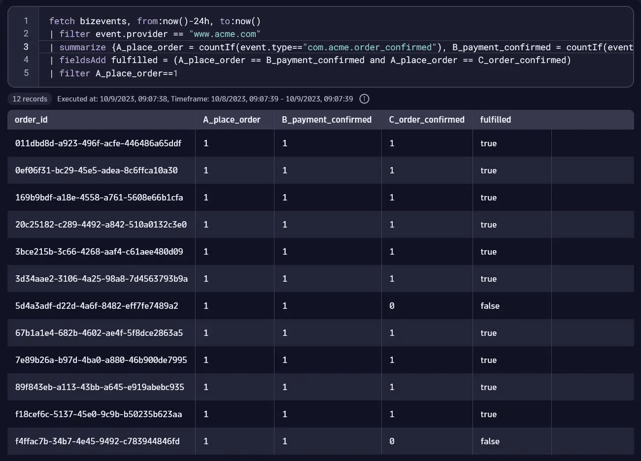
Missing transactions
A retail company commits to same-day shipping, accepting orders from 8:00 AM to 5:00 PM. They track orders placed, payments confirmed, and orders closed. Shipping is complete by 9:00 PM. each day, at which point the number of events recorded for each event type should be the same; any discrepancies are flagged as an anomaly to be investigated. They run this query at 9:00 PM each day.
- Important event types for this query are
com.acme.order_confirmed,com.acme.payment_confirmed, andcom.acme.close_order. The query generates a series of counts from the three event types.
- The query creates a new field with a condition that should normally be
fulfilled. Specifically, the condition is fulfilled when the counts for all three event types are identical.
`fetch bizevents, from:now()-24h, to:now()| filter event.provider == "www.acme.com"| summarize {A_place_order = countIf(event.type=="com.acme.order_confirmed"), B_payment_confirmed = countIf(event.type=="com.acme.payment_confirmed"), C_order_confirmed = countIf(event.type=="com.acme.close_order")},by:{order_id}| fieldsAdd fulfilled = (A_place_order == B_payment_confirmed and A_place_order == C_order_confirmed)| filter A_place_order==1
Results displayed as a Table show which order IDs are not fulfilled (false) on the dame day.
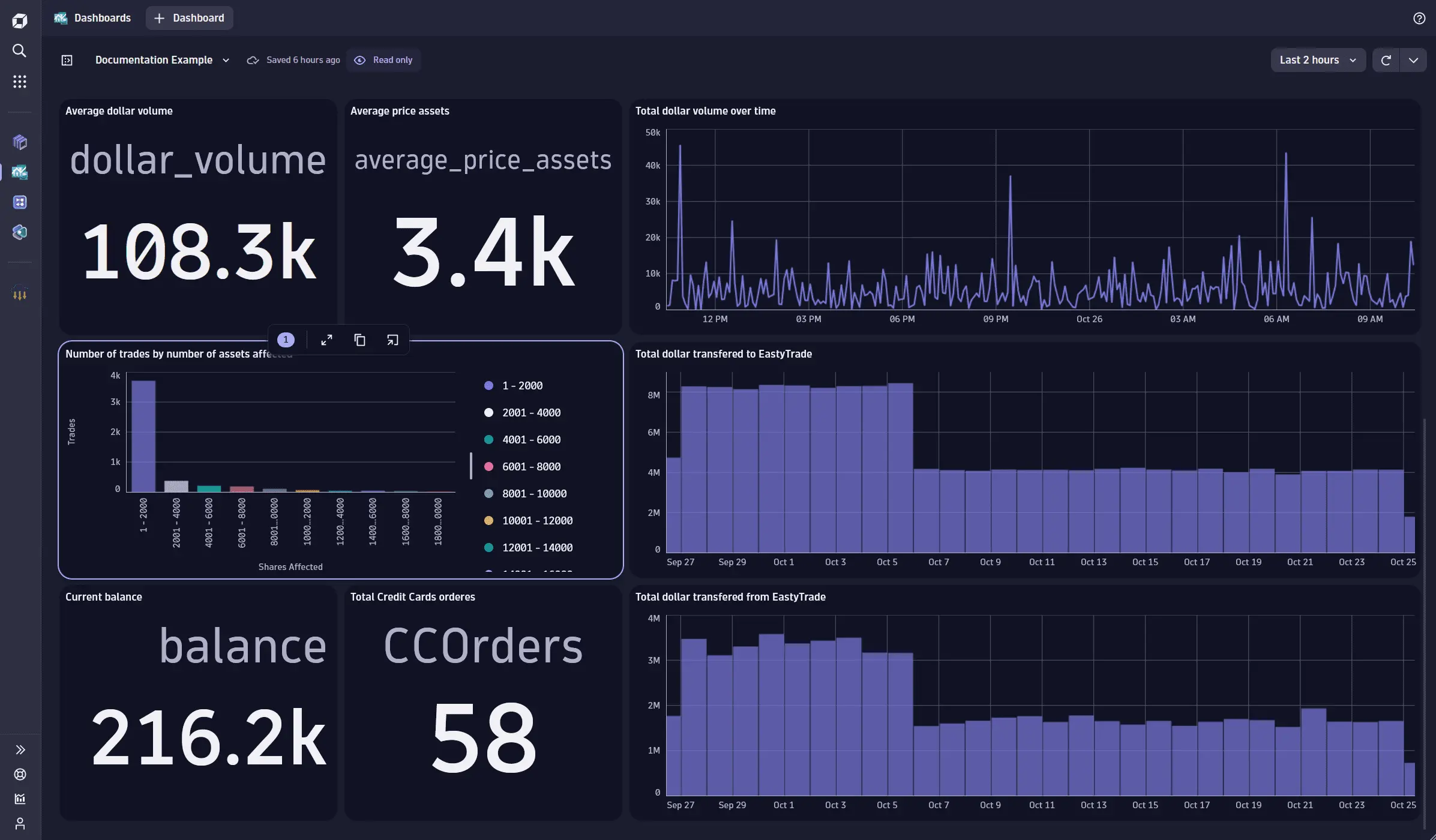
Dashboards
You can also use Dashboards to easily implement all the metric examples in Notebooks described above. The image below shows a dashboard containing tiles for some of the DQL queries explained above and some other queries that are simple modifications or variations of the examples above.
Select any tile and then select Open with  to reuse content from Dashboards in another app, such as Notebooks.