Area chart visualization
Latest Dynatrace
Use an area chart visualization:
When you want to show how different categories contribute to an overall trend over time, emphasizing the magnitude of change in each category.
When you need to compare the contributions between these different categories over time, it helps visualize the proportion of each category at a certain point in time.
When you need to show cumulative data such as the number of sessions, or revenue, over time. Area charts can be effective in showing the sum/growth of values.
Example
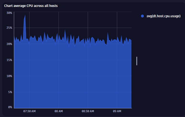
The chart above is based on the following query.
timeseries avg(dt.host.cpu.usage)
- The visualization type is set to Area chart.
Other options are set to defaults.
Title
Use this field to add a title. The edit box is displayed at the top of the options panel.
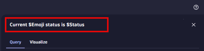
You can use emojis such as 😃 and 🌍 and ❤️.
You can use variables.
Example:
- Define variables called
StatusandEmojiin your dashboard. - Set Title to
Current $Emoji status is $Status. - Set
StatustoGood. - Set
Emojito🌍.
The title will be displayed as Current 🌍 status is Good.
Visualization
If you aren't sure that you chose the right visualization, use the visualization selector to try different visualizations.
Data mapping
The data mapping section shows how a column of your result is mapped to the visualization.
For example, when working with DQL and a timeseries, in the result we have a column with a value array for each series (one row with that one cell of values). For a timeseries, this mapping is done fully automatically, but the data mapping shows you which underlying column is mapped.
Area chart options
To learn about options quickly and decide what works best for you, turn options on and off and see the effect immediately on your chart. For example, does it look best with a label or without? Turn that option on and off and see for yourself.
Color palettes
You can select a color palette from the list under Color palettes.
For a line chart, area chart, or bar chart, you can optionally override the selected color palette for any series as needed.
Legend position
Select where to display the visualization legend:
- Automatic—Dynatrace chooses an appropriate location
- Hidden—no legend is displayed
- Bottom—the legend is displayed along the bottom of the visualization
- Right—the legend is displayed on the right side of the visualization
Legend fields
Select which elements to display in the legend.
Null values
Connect null values—specifies whether to connect null values in the visualization.
Time axis
Selects the X-axis.
Left axis
Sets the scale of the left axis:
- Logarithmic
- Linear
Min
The minimum of the visualization range.
- Auto—Dynatraced automatically selects a suitable minimum based on data (0 or min-value).
- Min-value—The minimum is set to the minimum data value.
- Custom—Displays an edit box for you to enter a custom minimum value.
Max
The maximum of the visualization range.
- Auto—Dynatraced automatically selects a suitable maximum based on data (0 or max-value).
- Max-value—The maximum is set to the maximum data value.
- Custom—Displays an edit box for you to enter a custom maximum value.
Label
Vertical text to display as a label for the Y-axis.
Series overrides
For a line chart, area chart, or bar chart, you can optionally override the selected color palette for any series as needed.
The Series overrides section lists all configured overrides.
To add or change an override for a series
-
Edit the visualization tile.
-
Select the series for which you want to override the palette color. There are two ways to select a series:
- On the graph, select the series and then select Edit series from the pop-up window
- Select Add override in the Series overrides section in the lower-right corner of the page and then select the series from the list.
-
Change the Color setting to the color you want to display for the selected series.
-
Select Update to save your changes to the dashboard.
Thresholds
Configure thresholds
To configure thresholds in a dashboard or notebook visualization
-
Select
 to edit the visualization tile.
 -
Select Thresholds.
- In Dashboards, select the Visualize tab in the side panel, and then select Thresholds.
- In Notebooks, select Thresholds in the side panel.
-
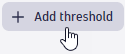
Select
 Add threshold.
 -
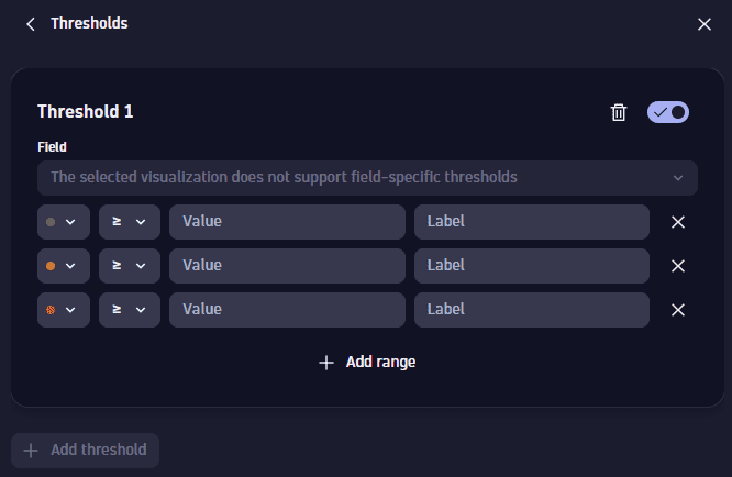
Define the thresholds. For each range:
Select a color to display for that range
Select the operator to define the threshold for that range
Enter a static value to compare (using the selected operator) with the returned value
- Enter a label to associate with the defined range.
Labels apply only to charts with a Y axis, such as timeseries charts and the categorical bar chart.
Labels can't be defined for tables and the single value chart.
This example uses a bar chart, but the options apply to other visualizations.
-
In Dashboards, create a dashboard.
-
Select
and, in the Snippets section of the menu, select Metrics > Chart top 10 hosts by CPU usage. -
In the section edit panel, select the Visualize tab and select Bar chart. (To simplify the examples, we hid the chart legend (see Legend in Bar chart options), but that makes no difference to thresholds.)
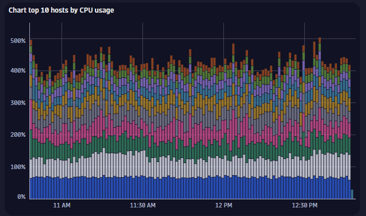
-
Select Thresholds.
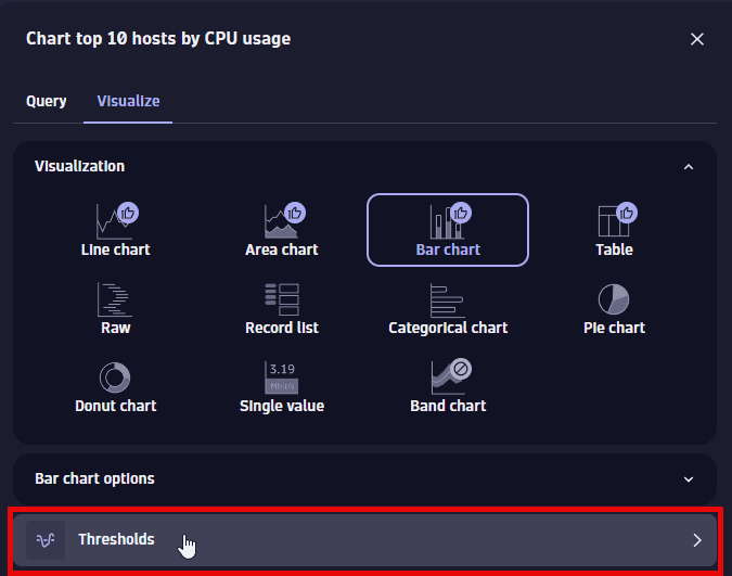
-
Select
Add threshold.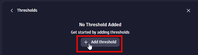
An empty set of threshold fields is displayed.
-
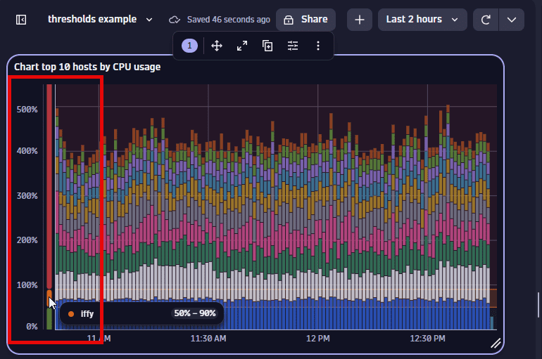
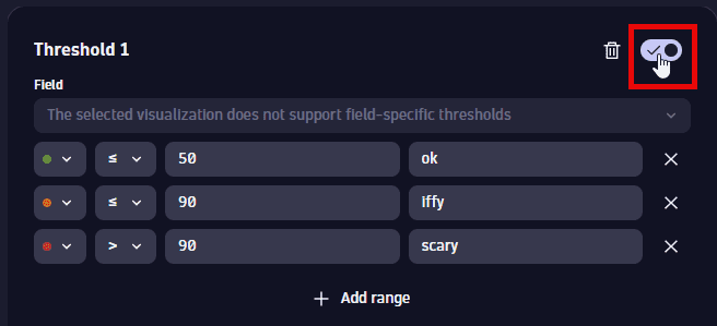
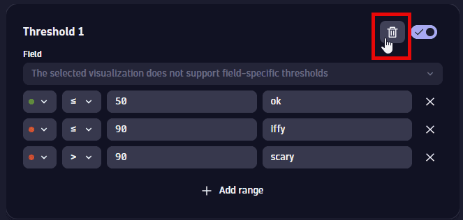
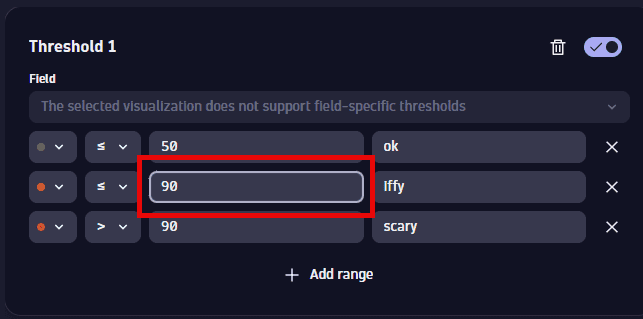
Define the thresholds for the displayed metric. You can observe your changes in the Y axis of the chart.
In this example, we define three ranges of CPU usage with corresponding colors and labels.
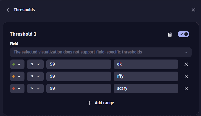
You can see the ranges displayed on the Y-axis and in the tooltip.
To reset to defaults (discard threshold settings), select the trash can  next to the item.
Edit thresholds
-
Select
to edit the visualization tile. -
Select Thresholds.
- In Dashboards, select the Visualize tab in the side panel, and then select Thresholds.
- In Notebooks, select Thresholds in the side panel.
-
From this point, you can do the following (expand rows for details):
To add thresholds (if the selected visualization supports additional thresholds), select Add threshold.
To turn off (hide) existing thresholds, use the switch. No settings are lost. You can turn them back on if you change your mind.
To delete existing thresholds, select the trash can
.
To change existing threshold settings, just edit the fields.
To add a range to existing thresholds, select Add range.
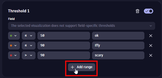
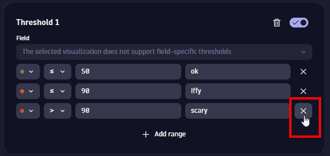
To delete a range from existing thresholds, select the delete button in that row.
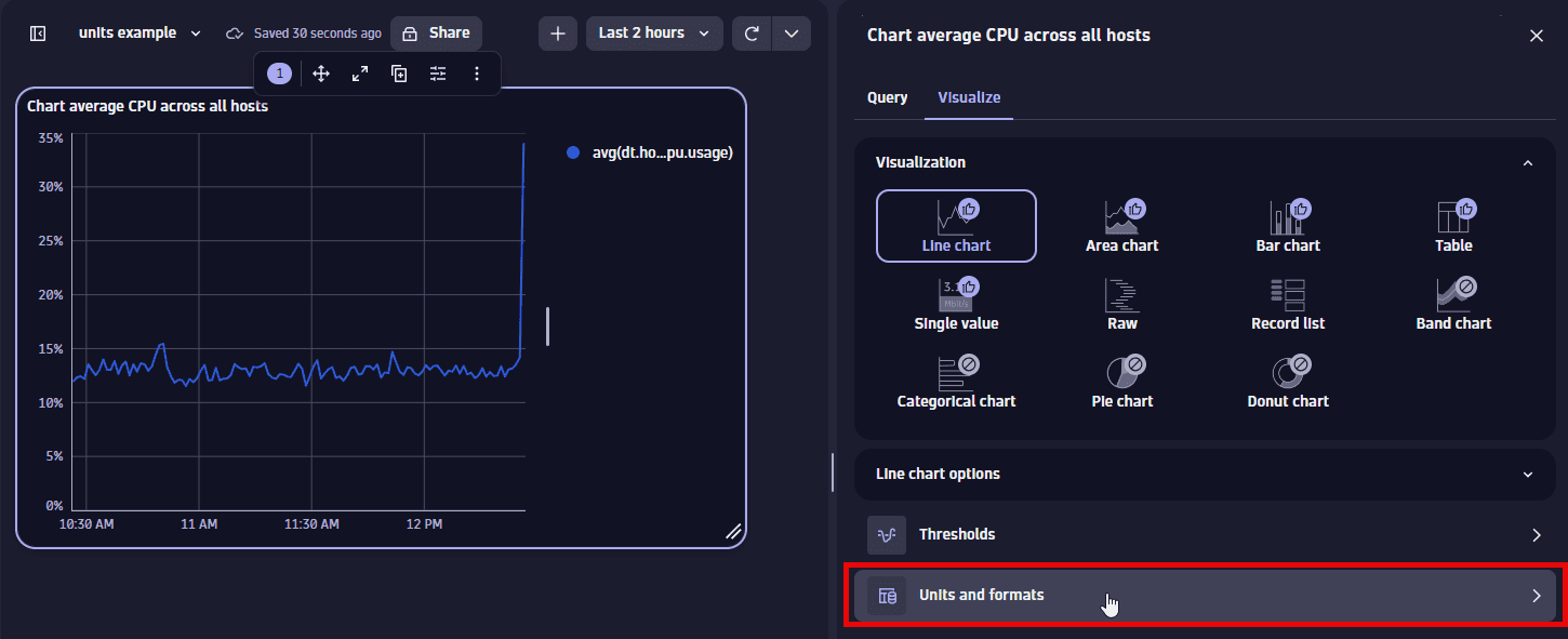
Units and formats
To override the default units and formats in a dashboard or notebook visualization
-
Select
to edit the visualization tile. -
Select the Visualize tab.
-
Select Units and formats.
-
Select Override.
-
Select
Override -
In the dropdown list, select the item for which you want to add a unit override.
This is a numeric column of the underlying DQL result, so it varies according to the query. For example:
- A
fetch eventsquery returns events. The dropdown list here lets you select a numeric field (such astransfer_size) from the results. - A
timeseries avg(dt.host.cpu.usage)query returns a single timeseries foravg(dt.host.cpu.usage). That timeseries is then the only selectable option in the list.
- A
-
Define the override.
- Default unit: The base unit in which the values were captured. It's
Noneif it was not included in the DQL result, or its automatically defined by the unit passed from the DQL result. This field doesn't lead to any conversion. - Displayed unit: Once you define a default unit, you can use Displayed unit for conversion. For example, if the DQL result defined your numeric value in the result as
Bytes, Displayed unit now offers a suitable list of byte conversions such asKilobyteandMegabyte. Unlike the Default unit, the Displayed unit is always a numeric conversion. - Decimals displays the default number of decimals (degree of precision) to display. To see it in action, change the Decimals selection and observe the change in the visualization.
- Suffix displays the suffix to display after the unit. To see it in action, enter a string and observe the change in the visualization. When you don't find the unit you're looking for, you can use Suffix to display the desired unit.
- Default unit: The base unit in which the values were captured. It's
-
Turn on Abbreviate large numbers if you want to display large figures in abbreviated form. For example,
1053becomes1.1K.
To reset to defaults (discard override settings for the selected item), select the trash can next to the item.
This example uses a line chart, but the options apply to other visualizations.
-
In Dashboards, create a dashboard.
-
Select
and, in the Snippets section of the menu, select Metrics > Chart average CPU across all hosts. -
In the section edit panel, select the Visualize tab and select Line chart.
-
Select Units and formats.
-
Select
Override.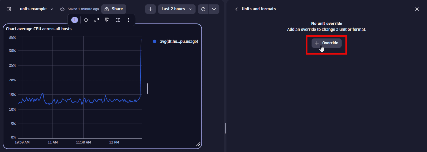
-
In the dropdown list, select the metric for which you want to add an override. There's only one metric to select in this example.
-
Define the override for the displayed metric. You can observe your changes in the Y-axis of the chart.
-
Default unit displays
Percent (%), which is the default unit for the selected metric. Try a different setting, such asOneto instead display the result as a fraction of 1. -
Displayed unit displays
Auto. You can change it to a different unit, such asOneto instead display the result as a fraction of 1.Only linear and static conversions are supported. For example, you cannot convert
Degree Celsius(°C)intoDegree Fahrenheit(°F), or convertUsd(US$)intoEur(€). -
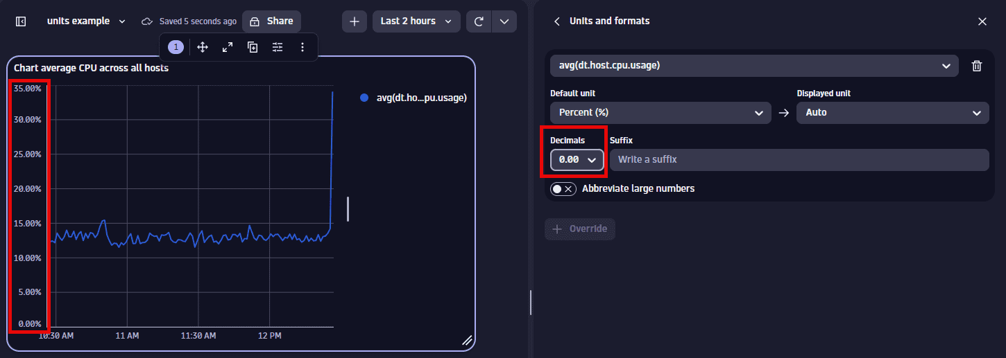
Decimals displays the default number of decimal points (degree of precision) to display. To see it in action, change the Decimals selection and observe the change in the visualization.
For example, change this:
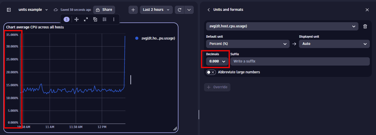
To this:
-
Suffix displays the optional suffix to display after the unit. To see it in action, enter a string and observe the change in the visualization.
-
To reset to defaults (discard override settings for the selected metric), select the trash can next to the metric.