Configure and use a stacked area visualization in Dynatrace
The dashboards discussed here are classic dashboards created using the dashboarding functionality integrated with previous Dynatrace.
- For more about classic dashboards, see Dashboards Classic.
- For more about dashboards created with the Dashboards app in the latest Dynatrace, see Dashboards.
- To improve your dashboard experience, you can upgrade existing dashboards from Dashboards Classic to the Dashboards app in the latest Dynatrace.
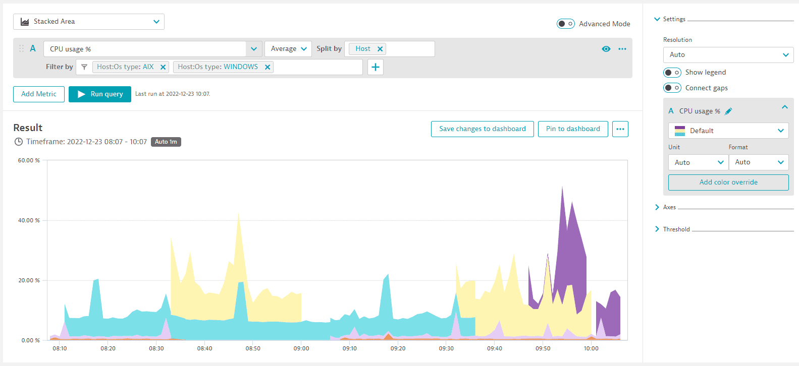
To visualize your query results as a stacked area chart, select Stacked area from the list above the query definition, in the upper-left corner of the page.
Use your metric selection to control which metrics are stacked.
Note that you can only stack metrics with the same unit.
Example in Data Explorer
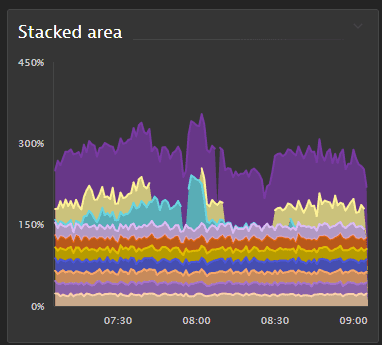
Example pinned to a dashboard as a tile
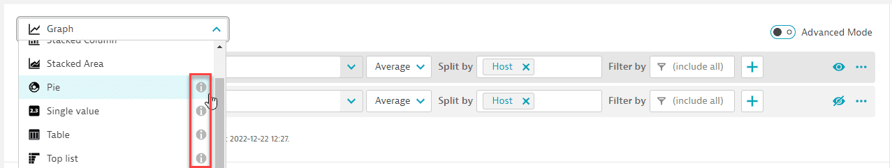
Change visualization
When switching between visualizations, be aware that some visualization settings are visualization-specific.
-
If you select a visualization and configure Settings for that visualization, and then you switch to a different visualization, some of your settings for the first visualization may be ignored because they don't apply to the newly selected visualization. An information icon in the list of visualizations will alert you to the possibility.
-
If you switch back to the original visualization, you may need to reconfigure some visualization settings.
Change metric selection
Your visualization can show any selection of metrics in a multi-metric query.
To toggle metrics on and off, you can select the letter next to the metric you want to visualize, or you can select the eye icon .

Settings
The Settings section is one of the expandable sections in the right panel of Data Explorer. The contents of the Settings section may vary depending on the visualization you have selected.
Resolution
Resolution is the X axis (time) granularity of the visualization.
- To allow Data Explorer to automatically select an appropriate resolution for the selected timeframe, in the Settings section, set Resolution to
Auto To specify a certain resolution, select one from the list
Some resolutions are unavailable for some timeframes. If you select an incompatible combination of timeframe and resolution, Dynatrace automatically selects a resolution and displays an explanatory message such as: Auto-resolution applied. Resolution value of [6 hours] applied. Selected timeframe doesn't allow for [5 minutes] resolution. To override auto-resolution, select a different resolution from the list.
To prevent performance issues on dashboard tiles created with Data Explorer, the maximum number of data points for a query on a dashboard tile is 4,000. Based on the selected timeframe and the applied custom resolution, Dynatrace projects the number of data points for the query result. If the projected number of data points exceeds 4,000, Dynatrace automatically switches to a resolution high enough to keep the number of data points below 4,000.
Note that this does not apply to visualizations in Data Explorer itself, where you can have more than 4,000 data points. It applies only to dashboard tiles created with Data Explorer where the resolution/timeframe combination selected on the dashboard results in more than 4,000 data points.
Show legend
Whether to display a legend under the visualization.
Note that the legend is active: you can select a legend entry to toggle display of the corresponding entry on or off.
Connect gaps
To connect gaps in a chart, in the Settings section, turn on Connect gaps.
Settings per metric
The Settings section also displays visualization options per metric selected for the query.
Rename a metric
You can change the name of a metric as it is displayed on the chart and in the chart legend. The query definition retains the metric's original name.
- In the Settings section, select
 for the metric you want to rename.
 Edit the name, and then select the checkmark to save the new name.
Change color palette
To change the color palette for a metric, in the Settings section, select a new palette from the list.

Unit and Format
Use the Unit and Format settings to determine how your data is displayed. If you export to a CSV file, the Unit and Format settings are also reflected in the exported values.
Unit
Use the Unit setting to set the unit in which the metric is displayed.
None= No unit displayedAuto= Dynatrace selects an appropriate display unitOther selections specify the exact unit to display. The options here depend on the metric's unit. A time metric, for example, offers alternative units for displaying time.
- To add a custom unit/suffix string, type the custom string in the Unit box and then select it from the list.
- In Advanced mode, you can use
:setUnit(<unit>)to select from a wider range of units.
Examples of order-of-magnitude notation in Dynatrace:
| Notation | Factor | Meaning |
|---|---|---|
k | 10^3 | kilo, thousand |
M | 10^6 | mega, million |
G | 10^9 | giga, billion |
T | 10^12 | tera, trillion |
Format
Use the Format setting to configure the number of decimal places displayed for the selected metric.
None= No formatting.Auto= Dynatrace selects an appropriate format. For example, whereNonewould display5.062357754177517 %,Autowould display5.06 %.- Other selections specify the number of decimal places to display:
0,0.0,0.00,0.000
Examples
When the basic unit of the metric is bytes:
-
If you set Unit to
Auto, Dynatrace automatically expresses the results in a human-readable unit, which in this case could beGiB.A byte-based unit can have either a binary or decimal base, which will determine whether Dynatrace selects, for example,
GiBorGB. If no base is defined in the metric itself, a decimal base is used. -
If the automatically selected unit isn't suitable in your case, you can force Dynatrace to express the same values in a specific unit (Unit =
B,KiB,MiB, orGiB). -
If you want to see raw data (no conversion), you can set Unit to
Noneand see the results in the basic unit of the metric (which in this case is bytes).
When the basic unit of a metric is dollars and cents:
- For smaller values, to see the results expressed in exact dollars and cents: set Unit to
Auto, and set Format to0.00(to have two decimal places for the cents). - For larger values, to see the results expressed in thousands, millions, or billions of dollars and no cents: set Unit to
k (thousand),M (million),G (billion), and set Format to0(to see nothing after the decimal point).
When the basic unit for the metric is a count:
-
To see an exact count:
- Set Unit to
Auto - Set Format to
None
- Set Unit to
-
To see a rough count:
- Set Unit to
k (thousand),M (million),G (billion), orT (trillion), depending on the magnitude of your values - Set Format to
0.0,0.00, or0.0000, depending on how many decimal places make sense in combination with the selected Unit setting
- Set Unit to
When setting threshold values:
- If you select a Unit (for example,
MiB), the Threshold settings are then prepared to match the selected unit, so you just need to enter threshold values without specifyingMiB. - If you set Unit to
Auto(to let Dynatrace automatically scale the displayed output), you still need to set Threshold values in a specific unit such as bytes.
Add color override
To force a different color (override the color palette) for a specific series such as a selected host
- In the Settings section, select Add color override
Select the series from the list
Select the override color for that series
Axes
The Axes section is one of the expandable sections in the right panel of Data Explorer. In the Axes section, you can control how the X axis and each Y axis of your visualization are displayed.
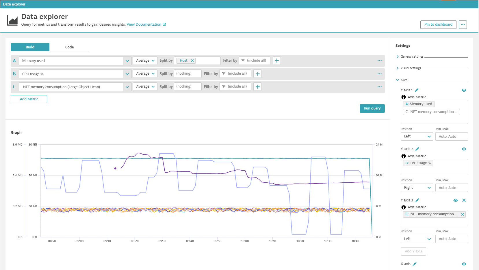
In this walkthrough, you add some metrics to a visualization and see how to adjust the axis settings in the Axes section of the Settings for your graph. (This example uses a Graph visualization, but the same settings apply to other visualizations that have axis settings.)
-
Go to Data Explorer.
-
In Data Explorer, add metric
builtin:host.mem.used, split byHost, and select Run query.- The X axis, which is displayed along the bottom of the graph, is the current timeframe as determined by the timeframe selector.
- The X axis has no name by default, but you can name it: in the Axes section, find
X axis, select in the X axis row, change the name (for example, to Time), and then select the checkmark to save the new name. - To toggle the display of the X axis on and off, select in the X axis row.
- The X axis has no name by default, but you can name it: in the Axes section, find
- The Y axis by default is displayed up the left side of the graph.
- There can be more than one Y axis on a chart. The first one is automatically labeled
Y axis 1in the Axes section. In this example, it displays memory used in GB, corresponding to the first metric you have added to your chart,Memory used(builtin:host.mem.used). - As with the X axis, you can name and hide/show the Y axis: find
Y axis 1in the Axes section and select and accordingly. - To move the Y axis to the right of the chart, change Position from
LefttoRight. - To specify the range of a Y axis, change Min, Max from
Auto, Autoto numeric values. For example, set Min, Max for this metric (Memory used) to5, 10to chart values between those values.
- There can be more than one Y axis on a chart. The first one is automatically labeled
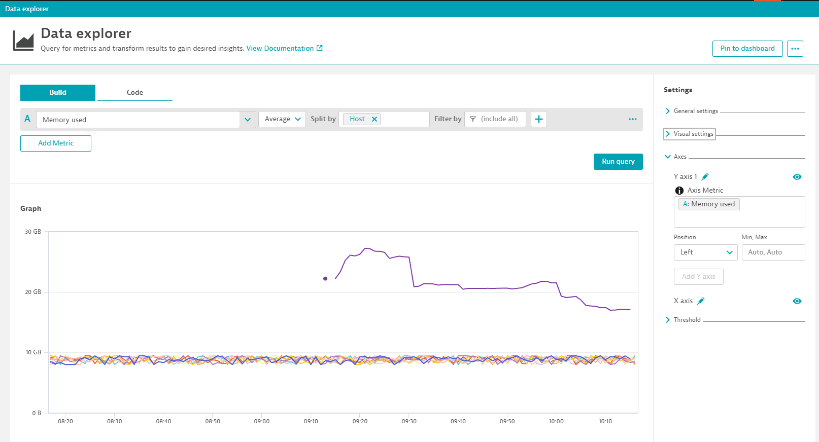
- The X axis, which is displayed along the bottom of the graph, is the current timeframe as determined by the timeframe selector.
-
Select Add metric and add metric
builtin:host.cpu.usage, split byHost, and select Run query again.-
The Y axis for the second metric (
CPU usages %) is displayed up the right side of the graph to indicate CPU usage percentage. (If you moved the Y axis in the previous step, now they both run up the same side of the chart.) -
In the Axes section, a new
Y axis 2section is displayed.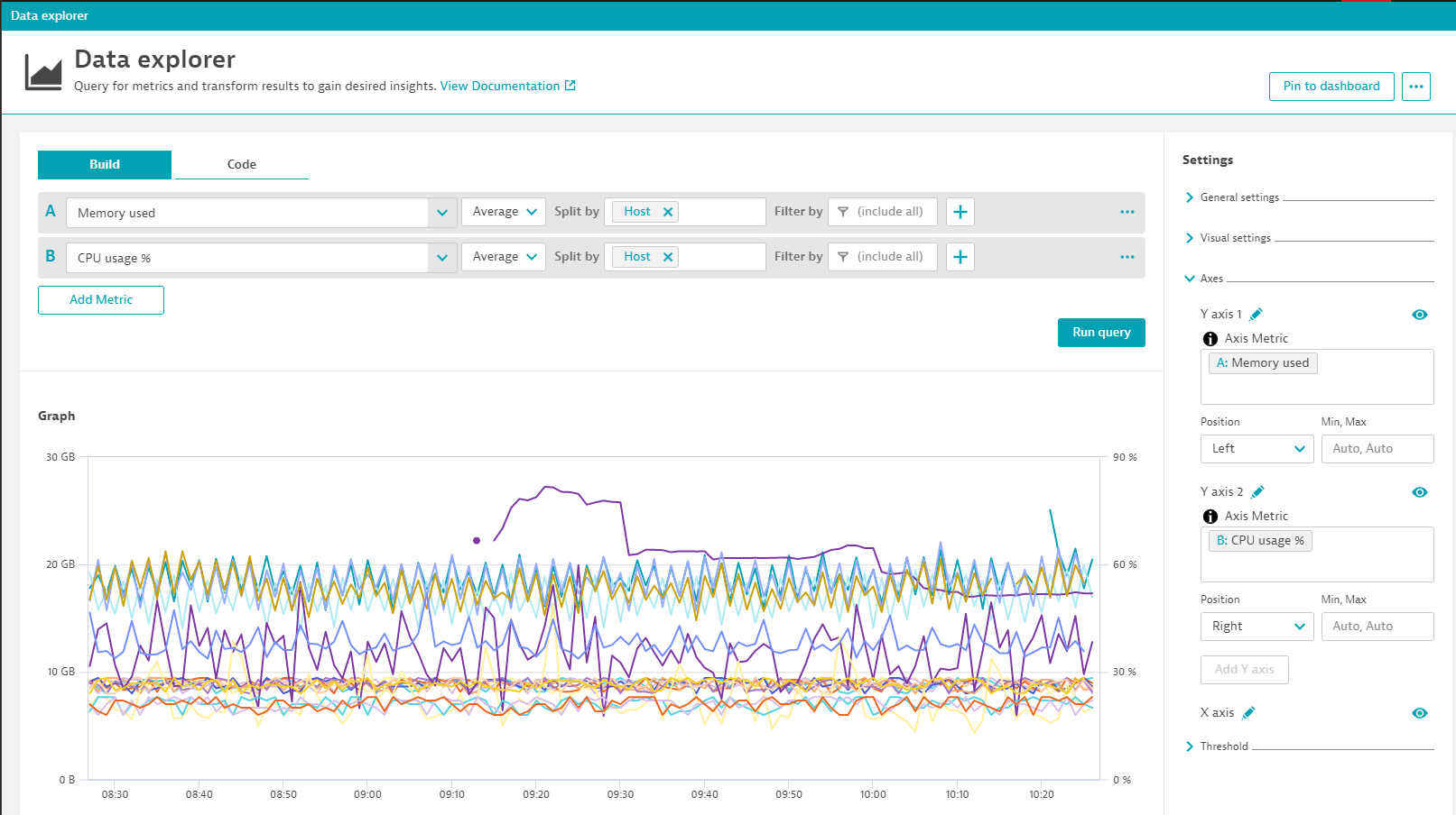
-
Additional Y axes are not created automatically for any subsequent metrics you add to the chart, but you can add them manually: after you add the metric to your query, select Add Y axis in the Axes section, select in the empty Axis Metric box, and then select the metric you want to display for the new axis. Below, a third metric has been added with a third Y axis for .NET memory consumption (Large Object Heap).
Name an axis
To name an axis
- In the Axes section, find the axis you want to rename.
- Select next to the axis name.
- Enter a new name and select the checkmark to save the change.
The axis name is displayed vertically next to a Y axis and horizontally under the X axis.
Hide or show an axis
To hide an axis
- In the Axes section, find the axis you want to hide.
- Select .
To unhide the axis, select again.
Define an axis position
To specify the side of the chart on which to display a Y axis
- In the Axes section, find the Y axis you want to move.
- Set Position to
LeftorRight.
Set an axis minimum and maximum
By default, minimum and maximum axis values are set automatically.
To set custom minimum and maximum values for an axis
- In the Axes section, find the axis for which you want to define a minimum and maximum.
- Change the value of Min, Max from
Auto, Autoto a comma-separated pair of values corresponding to the values on the selected axis.
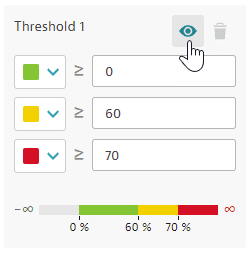
Threshold
The Threshold section is one of the expandable sections in the right panel of Data Explorer. The contents of this section may vary depending on the visualization you have selected. Use threshold settings to enhance your visualizations and tiles.
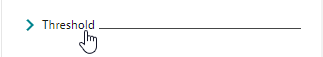
Set threshold values after you set Unit:
- If you set Unit first, the threshold settings are prepared to match the selected unit.
- If you change Unit after you set threshold values, the threshold values are not automatically adjusted to match the new unit setting.
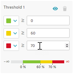
Set thresholds
-
In the Thresholds section, enter threshold values
-
Adjust threshold colors optional
Hide or show threshold colors
To hide or show threshold colors without deleting the threshold settings, in the Thresholds section, select .