Data Explorer quick start
You're in the right place if you want to see what Data Explorer can do and learn a little about writing your own queries.
You have two options here:
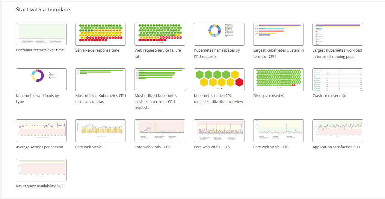
- Start with a template—An easy intro
- Start from scratch—A little harder
Start with a template
Starting with Dynatrace version 1.251, Data Explorer opens with a Start with a template section. This is the fastest and easiest way to get up and running with Data Explorer.
Don't be afraid to experiment. You can't break anything.
If you need to start again, navigate away from Data Explorer (select another app) and then go back to display the Start with a template section again.
To get started with a template
-
Go to Data Explorer.
-
In the Start with a template section, select a template.
When you select a template, Dynatrace automatically fills in the query definition, configures the visualization settings, and runs the query.
-
Hover over visualization elements to see tooltips.
-
Select visualization elements to access drilldown actions.
-
Experiment with the query definition. After you make a change, select Run query to see what happens.
-
Experiment with the Settings panel on the right. Tweak some settings and see what happens.
-
optional Dashboards Classic: When you come up with something you like, select Pin to dashboard to add the query to a dashboard. The list of dashboards is searchable: select in the list and start typing to filter the list, and then select the dashboard from the filtered list.
- If you don't have a dashboard, just select Create new dashboard when the Where do you want to pin to? message pops up.
You can pin multiple versions of your work to your dashboard so you can see them side by side.
If you're ready to start exploring a little more, try starting from scratch.
Start from scratch
Use this procedure to get hands-on experience with Data Explorer.
In this walkthrough, you'll:
Create a simple metric visualization from scratch
Use the visualization directly in Data Explorer
Pin the visualization to a dashboard as a tile
Create a visualization from scratch
-
Go to Data Explorer.
-
On the Build tab, add a metric to your query.
-
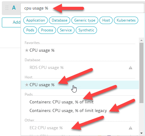
Select a metric such as
CPU usage %(builtin:host.cpu.usage).How to select a metricWhen you browse the list of metrics
-
You can type or paste a metric name directly into the box to find all matching metrics. In this example, there are multiple matches. We select the metric in the Host category to add it to our query.
-
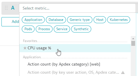
If you have favorited any metrics in the Metrics browser browser, those metrics are displayed at the top of the list in the metric selector.
-
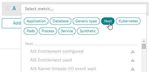
You can select a metric category to focus the list of metrics.
-
When you hover over any metric in the list, a side panel displays details about that metric.
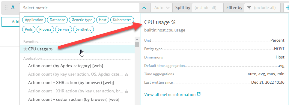
To see more information about that metric, select View all metric information. This opens the Metrics browser in a new tab (so you don't lose your work in Data Explorer) with lots of useful details about the selected metric.
-
-
Choose an aggregation (for example,
Average,Minimum, orMaximum) -
Select Split by dimensions. In this example (
CPU usage %), we split by host to see CPU usage per host. -
Specify Filter by criteria as needed. In this example, we leave it empty.
For details on building a query, see Query components and concepts and Examples.
-
-
optional To review or edit the code for your query, turn on Advanced mode, which is the advanced query editor.
-
Add and delete metrics as needed.
-
A query can have up to 10 rows.
-
To add a new empty row, select Add metric and then repeat the previous step to define that row.
-
To reorder metrics, select and drag the metric to a new position in the list of metrics.

A query's metrics are rendered in order from top to bottom, so the last one is rendered on top of the others.
- Note that the order of the metrics is also updated in the Settings section in the side panel.
Rerun the query to see your changes.
-
To make a copy of a metric that you have already added to the query, select > Duplicate and then edit the copy as needed.

-
To enable or disable a metric, select the eye button .

-
To delete a metric, select > Delete.
-
-
optional To add or remove metric transformations for a row, select the transformations (+) button and then select or clear checkboxes as needed.

-
Select Run query to take a first look at the visualization. The Run query button displays the status of the displayed results:

-
Use the Settings panel to configure your visualization.
The visualization is updated with each change.
- Choose from several visualization types:
When you are satisfied with your visualization, you can use it within Data Explorer immediately or pin it to a dashboard for future use.
Use the visualization in Data Explorer
Visualization elements are active. For example:
To see details in tooltips, hover over visualization elements
To drill down from a problematic (red) element, select it.
To hide or show a visualization element, select the corresponding label in the visualization legend
When you're done using your visualization (for now, anyway), you need to decide whether to discard it or save it.
To discard your visualization (and the query that generated it), just navigate away from Data Explorer.
To save your visualization and query for future use, you need to pin the visualization to a dashboard. See below.
Pin the visualization to a dashboard
To save the visualization as a dashboard tile, select Pin to dashboard.
To return from the dashboard to Data Explorer with the visualization open for viewing and editing, open the menu in the upper-right corner of the tile and select Configure tile in Data Explorer. Now two buttons are displayed in the Results section of Data Explorer:
- Save changes to dashboard—saves the visualization to the same tile and dashboard you used to open Data Explorer. If you have made any changes, they will update the tile on your dashboard.
- Pin to dashboard—saves the visualization as a tile on a different dashboard. You might want to pin the same visualization (perhaps with filtering differences) to various dashboards.
For details about pinning tiles to dashboards, see Pin tiles to your dashboard.
What's next?
If you're ready for the technical details, see:
- Data Explorer—learn the details of query construction
- Data Explorer Advanced mode query editor—learn how to edit queries om Advanced mode