Data Explorer
Data Explorer greatly enhances your abilities to query and visualize metrics.
Analyze multidimensional metrics, whether built into Dynatrace or ingested from StatsD, Prometheus, Telegraf, and other channels.
Choose a visualization type.
Add your visualization right to your classic dashboards for easy access and sharing.
Provides a foundation for metric calculation in visualizations on classic dashboards.
If you prefer to skip the technical details for now and learn by doing, try the Data Explorer quick start. You'll learn how to:
Use a template
Create a simple visualization from scratch
Use the visualization directly in Data Explorer
Pin the visualization to a dashboard for future use and sharing
But if you want the details now, read below.
Query components and concepts
Every metric query is composed of multiple optional components. For example, this query:
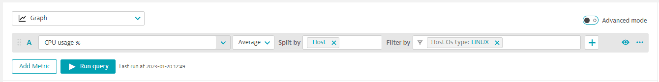
has the following components:
- Metric name:
CPU usage %(builtin:host.cpu.usage) - Aggregation:
Average(avg) - Split by:
Host(dt.entity.host) - Filter by:
Host:OS type:Linux
See below for descriptions of these and other possible query components.
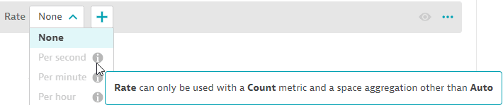
The query editor helps you to select query settings that are compatible with the query you are configuring.
In the example below, if you hover over the i (information) icon in the selection list for Rate, the editor explains why the setting is unavailable for the current query.
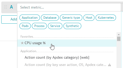
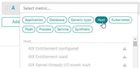
Metric name
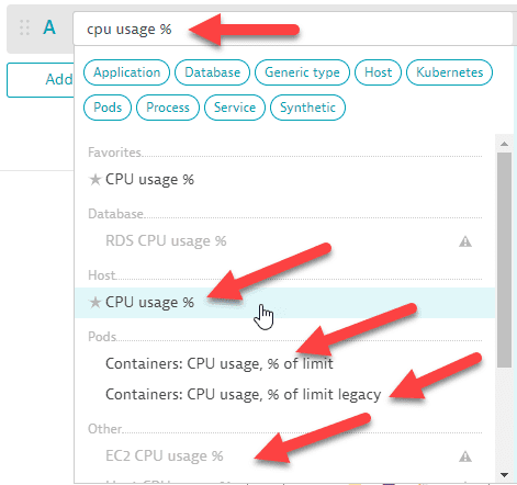
In the query editor, select the metric name from the list displayed in the Select metric… box. This can be a built-in metric or a metric ingested from a channel such as StatsD, Prometheus, or Telegraf over our metrics API.
To select the metric
-
You can type or paste a metric name directly into the box to find all matching metrics. In this example, there are multiple matches. We select the metric in the Host category to add it to our query.
-
If you have favorited any metrics in the Metrics browser browser, those metrics are displayed at the top of the list in the metric selector.
-
You can select a metric category to focus the list of metrics.
-
When you hover over any metric in the list, a side panel displays details about that metric.
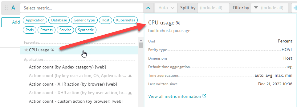
To see more information about that metric, select View all metric information. This opens the Metrics browser in a new tab (so you don't lose your work in Data Explorer) with lots of useful details about the selected metric.
Space aggregation
The space aggregation enables you to specify how the resulting data points of a metric query are supposed to be aggregated across dimensions.
The query will always provide the statistically most accurate results for a given query, even if certain metrics provide different statistics, which depends on the nature of each metric.
To change this aggregation, select one from the list immediately following the metric name in the query editor:

Every metric provides the same possible space aggregations: Auto, Average, Count, Maximum, Minimum, Sum, Median, Percentile 10th, Percentile 75th, and Percentile 90th.
Split by
By default, a query does not split by any dimensions using the metric's aggregation. When splitting by a dimension such as host, the aggregation is used for each host.
To split by a dimension
- If Split by is not already displayed in the query editor, select and then select
Split byfrom the list. - Set Split by to the dimension by which you want to split the query.
Example
If the row's metric is CPU usage %, Host is the only available dimension. In Split by, select Host.
Sort by
By default, results are sorted in descending order based on the aggregation chosen.
To set the sort order
- If Sort by is not already displayed in the query editor, select and then select
Sort byfrom the list. - Set Sort by to the dimension by which you want to sort.
- Select the sort order:
ASC(ascending) orDESC(descending).
Rate
To set the rate
- If Rate is not already displayed in the query editor, select and then select
Ratefrom the list. - Set Rate to
None,Per second,Per minute, orPer hour.
Filter by
The scope is determined by any filter you set. By default, the scope is (include all).
To filter your query (change the scope)
- If Filter by is not already displayed in the query editor, select and then select
Filter byfrom the list. - In Filter by:
Select an available dimension
Specify an attribute
Specify an attribute value
You can add multiple filters.
Example
If the metric is Action count (by Apdex category) [web] (builtin:apps.web.actionCount.category) and you want to filter for a specific web application named My web application
- If Filter by is not already displayed, display it.
- In Filter by, select
Web application, then selectName, and then selectMy web application
See also Auto-extended filtering
Limit
By default, the number of metrics you see if they are split by a dimension is 20.
To set an explicit limit
- If Limit is not already displayed in the query editor, select and then select
Limitfrom the list. - Set Limit to
1,10,20, or100.
To remove the limit, turn on Advanced mode and delete the :limit(n) component of the query.
Default
To set the default value
- If Default is not already displayed in the query editor, select and then select
Defaultfrom the list. - Set Default to the desired default value.
Timeshift
To set a timeshift value
- If Timeshift is not already displayed in the query editor, select and then select
Timeshiftfrom the list. - Set Timeshift to a number (positive or negative).
Select a unit (second, minute, hour, day, week) from the adjacent list.
Example
To shift back two minutes:
- Set Timeshift to
-2 - Set the unit to
minute
Query commands
Use these commands in the query editor to select query components and set values.
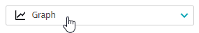
Visualization
The default visualization is a graph. To change the visualization, select one from the list in the upper-left corner of your query definition.
The following visualization types are available:
Plus
To add or remove metric transformations for a row in the query editor, select and then select or clear checkboxes as needed.

Add metric
To add a new empty row, select Add metric and then define that row's query.
Duplicate metric
To make a copy of a metric that you have already added to the query, select > Duplicate and then edit the copy as needed.

Add metric event
If you see something in a Data Explorer chart that you want to continue observing, it's easy to create a metric event.
To create a metric event from Data Explorer
-
Select > Add metric event in the query editor.
The Settings > Anomaly detection > Metric events page is displayed in a new browser window (so you don't lose your work in Data Explorer) with Add metric event selected and the metric fields already filled in where possible from your query.
-
Complete the metric event definition and save your changes.
-
Close that browser window and return to the first browser window to continue what you were doing in Data Explorer.
For details on metric events, see Metric events.
Reorder metrics
The order in which metrics are listed in your query affects the following:
Order in which elements of a drawing are rendered: a query's metrics are rendered in order from top to bottom, so the last one is rendered on top of the others
Order of columns in a table visualization
- Order in which settings are displayed in the Settings panel
To change the order of metrics in your query, select and drag the metric to a new position in the list of metrics.

Rerun the query to see your changes.
Toggle metric
To toggle metrics on and off, you can select the letter next to the metric you want to include in your query, or you can select the eye icon .

Delete metric
To delete a metric, select > Delete.
Run query
Select Run query to run the currently configured query and display a visualization of the results. The text next to the Run query button displays the status of the most recent run.

Advanced mode
To fully utilize the power of the Metrics API v2 queries from within the web UI, turn on Advanced mode for the query.
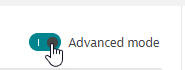
Advanced mode enables you to create metric expressions, timeframe shifts, and much more directly in the web UI and, of course, use this power to create vizualizations for your dashboards. Start by checking out metric expression examples.
For Advanced mode details, see Data Explorer Advanced mode query editor.
Baselines
To help you identify anomalies, you can use baselining to add a confidence band to a metric's line on the chart. Then you can see when the value goes outside the confidence band. The baseline calculation is based on the Seasonal baseline model which is used to create metric events for anomaly detection.
-
Baselines apply only to the
Graphvisualization. -
Baselines are not added to the dashboard tile when you pin a chart to a dashboard.
-
The timeframe used to infer the baseline is determined by the currently selected resolution:
Resolution range Resolution examples Baseline timeframe resolution < 5 minutes
1 minute
previous 14 days
5 minutes ≥ resolution < 1 hour
5 minutes
10 minutes
30 minutes
previous 28 days
1 hour ≥ resolution < 1 day
1 hour
6 hours
12 hours
400 days
resolution ≥ 1 day
1 day
1 week
1 month
5 years
Add a baseline
On the graph, select the line for the metric you want to baseline.
- In the pop-up, select Add baseline.
- Wait a moment while the baseline is calculated (
Loading). The graph is then redrawn with the baseline displayed for the metric you selected.
Hide or show a baseline
Baselines are listed separately in the chart legend. For example, if you add a baseline to the CPU usage % metric in a Graph visualization, the legend lists CPU usage % and CPU usage % - baseline. Select the legend entries to toggle their display on or off.
Remove a baseline
On the graph, select the line for the metric from which you want to remove the baseline.
- In the pop-up window, select Remove baseline. The graph is redrawn with the baseline removed.
Compared to metric event baselines
You may notice differences between baselines in Data Explorer and metric events. These features offer different approaches to suit their different contexts. In general, the Data Explorer configuration is fixed, while the metric events configuration is configurable.
| Data Explorer | Metric events | |
|---|---|---|
Samples |
| Configurable |
Violating samples |
| Configurable |
Dealerting samples |
| Configurable |
Alert on no data |
| Configurable |
Tolerance (affects width of confidence band) |
| Configurable (range: |
Resolution (affects granularity) | Configurable |
|
Training time | Instantaneous | Daily |
For details on seasonal baselining, see Seasonal baseline.
Baselines FAQ
The baseline calculation is based on the seasonal baseline model used to create metric events for anomaly detection. For details on the inner workings of the model, see Seasonal baseline.
Although the baseline model is based on the seasonal baseline model, there are several reasons why the resulting baselines can differ:
- Resolution: The baseline in Data Explorer is derived from the data depending on the currently selected resolution as described above. A seasonal baseline model of a metric event configuration always learns the behavior from 1-minute resolution data. If the resolutions are different, the resulting baseline differs as the metric values are also different.
- Baseline timeframe: The timeframe used to infer the baseline is determined by the currently selected resolution as described above. As metric event configurations always use 1-minute resolution data, the training timeframe can differ, which also can lead to different baselines.
- Model parameters: The baseline in Data Explorer uses fixed default parameters to train a baseline model:
Tolerance = 4
Alert condition = 'Alert if metric is outside'
No alert on missing data If the parameters are different in the metric event configuration, the resulting baseline can be different.
Correlated metrics
Dynatrace Davis® takes domain-specific knowledge and topology into account when computing connected observability signals. Davis ranks the most relevant signals on top, and the Davis score for each detected signal indicates how closely the signal matches the reference signal's behavior during the selected timeframe. More about Davis® AI.
Add correlated metrics
Note that this option is available only if you Split by a dimension in the query.
-
Go to Data Explorer (standard or advanced mode), create a query of a metric series split by a related dimension, and display it in the
Graphvisualization.Correlated metrics are available only if you:
- Select the
Graphvisualization - Specify a query that is Split by a dimension related to the selected data series
Try this example:

That's this in Advanced mode:
 builtin:host.cpu.usage:splitBy("dt.entity.host"):sort(value(auto,descending)):limit(20)
 - Select the
-
Select Run query to graph the query.
-
Select (click on) a line on the graph to display a pop-up window of related options.
-
In the pop-up window, select See correlated metrics.
The Davis for Correlation analysis side panel lists metrics that, based on Davis AI correlation analysis, are correlated to the selected series. This correlation is determined by the shape of the series, not the values.
What does the analyzer display?-
Reference signal represents the data series you selected on the graph. Other shapes of other metric series are compared to the shape of this series.
-
Connected signals are other metric series that have a similar shape, sorted by most similar to least similar. The more similar the shape, the closer the correlation.
For each correlated metric, the analyzer displays:
Metric name
Dimension
ID of the entity
Correlations are sometimes grouped.
-
-
In the side panel, select any listed metric to automatically add it to your current query.
You can add multiple correlated metrics to your query
You can add the same metric multiple times and then edit the query
-
After you add correlated metrics, select Run query to update the graph.
Correlated metrics FAQ
To determine correlation, the analyzer checks the shape of the data series, not the values. Two series with very similar shapes are correlated.
If No connected signals found is displayed, possibilities include:
Too little variance in the sample (for example, a metric that is a straight line)
Too few data points in the sample (for example, in a very short timeframe)
Focus
To temporarily remove potential clutter from your graph and focus on a single metric, you can hide everything but a selected metric series.
- Focus applies only to the
Graphvisualization. Focus does not change your query and does not affect the dashboard tile when you pin a chart to a dashboard.
Focus on a metric series
-
On a line graph, select the line for the metric you want to focus on.
-
In the pop-up, select Focus.
The graph is redrawn with only the selected metric displayed.
Remove focus
-
On the graph, select the line for the metric you have focused on.
-
In the pop-up, select Remove focus.
The graph is redrawn to display all metrics.
Result
The Result section displays the selected visualization of your query results.
Interact with visualization
You can hover over and select visualization elements to view details, drill down to relevant Dynatrace pages, and alter the visualization to help you identify problems.
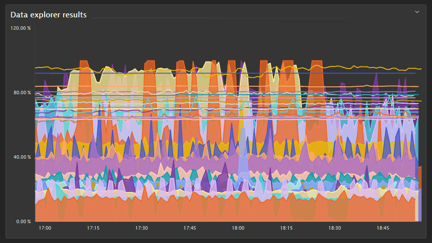
In this example—a Graph visualization showing a line chart of the CPU usage % metric for hosts—the visualization was showing a host behaving erratically, so we selected it to see details about the host in a pop-up window.
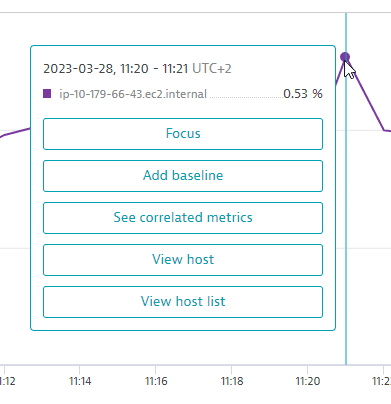
In this example, you have the following options:
- Select Focus to temperarily focus your graph on a single metric. For details, see Focus.
- Select Add baseline to add a baseline for the selected metric. For details, see Baselines.
- Select See correlated metrics to list correlated metrics and optionally add a selection of them to your query. For details, see Correlated metrics.
- Select View host to drill down directly to the details page for that host.
- Select View host list to go to the Hosts page.
The options available in the pop-up window depend on the query and visualization you configured.
Pin to dashboard
When you're satisfied with your query, you can add it to a dashboard.
- Select Pin to dashboard.
Select a dashboard for which you have edit permission.
- Select Pin.
For details, see Pin tiles to your dashboard.
Share your results
If you are doing analysis in Data Explorer and find some interesting results that you want to share with other authenticated users, or if you want to be able to revisit the same results yourself using a later timeframe
- Go to Data Explorer and, in the Result section, select > Share link.
- Determine the timeframe to associate with the link:
- To share the link with the current timeframe, turn on Use the current timeframe.
Otherwise, the shared query link will specify the current query and settings except the timeframe.
- Select Copy to copy the link to your clipboard.
Share the link with any other authenticated Dynatrace user or keep a copy for your own use.
Export to CSV file
To export to a comma-separated values (CSV) file
-
Go to Data Explorer and, in the Result section, select > Export CSV.
- CSV export is available for all visualizations except honeycomb and single value
- Values exported to a CSV file reflect the formatting specified with the Unit and Format settings in the Settings section.
-
A CSV file of the results is saved to your local machine.
The file name indicates the metrics, date, and timeframe.
For example:
CPU usage % (May 24, 2022, 11_41 - 13_41).csv—contains results from metricCPU usage %, run on May 24, 2022, for a two-hour timeframe of 11:41-13:41.CPU usage % +1 (May 24, 2022, 13_19 - 13_49).csv—contains results from metricCPU usage %and one more metric, run on May 24, 2022, for a half-hour timeframe of 13:19-13:49.
Use in API
After you run a query, you have the option to copy the request for use in an API request.
- Go to Data Explorer and, in the Result section, select > Copy request.
Select whether to use the timeframe of the result.
Select a response format: JSON or CSV.
- Select Copy to copy the request to your clipboard, or just select and copy portions of the request that you want to use.
- optional Select Get a token to go to the Generate access token page and get a token for the request.
Examples
Table with two metrics (split)
In this example, we select metrics CPU usage % and Memory used %, break it down by host for both, and display it as a table so that the rows are hosts and the columns show the metric values per host.
- A:
CPU usage %(builtin:host.cpu.usage),Average, Split byHost - B:
Memory used %(builtin:host.mem.usage),Average, Split byHost - Visualization:
Table
The complete query should look like this:
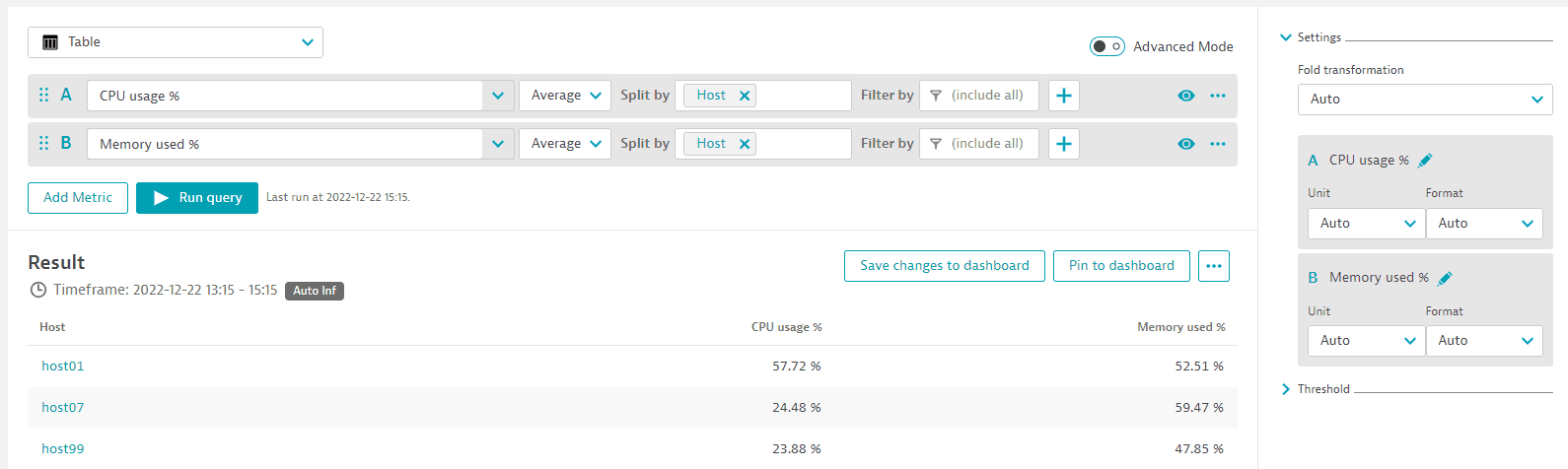
Example tile:
Graph with two metrics
In this example, we select the same metrics and display them as a graph.
When you set Visualization to Graph, the Settings are displayed, where you can select how to graph each metric. In this case, CPU usage % is an area chart (the area between 0 and the value of the metric is filled in) and Memory used % is a line chart (a single line representing the value of the metric over time).
- A:
CPU usage %(builtin:host.cpu.usage),Average, Split byHost - B:
Memory used %(builtin:host.mem.usage),Average, Split byHost - Visualization:
Graph - Visual settings:
- A =
Area - B =
Line
- A =
The complete query should look like this:
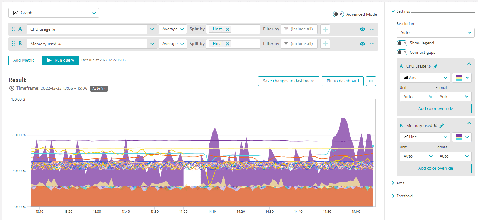
Example tile:
Auto-extended filtering
Auto-extended filters leverage the Dynatrace topology (entity model) to offer additional filter dimensions not available in the original metric. They work on both the tile level and the dashboard level.
- On a tile level, select them when you set Filter by in Data Explorer by simply selecting the original dimension of a metric that has the relationship assigned. For example, a metric that captures the performance for Synthetic events has a relationship to a Synthetic monitor. Using the topology, you can first select the related Synthetic event in the filter and then, besides the name, tag, id, or health state, you also get an additional option to pick the related monitor.
On a dashboard level, while you can't pick desired relationships, Dynatrace automatically extends the metrics where possible, so that, when you pass a dynamic filter, it can apply to a tile with that metric.
Example 1: Synthetic step metric extended by Synthetic monitor
Some performance metrics for Synthetic events lack the ability to filter them by monitor. However, the same event could happen in multiple monitors, and to look at a single monitor's performance you need the ability to filter for them.
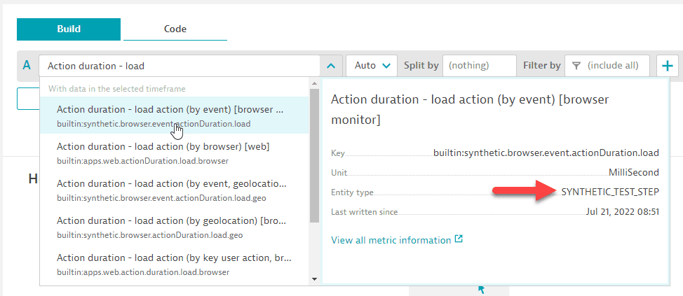
With automatically extended filters, you can now filter on the Synthetic test step.
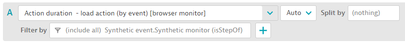
- Select the metric (for example,
Action duration - load action (by event) [browser monitor]). It has entity typeSYNTHETIC_TEST_STEP.
Add the filter.
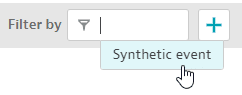
Select auto-extended dimension.
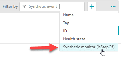
Resulting filter.
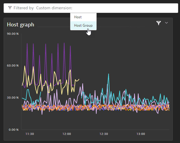
Moreover, you can now use auto-extended filters on your dashboard, so there's no need to configure multiple tiles to see the same metric for different monitors or different hosts.
- On the Dynamic filters tab of your dashboard's Dashboard settings page, add a filter for
Custom dimension.
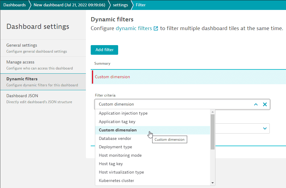
- Select
Synthetic monitor.
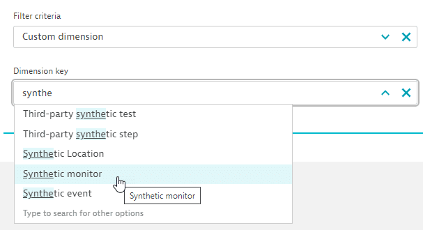
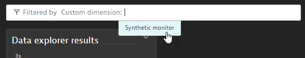
Save your changes and display the dashboard. Now you can filter all tiles on the dashboard by Synthetic monitor. The dashboard will automatically, for each tile, check whether any such relationship exists. So every tile (without filters set on a tile level) that has a Synthetic event metric will be filtered the moment a relationship exists between the step in the tile and the monitor you picked.
Example 2: Host metric extended
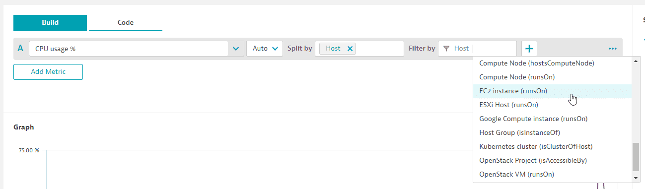
Here, we extend the host metric by EC2 instance.
-
Create a host-related tile with a host metric (for example,
CPU usage %-builtin:host.cpu.usage). -
Apply a related filter such as
EC2 instance (runsOn).Now the tile with all hosts is filtered to only the hosts running on that EC2 instance. This is possible even though the dimension
EC2 instancedoes not exist on the original host metric. By leveraging the topology (entity model), Dynatrace can filter the hosts based on that relationship.
In this variation, the host metric is extended by host group.
-
Set a filter for
Host.Host Group (isInstanceOf)and pin the tile to our dashboard.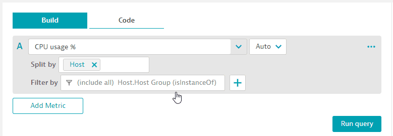
-
We are now able to filter the dashboard tiles by host group.
Notes and limitations
-
10 metrics maximum per visualization
-
Up to 100 series per metric
For a Honeycomb visualization, you can bypass this limit: turn on Advanced mode and delete
:limit(100)from the query. -
Unlike multidimensional analysis, Data Explorer uses long-term metric data, not trace and request data, so values on visualizations might differ from values in multidimensional analysis.
-
To prevent performance issues on dashboard tiles created with Data Explorer, the maximum number of data points for a query on a dashboard tile is 4,000. Based on the selected timeframe and the applied custom resolution, Dynatrace projects the number of data points for the query result. If the projected number of data points exceeds 4,000, Dynatrace automatically switches to a resolution high enough to keep the number of data points below 4,000.
Note that this does not apply to visualizations in Data Explorer itself, where you can have more than 4,000 data points. It applies only to dashboard tiles created with Data Explorer where the resolution/timeframe combination selected on the dashboard results in more than 4,000 data points.
-
Examples of order-of-magnitude notation in Dynatrace:
Notation Factor Meaning k
10^3
kilo, thousand
M
10^6
mega, million
G
10^9
giga, billion
T
10^12
tera, trillion
For details, see Order-of-magnitude notation.
Fold transformation and resolution
Be aware that the Fold transformation setting affects the resolution.
-
If Fold transformation is set to
Autofor visualizationTable,Single value,Top list, orHoneycomb, theInf(infinity) resolution is used to maintain backward compatibility. If the chosen metric selector doesn't support theInfresolution, thefoldtransformation is automatically added to the end of the query. -
If Fold transformation is set to a value other than
Auto,foldis used.
Because all metric selectors are queried using the same total value mechanism (either fold or Inf), adding a new selector that requires fold might change the result of the other selectors.
To inspect the actual query used by Data Explorer, go to the Result section in Data Explorer and select > Copy request.