Common interactions and features
Latest Dynatrace
Tooltip
A chart tooltip gives you extra information about a specific data point when hovering. It shows the exact value of the data point and any other important details related to the data being shown.
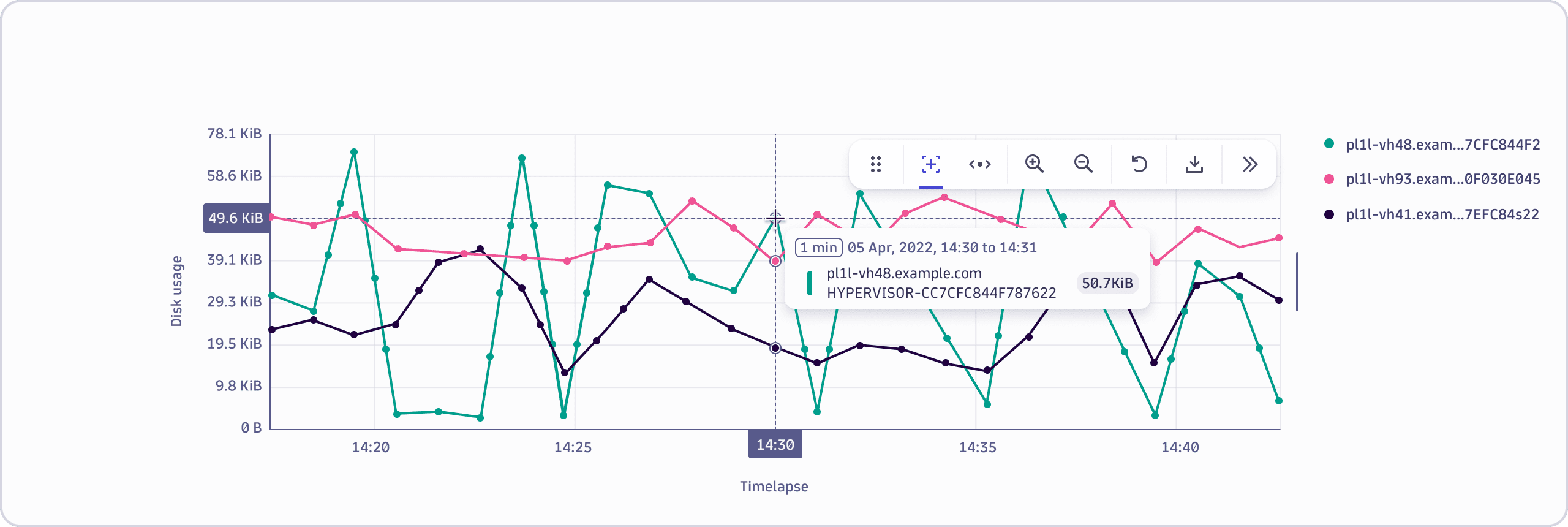
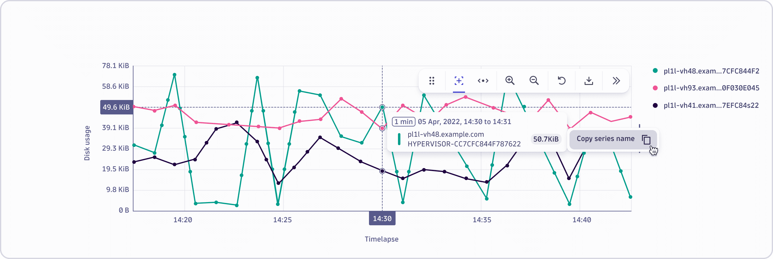
Additional actions like drilldowns can be triggered by pinning the tooltip and accessing the actions menu. These options vary across different applications.
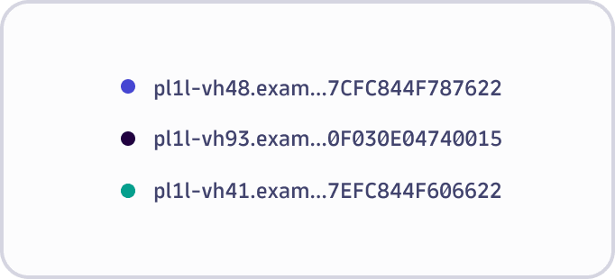
Legend
An optional legend might be displayed to the right or bottom of a chart, depending on the chart, app, chart size, and implementation. By using the legends menu, you can access actions without having to interact with the chart directly.
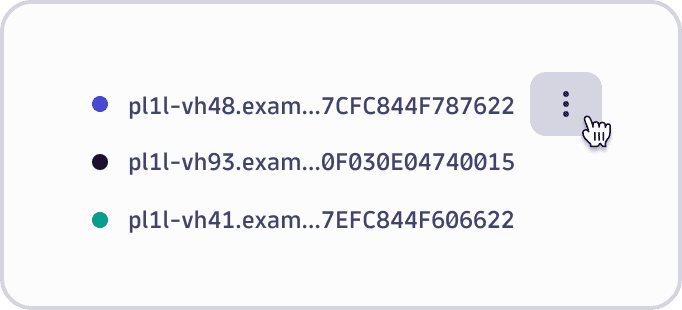
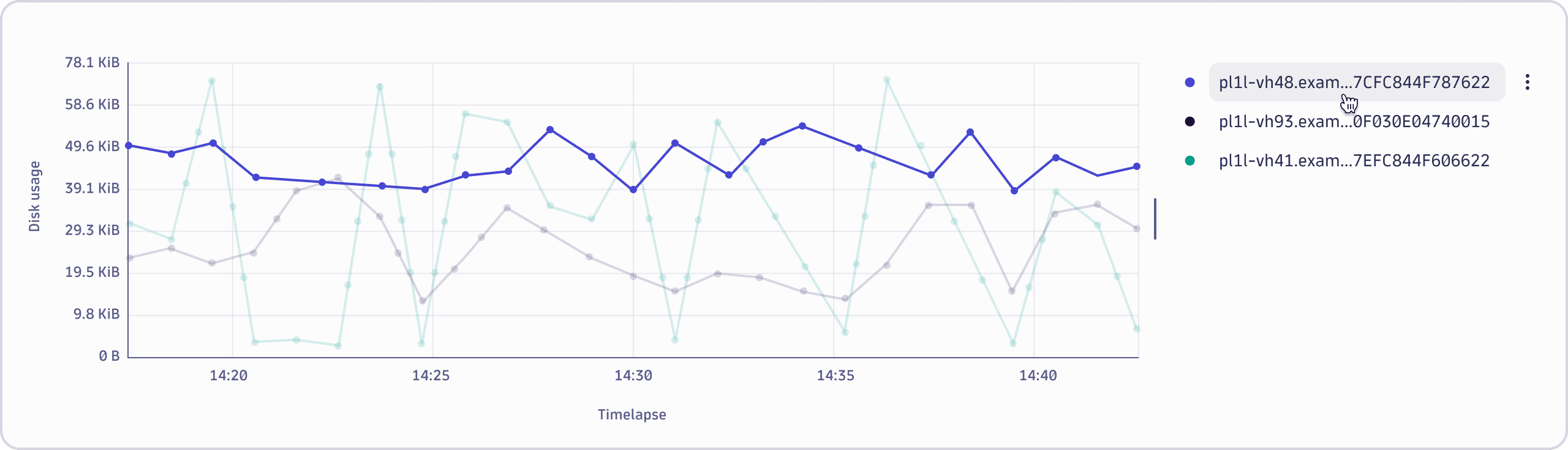
Series highlight and actions
Hover over a series name in the legend to interact with the chart. Corresponding series are highlighted in the chart. While hovering over the legend item, you can also see a contextual menu icon. This menu includes other actions that can be triggered without the need to directly interact with the chart.
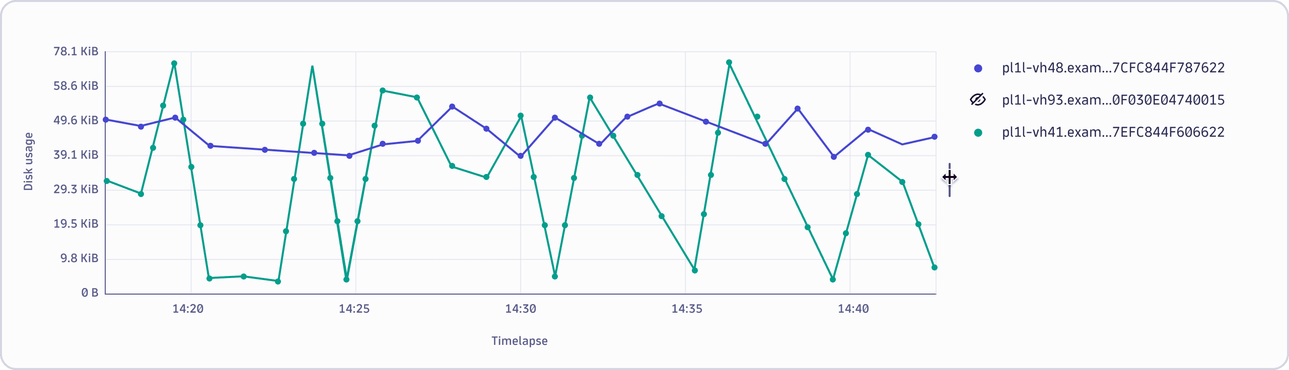
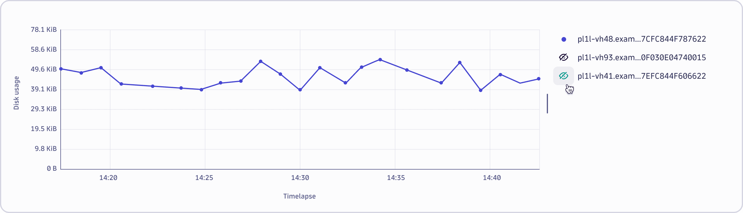
Isolating and hiding series within the chart
Selecting a series item within the legend isolates the corresponding series in the chart. A canceled eye icon indicates that those series are temporarily hidden. You can isolate multiple series by holding Shift or Ctrl/Cmd when selecting items.
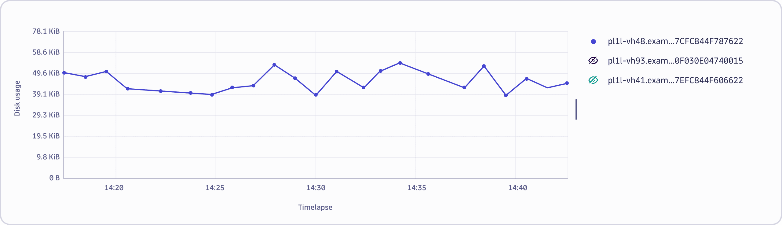
To hide or unhide series individually, select the eye icon. This toggles the visibility of an individual series.
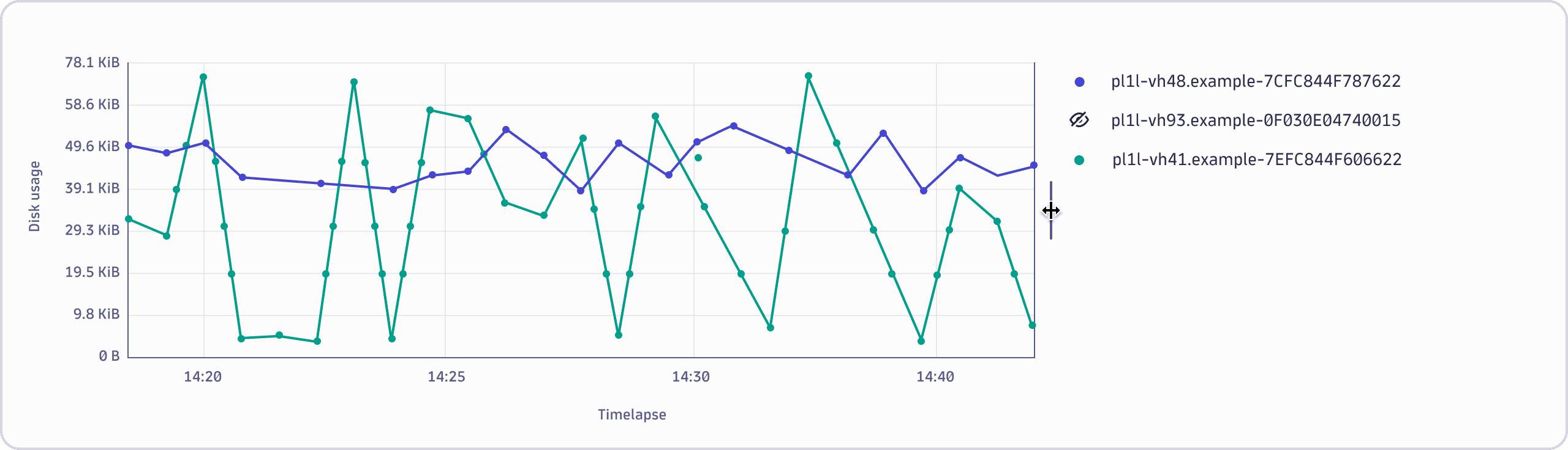
Resizing the legend
To resize the legend, drag the resize indicator located between the legend and the chart area.