
At Dynatrace, we’re constantly improving the UX and UI of our components and patterns. We recently identified two table-related functionalities that have repeatedly raised questions and increased the need for custom implementations on the Dynatrace platform.
These two table functionalities are:
- expandability of table rows
- reordering of table rows
The ideal team for component design consists of a UX designer and a front-end developer. So I joined forces with David Troyer from our synthetic team. This allowed for balanced opinions and insights from both the design and implementation perspectives. Together we created and improved concepts for a more powerful table component, which can handle additional use cases and provides better usability for our customers.

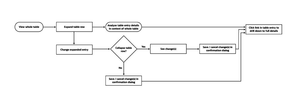
To start, we collected the use cases and functional requirements for both of the table functionalities from stakeholders and with the help from our new UX enablement guild. After this, we determined the user flows for both the expandability and reordering functionalities. Armed with this information, we gathered our ideas and conceptualized possible solutions, while ensuring that all use cases were addressed. The design concepts were tested and feedback was requested from the UX enablement guild.
Let’s take a closer look at the process and the results.
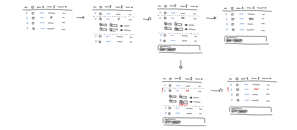
Expanding a table row
The flexibility of our components is key to speeding up development and striving for better user experience.
As Dynatrace is a complex software intelligence platform, we deal with a lot of different use cases for the table component. It’s therefore important to have cross-feature consistency for handling functionalities, such as expandable table rows. This allows us to build trust with our users and reduces their learning curve. Dynatrace users should be able to focus on their tasks, instead of figuring out how to interact with tables.
Here are the main challenges we tackled with the new concept for our expandable table rows:
- Location of the expand button
- Undefined click areas which resulted in inconsistent implementation
- Limited visibility of changes that are made when a table row is expanded
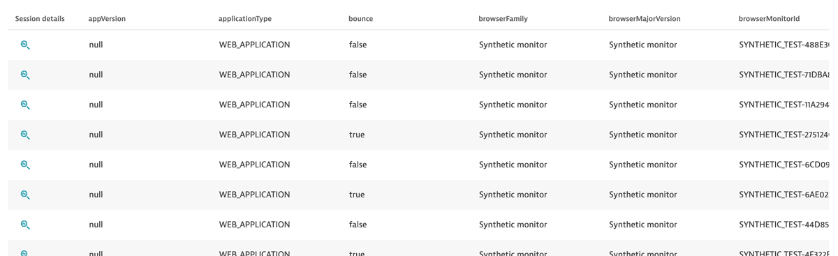
Currently, the implementation of our tables ranges from having just a few columns, to having over 40 columns (we can’t influence the result/data points of, for example, USQL queries). These different table layouts resulted in our nested expand button being placed too far away from the context, or in some cases, not even visible.
Apart from the position of the nested button, it’s not always clear to the user where they should click. Sometimes the whole table row can be clicked to trigger expansion, sometimes only the nested button is clickable.
Our tables provide the possibility of having components, such as input fields, within the expanded section. This is a great option for smaller in-place changes, but it brings its own challenges. Currently, some tables actually discard changes when the user collapses a row. In other tables, we observed that invalid user inputs in table rows are mostly not visible when all rows are collapsed, which can cause difficulties when saving the changes.
The goal: consistent handling of table row expandability
The following weren’t in the scope of this effort:
- Content that is shown in expanded sections
- The confirmation dialog and how it handles validations
- Other table functionality
The goal for this concept was to rethink the position of the expand functionality in our table, which is currently on the far right. Additionally, we want to better guide users in terms of changes within expanded sections.
The solution: a concept update for the handling of expandable tables
David and I prototyped our idea and double-checked it with all collected use cases and restrictions. We talked to people who use the most complex tables in Dynatrace to make sure we weren’t missing any requirements.
Then we decided to record a short video, describing the problems and clicking through our prototype with a bit of explanation. We sent this video (together with the option of rating the concept and providing feedback) to the UX enablement guild, who provided us with constructive ideas, concerns, and reactions.
The result: easier table handling via repositioning of the expand button
With all the feedback from the guild, which provided insights from different roles and different platform areas, we can now release a new concept for our expandable table functionality:
- The nested arrow button will be placed on the left side of the table row.
- Click area for the nested button is the cell the button is in, not the entire row, as this can’t be consistent throughout the platform.
- If changes that are made within the expanded section are visible in the table row as well, we will update the values. Highlighting these values will increase their visibility until the changes are saved.
- Invalid user inputs will be pointed out by the error indicator on the left side of the table. If the value of the changed input is a column in the table, this value will be highlighted in red.
As long as there are invalid inputs, saving changes is not possible.
This concept is demonstrated in the video below:
Note: If there are any other actions (delete, switches, multi-selection via checkbox, etc.) in the table row, they won’t necessarily have to be on the left side; their location should be determined according to their use-case and implementation.
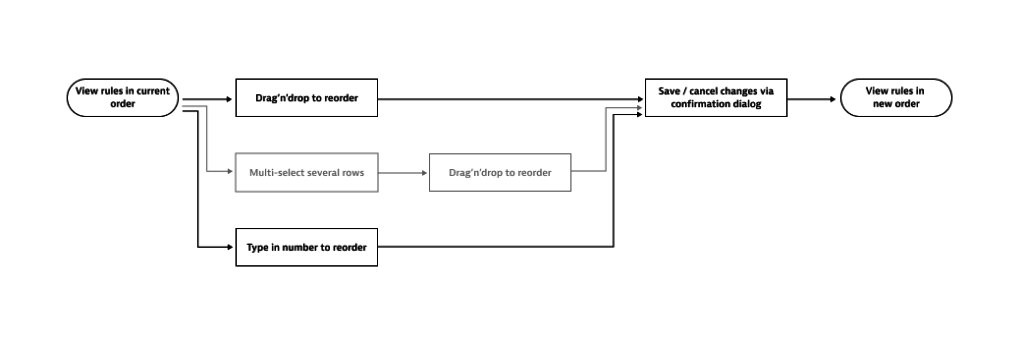
Reordering entries in Dynatrace tables
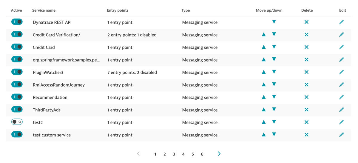
The current sorting or ordering functionality of our tables presents a number of challenges:
- Clicking the Move up/down buttons to reorder rows can take more time than is necessary when dealing with bigger rule sets.
- The row moves with every click, so users need to follow the rule with the mouse.
- In tables with pagination, rules often move to a different page. Users then have to switch to the correct page first, before they can continue the reordering.
The goal: intuitive reordering of a rule set
We had a look at different possibilities for reordering table rows and checked them to see if they meet all requirements. Starting with the user flows helped us to understand the big picture and prevented us from getting lost in the details.
In addition to changing the order of rules, we also identified restrictions which demand validations. For example, in our synthetic settings, users can reorder their recorded actions, but the script always has to start with a navigation action.
The following was not in the scope of this concept:
- The confirmation dialog
- Any other functionality of the table
The solution: introducing drag-and-drop
Drag-and-drop allows users to place their rules at the desired position in the most intuitive way. We identified some details to consider:
- Instant feedback for users is the key to the success of drag-and-drop.
- Immediately showing users why a row can’t be dropped in a certain location reduces irritation.
- Drag-and-drop, as easy as it is on desktop and mobile devices, isn’t accessible to users with certain disabilities.
The result: more intuitive and powerful table reordering
To provide the best user experience, we need to prevent users from dropping a table row on restricted areas and at the same time tell them why. Therefore, a hint shows users that dropping a table row on restricted areas isn’t possible and the row moves back to its original position.
This concept is demonstrated in the video below:
As the quality standards for our components are high, and we always consider accessibility, drag-and-drop can’t be the only way to change the order of a rule set.
In addition to the drag-and-drop functionality, the numbers indicating the rule order offer input fields when they’re clicked. Simply changing the number of a row and confirming it with the return key reorders the rules.
This concept is demonstrated in the video below:
There are however some limitations and notes to consider when using this new functionality:
- Pagination should not be used in tables with drag-and-drop.
- The ability to sort via table header must be omitted.
- If a user types in a number that’s higher than the number of available entries, the table row will automatically be placed at the end of the table.
- Invalid input in the number field (for example, special characters or letters) won’t affect the ordering. The table row stays at the same position but the input is invalid and can’t be confirmed.
What’s next?
These concepts have been tested and are ready for implementation. Now it’s up to you. As a UX team, we can work on concepts that improve the UX of the Dynatrace platform, but in the end, we aren’t app developers.
We already have an extensive, sophisticated open-sourced design system called Barista. Barista provides not only Dynatrace teams, but also any external user (as it is open-source), with high-quality, Lego-style components, which speeds up development and increases the consistency of our platform.
Contribute now and help us improve our component library!
You can find the feature request for the table-row reorder functionality here:
https://github.com/dynatrace-oss/barista/issues/561
The current Angular table implementation already allows repositioning of the nested arrow button as well as the display of validation errors in table rows. You’ll find updated examples in our Barista design system, along with the recommended pattern for usage.


Looking for answers?
Start a new discussion or ask for help in our Q&A forum.
Go to forum