
Let’s take a look at what many monitoring tools have in common
When it comes to “full stack” performance monitoring, you will find a collection of vendors including New Relic, Datadog, SignalFx, MSFT, Wavefront, and Sysdig offering solutions that are remarkably similar in many ways. With this article, I’d like to explore something that all these tools have in common – lots of metrics and lots of charts.
Lots of easy to get metrics
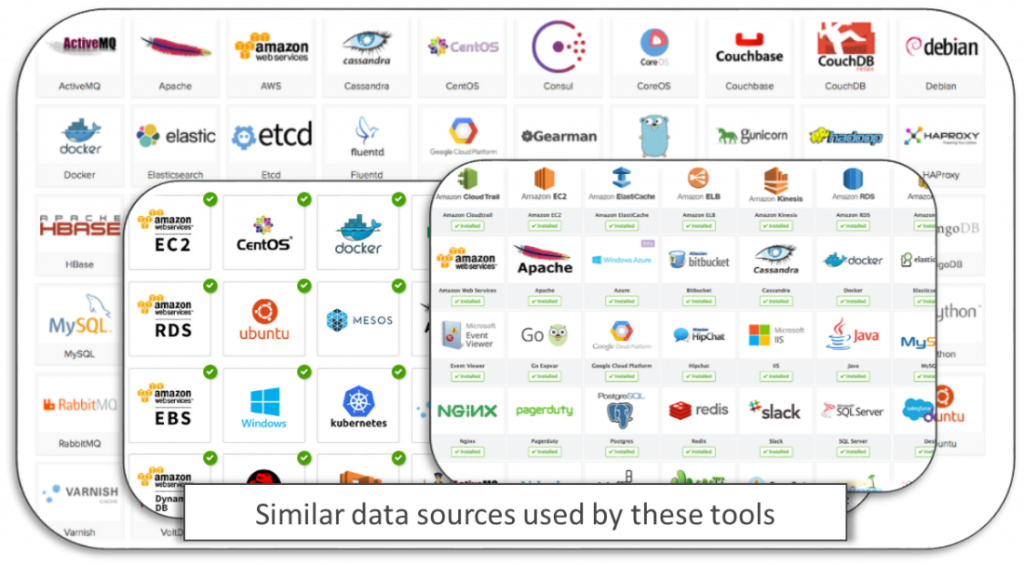
The first thing to notice is that these tools can capture metrics from a wide variety of data sources via “integrations” or “plug-ins” as shown in the screen shots (below). Typical examples include host performance, JMX, network throughput, WMI, Docker health, SNMP, and AWS metrics. These metrics are relatively easy to capture (technically speaking, pulling JMX data is not hard to do) although configuring these integrations and plug-ins isn’t always an easy task.
Lots of charts
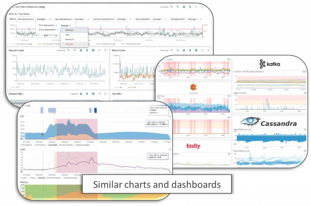
The data can be analyzed in various charts and dashboards as seen in the examples below. In fact, the experience of using these tools is largely based around building and viewing charts. I like to label this experience as JBoC (Just a Bunch of Charts). Looking for answers in the data involves putting several metric charts next to each other over the same time series and looking for correlations in the data. Out of the thousands of metrics to choose from, which ones should you be looking at? How do the charts explain the root cause of a performance problem? It’s a lot of guesswork. Just because you can see two metrics spiking up or down around the same time does not mean that one caused the other to happen. Does a sudden increase in the number of people with umbrellas cause it to rain?
How valuable is all this data?
Great, so there’s all sorts of metrics available to analyze and correlate, but do we understand what they really mean? The value of some metrics is obvious. When free disk space gets close to 0%, it’s time to act. However, the overwhelming majority of the metrics are confusing and not very valuable. For example, when MEMTABLE SWITCH COUNTS PER HOUR increases from 20 up to 40… Is that good? Is that bad?
This reminds of a great scene from my all-time favorite TV show: Seinfeld – The Little Jerry episode:
JERRY: Hey, guess what! Little Jerry ran from here to Newman’s in under thirty seconds!
GEORGE: Is that good?
JERRY: I don’t know.

The data is not connected
It’s also important to note that the metrics these tools are capturing are not connected or related to each other. If the CPU % chart spikes up, you would expect to be able to click and drilldown to see what’s consuming the CPU with the details explaining why. This type of workflow is not possible out of the box because the data is not connected. You might be able to manually create a series of high-level to lower-level charts and link them together somehow, but that’s tedious. Additionally, without knowing the relationships and dependencies in the data, this makes it impossible for A.I. causation algorithms to automate the problem solving for you.
High-value data is hard to get
What’s missing is the high-value data that’s needed to prevent and solve performance problems. End-to-end transaction tracing, real user monitoring, mapping the topology & dependencies of the entire enterprise and capturing method-level data (in production) with contextual transaction values – why are these capabilities missing from these tools? The answer is because it is not easy. This high-value data is really challenging to capture (technically speaking).
Luckily, there’s Dynatrace.
Instead of configuring a bunch of integrations and plug-ins to capture and chart all these low-value metrics, just install the Dynatrace OneAgent on your hosts. It takes a few seconds and that’s it.
Answers, not just data
Once the OneAgent is installed, Dynatrace will start telling you what you need to know in ways that are simple to understand.
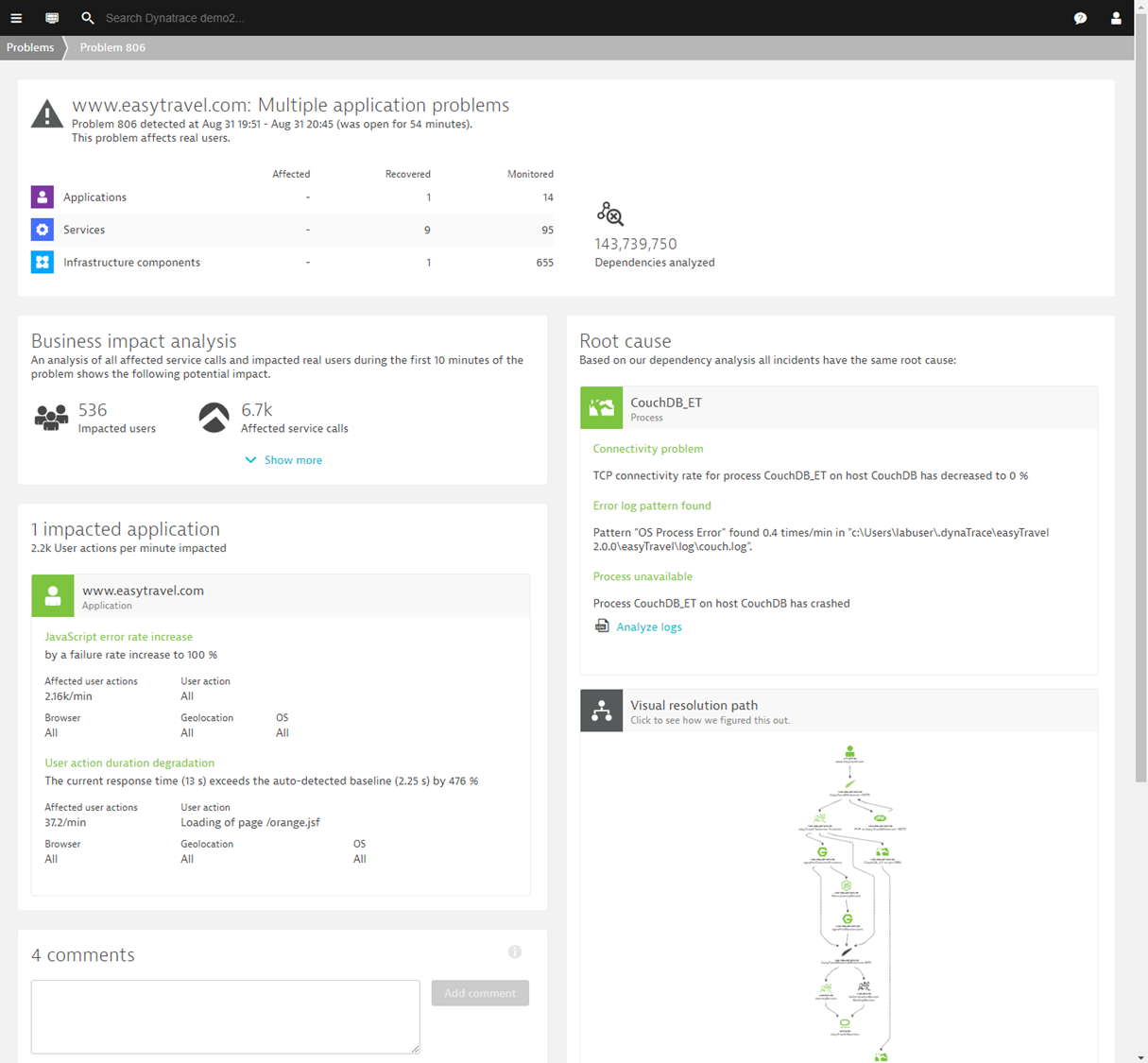
In the example above, you can see Dynatrace has detected a problem. It shows us:
Business impact = 536 users and 6.7K transactions
Impacted application = www.easytravel.com
Root cause = CouchDB process crashed
How simple is that? No configuration necessary.
Even better, you can get answers from Dynatrace by talking or chatting with Davis®.


Looking for answers?
Start a new discussion or ask for help in our Q&A forum.
Go to forum