
Dynatrace monitors the performance of each transaction that occurs in your environment. Performance data, including response times for each service and service method, are tracked and stored for each transaction. By collecting such time series data for each transaction and categorizing the results based on percentiles, Dynatrace can show the distribution of response times of each service and service method over time. All of the response time distribution charts presented on Dynatrace service and application overview pages are built using this same time-series data.
Variable percentiles for custom charting
Custom charting and the Dynatrace REST API enable you to use variable percentiles to chart your service and method response times based on the unique performance requirements of your application.
Response time percentiles show the distribution of response times that are monitored during the analysis time frame. These data can be huge. This is why our percentile data store is built to handle thousands of individual service request measurements per minute, in real time.
When percentiles are better than averages
For Dynatrace users, individual response time measurements are generally of little value on their own. Aggregate percentile analysis is, however, a great statistical tool for seeing into which response time percentile the majority of your service requests fall and how slow the slowest X% of your service requests are. Like averages, percentiles are a statistical tool that allows you to analyze huge amounts of response time data. Averages don’t, however, work well for analyzing the behavior of outlier response time measurements. Percentiles, on the other hand, are great for showing outlier response times. For more details, please see this blog post that explains when percentiles are preferable to averages.
Dynatrace is the only monitoring solution that collects and records the response times of all services and service methods across all percentiles. This functionality is available by default—no setup required.
Dynatrace anomaly detection algorithms rely on two percentiles, the 50th percentile (i.e., the median average) and the 90th percentile (the slowest 10% of measured response times). The 50th percentile is the response time range above which 50% of all your service requests are faster. The 90th percentile is the response time range above which 90% of all your service requests are faster (i.e., the slowest 10% of requests).
Custom percentiles for charts
I recently met with a large telecommunications enterprise that defines their own KPI standard based on the 70th percentile. The unique Dynatrace percentile store enables this customer to easily expose the 70th percentile of their response times using either custom dashboard charts or the Dynatrace API.
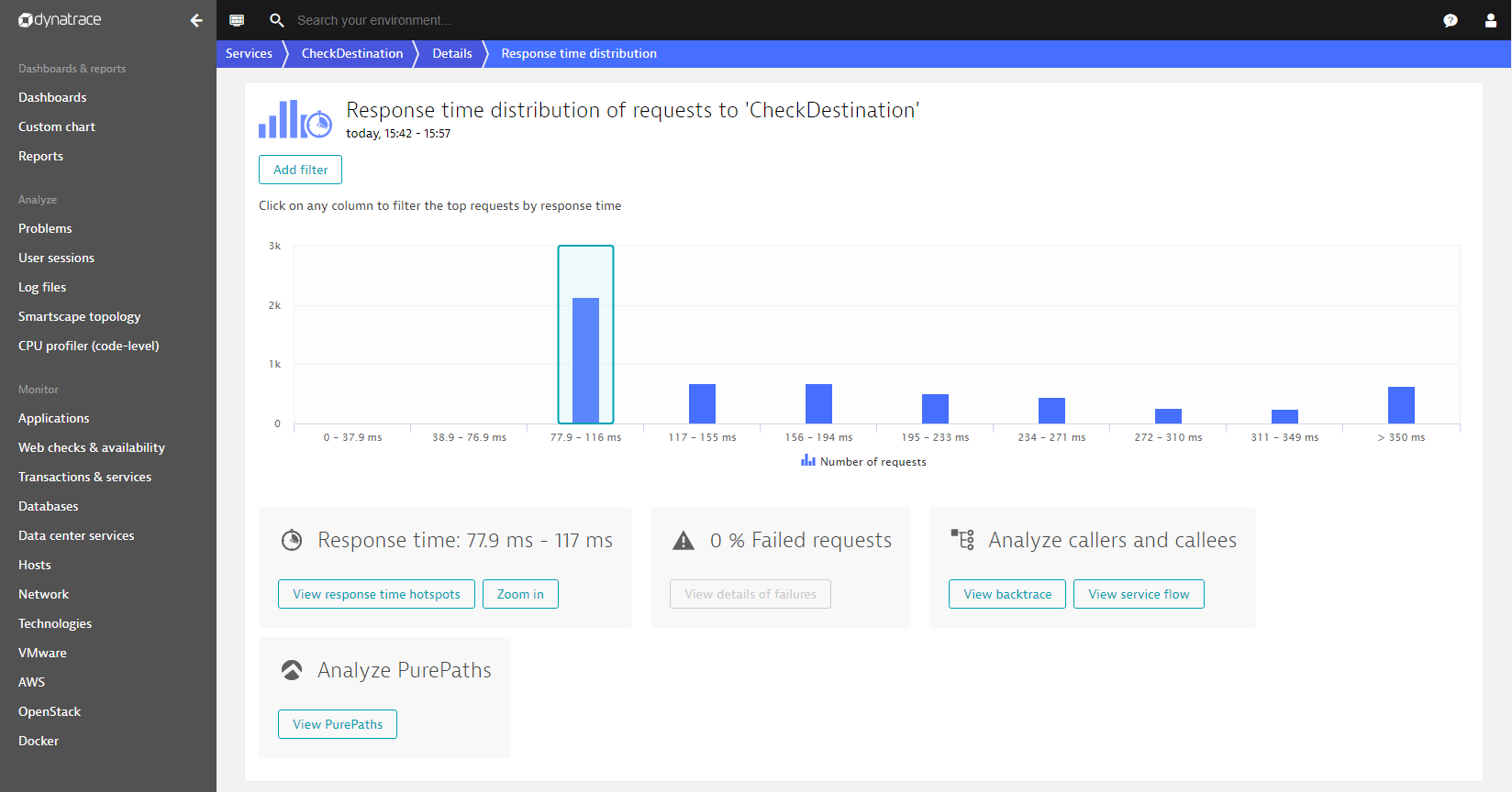
The example below shows the response time distribution chart of a typical service monitored by Dynatrace. The chart shows that most of the 2,000+ analyzed requests selected during the analysis time frame have a response time between 77.9ms and 116ms. The remainder of the response times are evenly distributed above 116ms.
To chart the response times of the fastest 30% and the slowest 70% of requests for this service, we need to create a custom dashboard chart. Custom charts provide a convenient means of charting variable percentiles. The example below shows a chart set up to show the 30th and 70th percentiles for this service. For more details, see our blog post about creating custom charts.
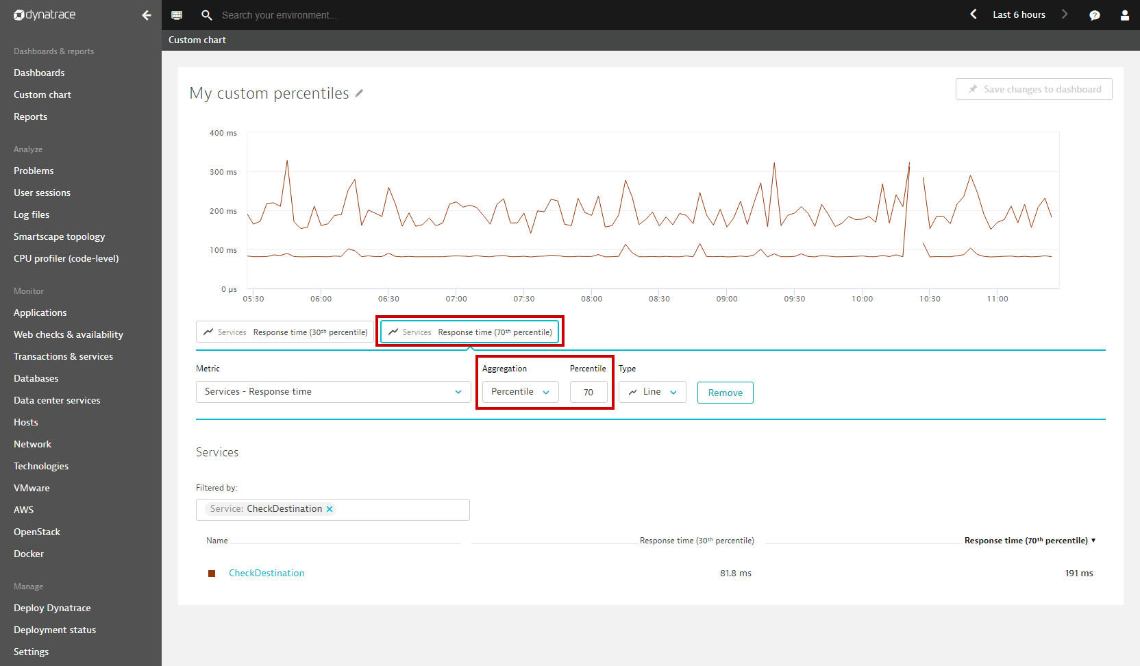
The percentile dashboard tile (See My custom percentiles chart example below) shows the selected percentiles for the analysis timeframe:

Dynatrace Timeseries API
The Dynatrace Timeseries API has been enhanced to allow you to fetch individual percentiles via our REST API. Simply specify an aggregation type ‘percentile’ and specify the individual percentile you want to fetch with the API.
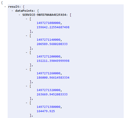
The following example API call fetches the 70th percentile for the given ‘CheckDestination’ service:
https://<YourEnvironmentID>.live.dynatrace.com/api/v1/timeseries/?Api-Token=<YourAPIToken>&entity=SERVICE-98FD70A8A4E2FA54×eriesId=com.dynatrace.builtin:service.responsetime&aggregationType=percentile&percentile=70&relativeTime=2hoursThe result shows the 70th percentile as a time series over the last 2 hours:
As the examples in this post demonstrate, Dynatrace enables you to chart response time percentiles either as dashboard tiles or by using our REST API to integrate integrating the percentiles into a 3rd party system.
Refer to Dynatrace API help for details about the REST API. Or visit our Github repository where you’ll find a simple example of how to fetch and chart percentiles using JavaScript.


Looking for answers?
Start a new discussion or ask for help in our Q&A forum.
Go to forum