
Dynatrace custom charting has been enhanced with some long-awaited metrics! Custom charts can now display performance metrics for specific web applications, web checks, and key user actions. Numerous metrics are now available for these entities. As always, it’s easy to add custom charts to your home dashboard where you can easily track the performance of the vital user actions and critical workflows that your digital business success depends on.
Custom charting now supports
- 27 web application metrics, including Action duration, DOM interactive, and Apdex (or User actions per user session). Web application metrics are split into three categories: JavaScript errors, Performance, and User behavior.
- 10 key user action metrics are now available for custom charting, including Visually complete and User action count.
Metrics for key user actions begin with the stringWeb app. key. - 7 web check metrics are now available, including Availability, Speed index, and Network consumption.
Build custom charts
To create a custom chart
- Select Create custom chart from the navigation menu.
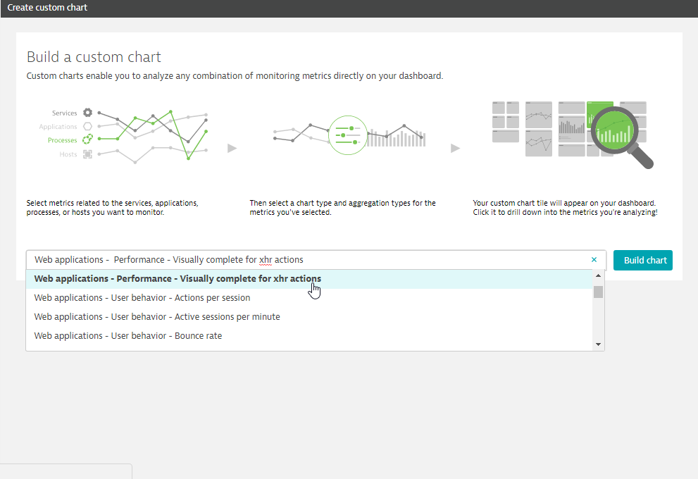
Alternatively, you can select the Build custom chart tile in the Tile catalog. - On the Build a custom chart page, select metrics related to the services, applications, processes, or hosts that you want to monitor.
For this example, we’ll select one of the new metrics, Web applications – Performance – Visually complete for XHR actions. - Click the Build chart button.
- Click the Edit button (pencil icon) next to the Custom configured chart field and type in an intuitive name for your new chart.
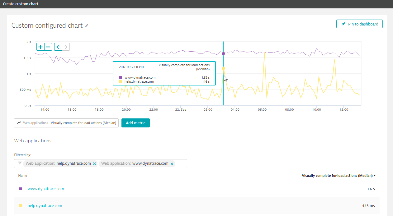
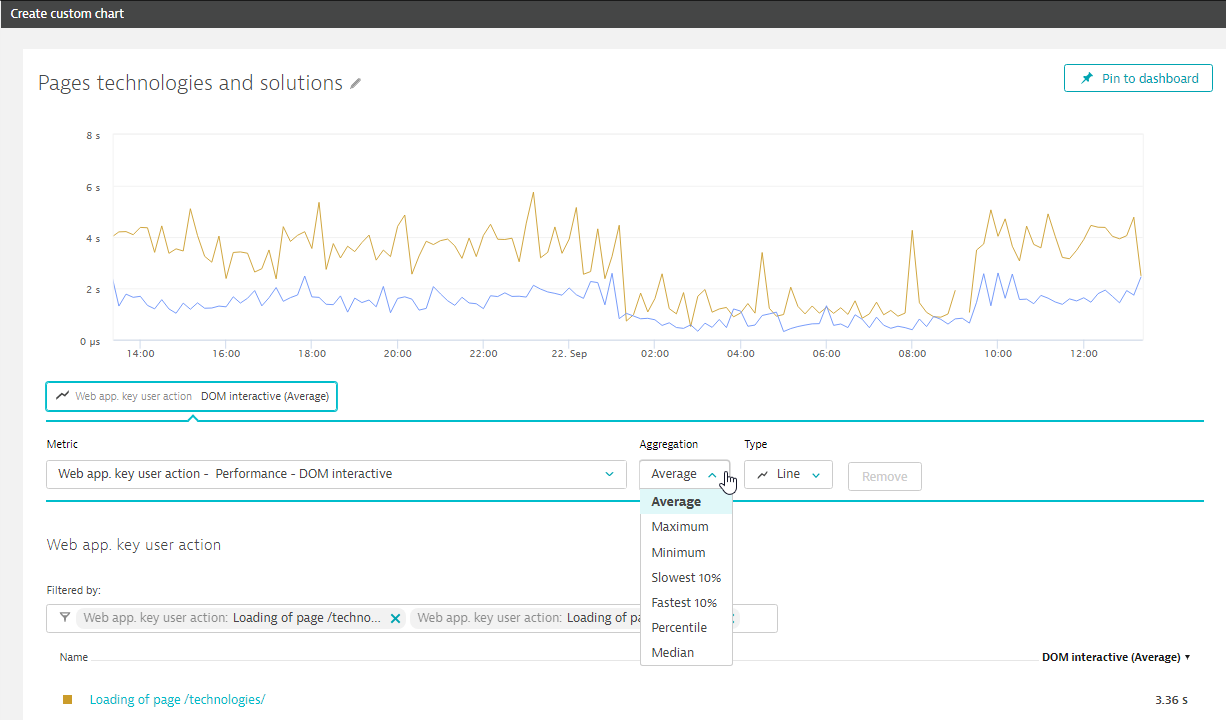
- Click the metric name beneath the chart to access the available settings for the selected metric. Adjust the aggregation and display options for the metric as required.
- You can optionally add additional metrics to the chart by clicking the Add metric button.
- Once you’re satisfied with your new chart, click the Pin to dashboard button to add the chart to your dashboard.
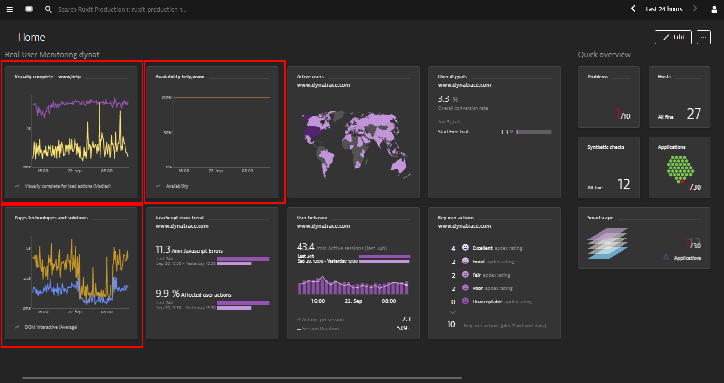
New dashboard tiles
The Dynatrace dashboard tile catalog features more than ten out-of-the-box tiles you can select from to monitor your web applications, key user actions, and web checks using the new metrics. To access the tile catalog, click the Edit button on your dashboard. Then click Add tile.
Additional charting options
In all, 32 new real user monitoring metrics have been added to the Dynatrace time series REST API. This means that all the new web application, web check, and key user action metrics are additionally accessible via Dynatrace API export.
Looking to create more sophisticated charts? See Use filtering to create more sophisticated dashboard charts.


Looking for answers?
Start a new discussion or ask for help in our Q&A forum.
Go to forum